Creating ideal web designs for a site is not an easy task. Different types of websites have different goals, and you need to work accordingly. For instance, if you are working on a lifestyle blog, graphical images and white space are the norm. That said, for an educational website, a simpler design would work fine.
Though you can absolutely customize every piece of your design, that can be very time-consuming. What if you could find a beautiful website you love and mimic that design? It would definitely save some time and show you what’s truly possible with WordPress.
The Criteria
I looked for sites that accomplished a specific goal within each category.
These are the ones I came up with-
- Affiliate website- Getting more conversions
- Personal blog- Improving traffic
- Digital marketing website- Getting more leads
- Business/resource website- Better User engagement
- Magazine- Improving subscribers
Note that this list considers the major goals a site would be targeting and it may vary for some sites, but you will mostly find a site working on design changes for the above list.
After funneling the most useful tips, I found some great insights to share with you. This post will help you learn the design changes to do that will help you serve both the better UX and functionality.
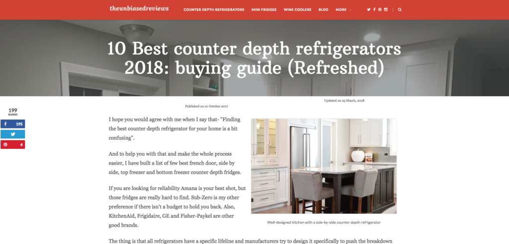
Theunbiasedreviews.com- Affiliate website
Goal- Getting more conversions
The Unbiased Reviews is an Amazon affiliate website managed by James Galea (an appliance expert and marketing specialist).
What design changes would you suggest for improvising conversion rate?
Here is what he said- “We did quite a few changes in our design, and these changes helped us improve the conversion rate by over 20%. We used WordPress thrive architect plugin to create buttons, lightboxes, and a table. We turned our content from half page to full page width. If you want to improve conversion; easy navigation and a natural interface are the two main pointers. Another thing that I would like to share is about AMP. I feel it safe to say, AMP helps with both ranking and conversions, but you do need to make sure it doesn’t degrade the page elements.”
These tips make a lot of sense; I read a similar post on seoroundtable which clearly stated that an AMP page is only valuable if the user experience is not compromised.
Heleneinbetween- Personal Blog
Goal- Improving Traffic
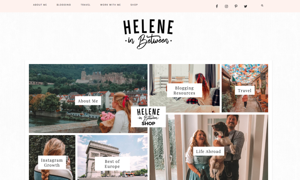
Helene In Between is a lifestyle and travel blog with over 100k monthly readers.
What design changes have you done on your site for boosting traffic?
“I would say that the best way I’ve changed my blog is to add tabs for most asked questions. For example, my design used to focus on travel, blogging, and social media. But so many people asked questions about my Life abroad or traveling with dogs. So instead of making them dig, they are now able to click on images that direct them to those specific posts,” Helene said.
Navigation of this site is eased to a great extent. If you scroll down to the end of the homepage, you will find images a bunch of images. Adding eye-catchy pictures connected with a relevant post is a creative way of the engaging users. It helps not only with traffic but also in easing the navigation.
She further said- “Anticipating your reader’s need is one of the best ways to encourage traffic and keep people on your site.”
WPKube.com- Resource/business website
Goal- Improve user engagement
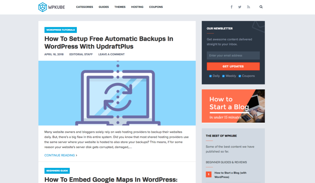
WPKube is an online resource featuring WordPress info, design posts, and related technical guides.
What design elements have you changed for better User engagement?
According to the team behind the site, “We took several steps such as changing the main design of the site, removing ads, adding highly targeted optin forms, but the most critical change was improving the content. Writing content that actually helps the reader, for example, we recently updated our guide on how to install WordPress, and it improved our average on page time and bounce rate.”
KWFinder.com- Marketing and research website
Goal- getting more leads
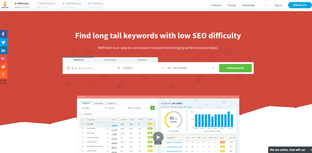
KwFinder is a marketing tool for keyword analysis. I contacted Maros Kortis, who is managing the marketing related activities.
What design changes have you done on KWFinder for improving leads?
Maros shared “the two things that helped them the most-
- We’ve added a “Don’t miss any future post!” subscribe form under each blog post. During the first month, we gained 10% more blog subscribers that in the past.
- We’ve changed the appearance of the related article under each blog post; there used to be four at the very bottom, now it’s only one highly-related article in the bottom-right corner. The avg. CTR improved by 30%”
CTA buttons and highly-relative post suggestions have always worked well for better conversions. I mentioned CTAs as a good way of enhancing your design, in one of my previous post on Torque magazine.
OnEXtraPixel- Design and Inspiration magazine
Goal- Get more Subscribers
Onextrapixel is a web design and inspiration magazine. You can also find web development guides on this website.
What design elements you pushed on, to get more Subscribers?
Email marketing has always been helpful, and popup subscribe-box is your best shot here.
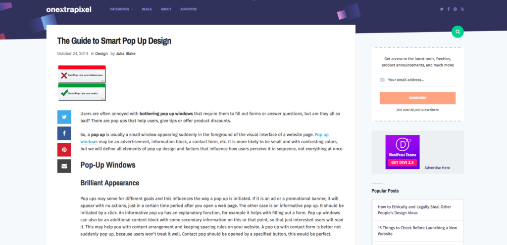
What they said- “It wasn’t until 2017 that we realized our email list would only boost by serving relevant and of course, elegant looking popups. We used most of the things shared on the post from 2014 on smart popup guide, these tips still helps boost subscription rate. We use highly-relevant content along with the subscription popup.
We created different content templates and PDF files tailored in accordance with the post type. For instance, a post on Facebook marketing tips was provided with free templates for improving Facebook ad conversion. We have built around 60k subscribers and are now focusing on other aspects of our magazine.”
I have heard about the technique mentioned by Onextrapixel magazine. It is a popular marketing technique and is used by many other advertising companies like Adespresso, a post on Instagram marketing is provided with Instagram ad examples for getting more targeted subscribers.
If you want to read a more comprehensive and in-depth guide for boosting subscribers, take a look at this guide on Torque Mag.
The post How to Learn Design From Competitor Websites appeared first on Torque.
