As a front-end developer, nailing the basics of HTML, CSS, and JavaScript is relatively easy. It’s learning how to write, architecture, and organize your code in a maintainable way that’s challenging.
Using modular code for front-end development can make your experience significantly more enjoyable and efficient. In a nutshell, taking a modular design approach lets you write code and building block patterns for repeated use. The result is being able to add, remove, and replace elements on your site with ease.
In this post, we’ll explain what a modular approach to design is and what its benefits are. Then we’ll provide you with three tips for adopting it as a WordPress developer. Let’s get started!
An Introduction to Modular Design
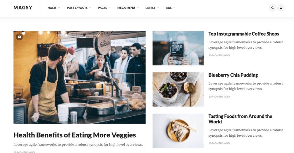
Modules are building blocks for a website. They let you create beautiful web pages and functional, aesthetically-pleasing sites for your clients:
In this context, a module refers to an element with set functionalities that aren’t tied to the site’s layout. Common examples include forms and buttons. While they may not have the same style, they are used to perform similar functions.
Modular design, also known as ‘atomic design’, is the practice of grouping site elements into patterns that are reusable. The best way to think about modular design is to liken it to building with Legos.
In other words, modules are versatile bricks, each self-contained, that can be arranged and rearranged in whatever order you wish. Each one has the same padding between elements. The result is a grid-like pattern that makes it easier to move the elements around, without disrupting the rest of the content on the page.
The Benefits of a Modular Approach to Web Design
There are many benefits of using modular code for front-end development. The first is that it lets you make changes quickly and easily. As a designer, you know that client approvals and redesigns can stall project timelines.
Plus, templates can be rigid and sometimes limiting. You’re often restricted to using certain elements in the pre-structured content spaces. Modular designs, on the other hand, are more flexible and easier to amend. Fewer mockups are needed, minimizing the development, approval, and deployment process.
Additionally, you can recreate pages using a different variation of the same modules with ease. This can make the deployment of future sites significantly quicker. In addition, it makes the design experience more manageable and organized as projects get bigger and more complex.
Modular design also presents the opportunity for you to create sites that are more modern and clean looking. This type of design creates a clear distinction between elements. This makes them easier to navigate and simpler to adapt as responsive for mobile devices – ultimately resulting in a better User Experience (UX).
3 Tips for Getting Started With a Modular Approach to Front-End Development
If you’re sold on the benefits of modular design, the good news is that it’s not difficult to adopt this strategy. Let’s take a look at three tips you can use for getting started with a modular approach to front-end development.
1. Use a Preprocessor Such as Sass
CSS preprocessors are scripting languages that make it easier to extend CSS’s default capabilities. You can incorporate variables, functions, mixins, etc. to produce more logical code. Preprocessors are an effective way to improve your workflow as a front-end developer.
There are a handful of preprocessors to choose from. One you might consider using is Sass:
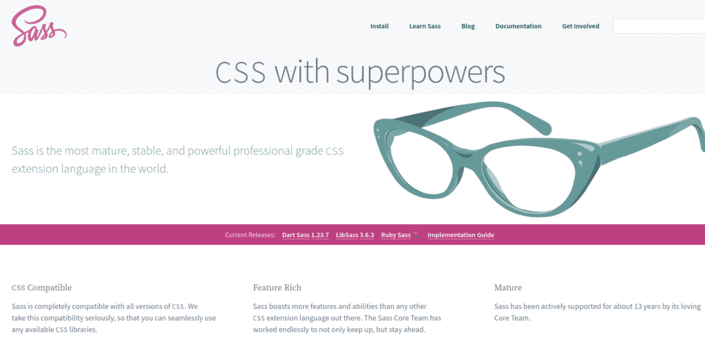
Sass is a stylesheet language compiled to CSS, which can make your stylesheet both modular and more scalable. You can use it to turn a large stylesheet into one that is more organized and maintainable. The Sassy CSS (SCSS) language of Sass is similar to CSS, so its principles are pretty easy to adopt.
Once you install Sass in a local staging environment, you can use it for creating built-in modules. We recommend familiarizing yourself with the basics before getting started.
Fortunately, there are many online resources available that you can leverage to gain a better understanding of modular CSS architecture. For example, you might consider taking the Modular CSS with Sass course to improve your Scalable and Modular Architecture for CSS (SMACSS) skills.
2. Download the Advanced Custom Fields Plugin
As a front-end developer, you’re no stranger to the convenience WordPress plugins offer for extending capabilities. When it comes to modular design, a particularly useful tool you may want to consider installing is Advanced Custom Fields:
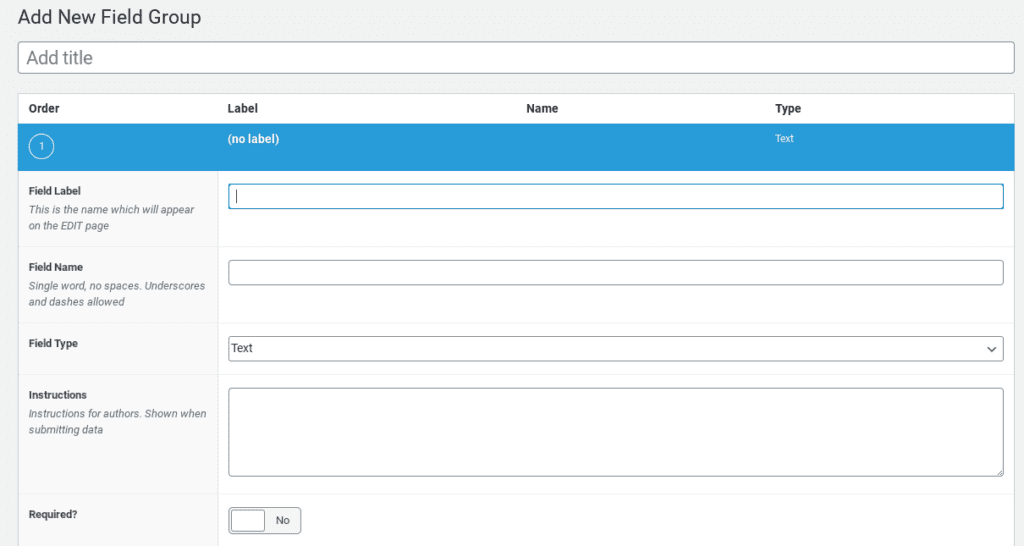
This plugin lets you add your own fields to your WordPress edit screens. You can place them anywhere in theme template files.
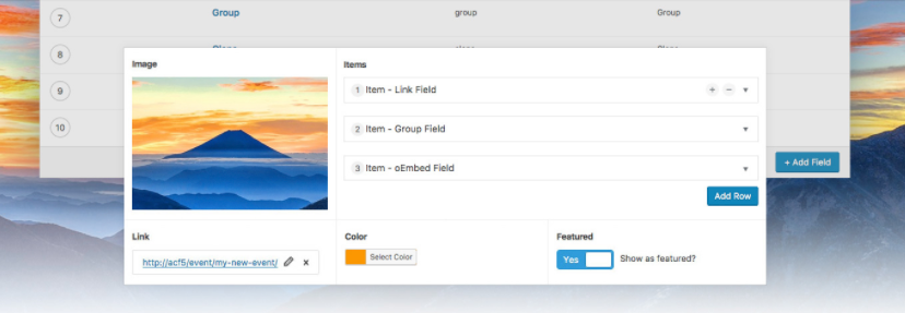
Once you install and activate the plugin, you can use it to create a new Field Group. Each ‘field group’ has a designated layout where you can define your own modules that are post-specific:
In each module, you can include a defined set of fields, each with a wide range of formats to choose from. With the Flexible Content and Repeater field features (available with the Pro version), you can build a series of modules to apply and reuse on any page.
3. Be Clear and Consistent When Naming and Defining Elements
When it comes to writing maintainable code, consistency is key. This is another reason we recommend familiarizing yourself with SMACSS best practices. At the core of this are five types of categories:
- Base
- Layout
- Style
- Module
- Theme
With the CSS rules divided into five categories, it’s easier to achieve clarity and understanding through naming conventions. Jonathan Snook, the creator of SMACSS, suggests using classes over IDs and element selectors for modules.
When naming classes for modular design, the goal is to make them generic enough to be reusable. However, they should still be specific enough to make finding and understanding them easy. It’s a smart idea to separate classes to define how the elements fit into a layout as well as how they’re styled.
Let’s say you’re creating a callout module. You can simply name the class after the module: .callout. If you wanted to add a state to the module, you could add .is-state. A collapsed callout, therefore, would look like this: .callout.is-collapsed.
Sass offers more guidance and advice on modular CSS naming conventions. Once you choose and establish an approach to naming elements, the key lies in keeping it consistent over time.
Conclusion
Like any front-end developer, you probably want your approach to creating client sites to be as easy, efficient, and manageable as possible. However, the bigger and more complex design projects get, the more difficult this becomes. This is why modular design is worth considering for front-end development.
As we discussed in this article, three tips you can use for getting started with modular design include:
- Using a preprocessor such as Sass.
- Downloading the Advanced Custom Fields plugin.
- Being clear and consistent when naming and defining elements.
Do you have any questions about using a modular design approach? Let us know in the comments section below!
The post Why Front-End Developers Should Consider a Modular Design Approach (And How to Get Started) appeared first on Torque.
