Sometimes, one page is all your website really needs. However, designing an effective one-page site requires special considerations – not least of which is deciding whether you should actually create one in the first place.
Of course, no one format is perfect for every website, and one-page sites have many pros and cons. However, they can be very useful in the right situations and are often best designed similarly to a landing page. By thinking about how you’ll ‘funnel’ the visitor down the page, you can speak more effectively (and persuasively) to them.
In this post, we’ll talk about why you might want to build a one-page website. Then we’ll introduce the key elements you’ll need to consider, and offer some advice for putting your site together. Let’s get started!
Why Building a One-Page Website Can Be a Smart Idea
One-page websites are not as popular as their multi-page brethren. This is understandable, given that the latter is the ‘default’, traditional choice when creating a new site.
However, that’s not to say there aren’t benefits to keeping your site small. For example:
- You can better funnel visitors through to conversion.
- Given the reduction in overall attention spans, concise wording can be beneficial.
- For sites that don’t upload new content regularly, one-page sites can be very simple to maintain.
There are many kinds of sites that can benefit from a one-page layout. These include portfolios, tech startups, and sites selling large-value items. In contrast, e-commerce stores and sites that upload a lot of content (such as business sites with attached blogs) may want to stick with a more traditional design.
Of course, one-page websites have certain drawbacks as well. Search Engine Optimization (SEO) can be negatively affected since search engines tend to favor sites with lots of content that spans multiple pages. After all, that approach offers a greater number of chances to index the site.
Also, space is obviously at a premium on a one-page site, so the wording you use needs to be incredibly concise. This could impact the level of depth you give each section or topic and might be detrimental if the site is focused around a complex product or service.
Finally, the scope for a one-page site’s expansion is more limited. For example, if you want to include a blog at some point, this naturally turns a one-page website into something else entirely. Technically, you could achieve the same goal using a multisite installation. However, the path of least resistance is to simply revert to a multi-page format.
The Key Elements of a One-Page Website
If you decide that the advantages of a one-page site outweigh the drawbacks for a specific project, you’ll want to carefully consider what elements to include. Your choices here will be unique to your own situation, of course, or to your client’s needs.
Even so, there are a few key features just about every one-page site can benefit from:
- A strong Call To Action (CTA)
- Information on the business and/or team behind the site
- Details on the business’ primary offering(s)
- An easy-to-use contact method
It’s worth noting that the first and last items on this list might be one and the same, especially if the ultimate goal is to build leads. However, if the site’s goal is to generate sales, you may end up with two CTA elements. To avoid confusion, which could negatively affect Click-Through Rates (CTRs), you’ll want to make contacting the business easy while still prioritizing the primary CTA.
How to Create an Effective One-Page Website
Finally, it’s time to get down to business. As we’ve touched on already, a one-page site’s job is to take the reader on a journey from the top to the bottom of the page. By the end, the only decision they should have to make (from your point of view) is whether or not to convert.
In other words, you can consider your one-page site a virtual path through the conversion funnel. This makes it vital to kick things off with some captivating elements. For example, it’s smart to create a bold header containing a ‘hero’ image, a tagline, and a clear CTA.
Bitrise’s website illustrates this technique well:
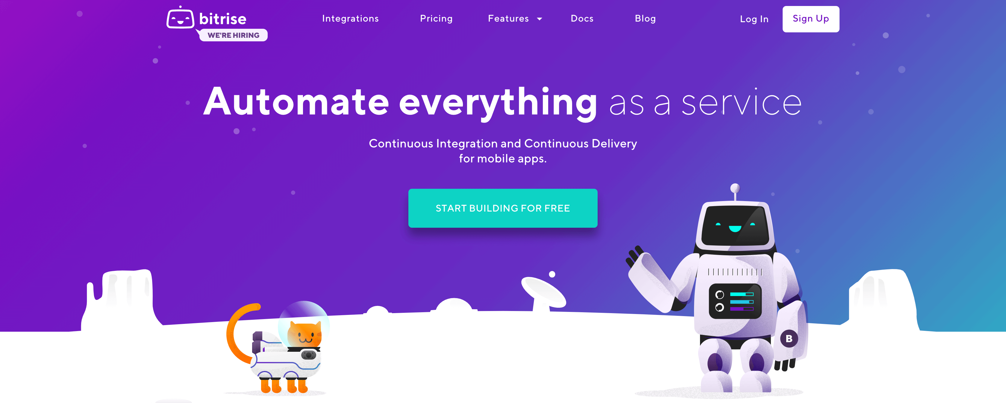
What a static screenshot doesn’t showcase is the site’s dynamic tagline, which displays a number of different “…as a service” messages. This informs the visitor about the company’s breadth of services, and also keeps the branding prominent.
What’s more, the CTA on the Bitrise website is also a nearly-perfect example. The bright color makes it stand out, and it’s almost dead center on the page. What’s more, the text is both actionable and clear: “Start building for free”. Creating a similar header for your own site will ensure that each visitor is given a clear path to follow.
When it comes to what goes underneath the header, you have a few options. For starters, it’s key not to ignore the very bottom of the page. Although you’ll offer a CTA immediately, you still need to capture those who have scrolled through the entire site (and don’t necessarily want to scroll back up).
For a good example of how to do this, you can take a look at the Jelvix website:

This site does a particularly effective job of leading the visitor and giving them few decisions to make. For example, they can click on the email address and phone number, or on the more prominent “Get in touch” message that makes it easy for them to make contact. Since this is the final stop on the tour, so to speak, you need to be sure that the reader’s next options are very clear.
As for the middle portion of your one-page site, this will normally consist of several different sections that depend on the site’s and business’ goals. Typically, you’ll want to include:
- An About section
- Details on the core service and product offerings
- Customer testimonials
- A portfolio or other work samples
Of course, your one-page site can contain practically anything that’s necessary to win successful conversions. However, as a general rule, we’d suggest keeping the text content concise and attention-grabbing (almost like additional taglines). This improves the chance for visitor conversions and gets them through the funnel quicker.
Last but not least, there’s one more element to consider when designing a one-page layout. Since many decisions will be black and white, part of your task is to make the site’s analytics easier to decipher. For instance, if you’ve done your job right, engagement rates will be consistent. This means you can easily spot anomalies, and ascertain whether the layout is at fault. A quality one-page site can benefit greatly from additional refinement over time.
Conclusion
Websites generally consist of multiple pages, mainly because there’s a definitive SEO benefit to that kind of design. However, there are a number of benefits to keeping your site short and sweet. For instance, one-page sites can result in an improvement to key metrics, such as ‘time on site’ and bounce rate.
When it comes to building a one-page website, you’ll want to use a similar setup to a landing page. For example, you’ll need a prominent hero image and a strong CTA, followed up with information about the company’s services and products. Then, you can showcase the business and team, and finish off with a converting element like a contact form.
Do you have any questions about creating an effective one-page website? Let us know in the comments section below!
Featured image: Pixabay.
Tom Rankin
Tom Rankin is a key member of WordCandy, a musician, photographer, vegan, beard owner, and (very) amateur coder. When he’s not doing any of these things, he’s likely sleeping.
The post How to Create an Effective One-Page Website appeared first on Torque.
