A one-page website is an excellent way to communicate a specific purpose to your visitors, without overwhelming them through lots of clutter and information. However, if you only have one page with which to impress people, you’ll need to pull out all the stops.
If you’re looking for a way to make your one-page site truly stand out, you may want to consider implementing a scrolling design. This divides your page into distinct sections and lets visitors navigate from one to the next by simply scrolling their mouse. There are a lot of benefits to using this particular feature – not the least of which is that it looks impressive.
In this post, we’ll dig deeper into why you might want to incorporate a scrolling design into your one-page website. Then we’ll show you how to get the job done, using the Uncode theme’s Slides Scroll feature. Let’s jump right in!
Why a Scrolling Design Can Benefit Your One-Page Site
When you’re building a one-page website, you have to be very particular about the information you include. You’ll want to keep the page relatively concise while making sure all of the most important information is present.
Usually, the best way to resolve this dilemma is to break your single page up into distinct sections, which keeps all of the information organized. Plus, you can design each section separately, for maximum impact.
However, for sites with a number of sections, visitors may tire of having to scroll down a lengthy page to view all of your content. Enter scrolling design:

This feature turns your page’s sections into a presentation of sorts. Users can scroll smoothly from one to the next using their mouse. This design is even accessible since those unable to use a mouse can simply press their arrow keys instead.
The chief benefits of a scrolling design are:
- Each section is presented independently, so it can make a stronger impression.
- Moving from section to section is easier, helping visitors to quickly find what they need.
- The effect looks impressive and makes your page dynamic, which can bolster the overall impact of your message.
While a scrolling design can be used on any type of website, it’s particularly useful for one-page sites, landing pages, and others. Plus, it can be surprisingly simple to set up. Throughout the rest of this article, we’ll show you one way to achieve it.
How to Create an Advanced Scrolling Design for Your One-Page Website (In 4 Steps)
There are a few methods you can use to implement a scrolling design on your site. For instance, you could code it manually, if you have the technical expertise. However, the easiest way to accomplish this is typically by using a theme that includes scrolling functionality out of the box. A perfect example of this in action is the Uncode theme:

This multipurpose WordPress theme offers a myriad of features to help you design a compelling and unique website. Most importantly for our purposes here, it includes a handy Slides Scroll feature that makes adding a scrolling design to your site quick and painless:

Let’s walk through how to use this feature!
Step 1: Install Uncode on Your Site
If you happen to be using the Uncode theme already, you can skip this step. If you aren’t – or if you’re setting up a brand-new site – you’ll need to continue reading. After purchasing Uncode, you can install it like any other premium theme. This requires navigating to Appearance > Themes in your WordPress dashboard, selecting Add New, and clicking on the Upload Theme button:

Next, click Choose File, and find the zipped Uncode folder on your computer. Select it, and then hit Install Now. Don’t forget to activate the theme once it’s installed:

As we mentioned earlier, Uncode is a comprehensive and multipurpose theme. This means it requires a few ‘extras’ in order to work properly. To set those up, go to Uncode > Install Plugins within WordPress:
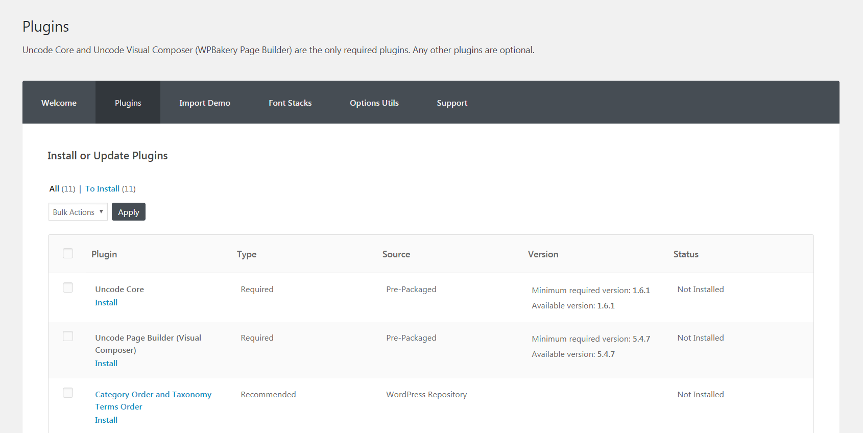
There are a lot of useful plugins here, although at a minimum you’ll need to install and activate Uncode Core and Uncode Visual Composer. Then, Uncode will be set up and ready to go!
Step 2: Create a New Page and Activate the Slides Scroll Feature
While you can add a scrolling design to an existing page, you’re best off starting with a clean slate. To do this, simply create a new page and give it a name:
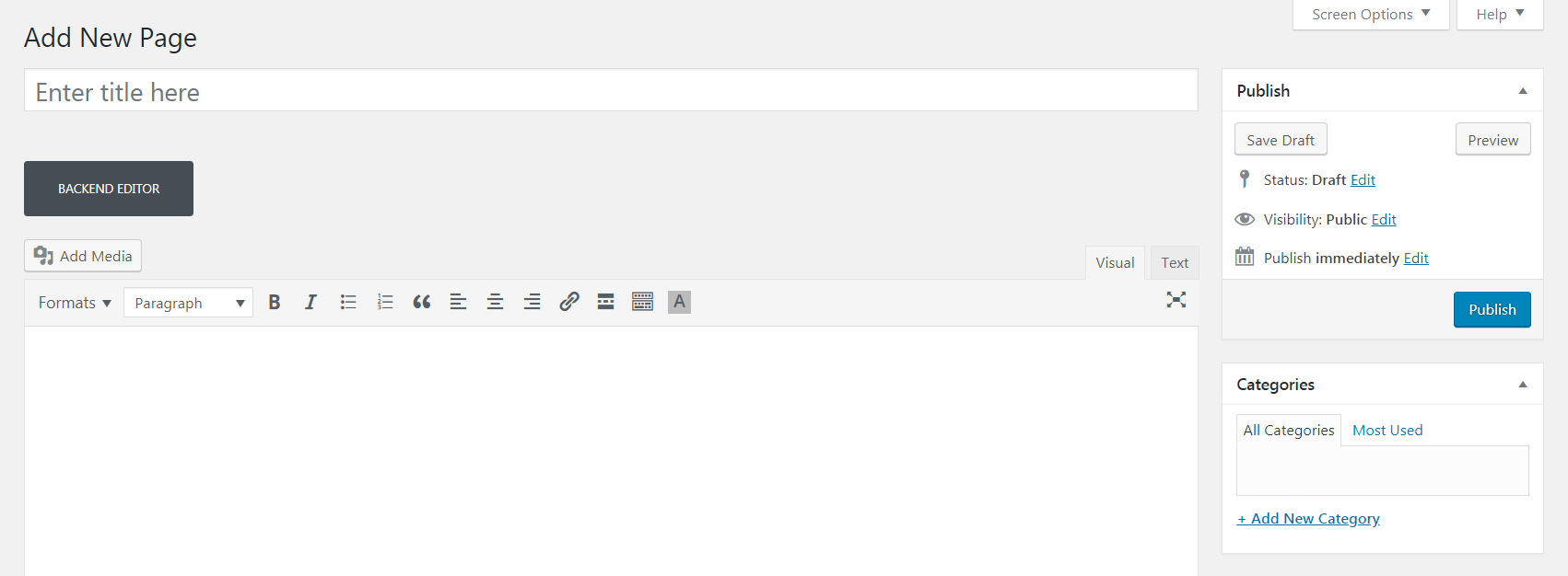
Next, scroll down to the Page Options metabox at the bottom of the screen. This contains many features for customizing your page’s look and functionality. For now, click on the Scroll section:
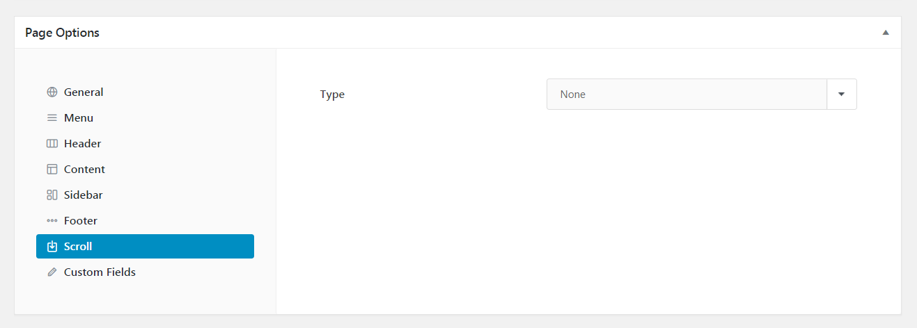
At first, all you’ll see is a drop-down menu labeled Type. There are only two options, and you’ll want to choose the one called Slides Scroll:
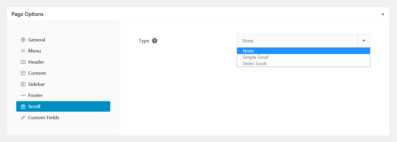
This makes the Slides Scroll feature active on your page. You’ll also see a new list of options appear – we’ll explore those in the next step.
Step 3: Configure the Slides Scroll Feature
Technically, you only need to select the right Scroll type to add a scrolling design to your page. However, you may also want to customize the way the feature works, to better suit your exact needs.
To do this, you can use the new settings listed under the Scroll section of the Page Options box:
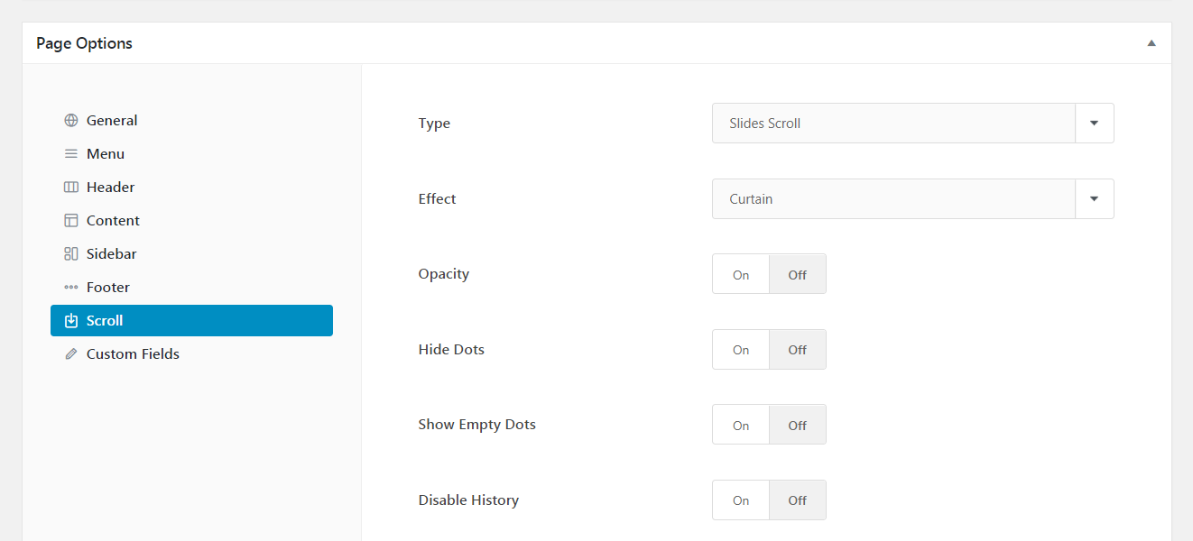
Under the Effect drop-down, you can specify the type of animation users will see when scrolling from one section to another. If you like, you can also add an opacity effect to the animation.
By default, your page will display a series of dots, which shows visitors the section they’re currently on:

The Hide Dots option will remove those icons, while Show Empty Dots will add an icon for every row you’ve created on your page (whether or not it’s been assigned a name).
In most cases, you’ll want to leave Disable History set to Off. This way, the user’s browser will display a unique URL for each section of your page, making it easier to navigate to and share specific information. However, you can turn this feature off if you like.
If you’re using a transparent menu, you may want to enable Safe Padding. This adds extra padding to the top of your content, to ensure it doesn’t overlap with the menu. You can even include extra space using the Safe Padding Additional slider:
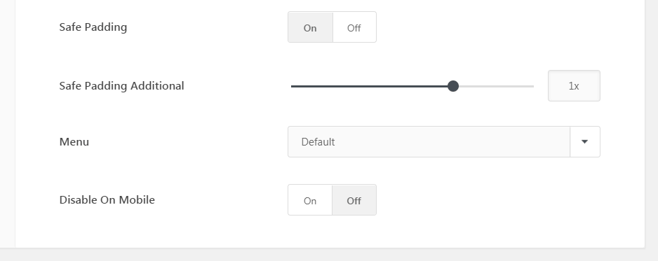
Next, you’ll want to decide if you want your main menu to appear on every section, or just the first one. If you’d like the menu to always remain visible, you can stick with the Default setting under Menu. Otherwise, chose Hide after first slide:

Finally, you may want to stop the scrolling effect from appearing on mobile devices. This can help to speed up performance for smaller screens. To do this, select On under Disable On Mobile.
That’s it! Once you’ve tweaked all these options to fit your needs, go ahead and save your page.
Step 4: Build Your Scrolling Page
At this point, all that’s left to do is add in your actual content. How you go about this will largely depend on your particular vision for your one-page site. Still, let’s look at how the process works overall.
If you haven’t already, scroll back up to the main WordPress editor for your page. Make sure you’re using the Uncode Page Builder to customize your content. If you aren’t, select the Backend Editor button to switch over:
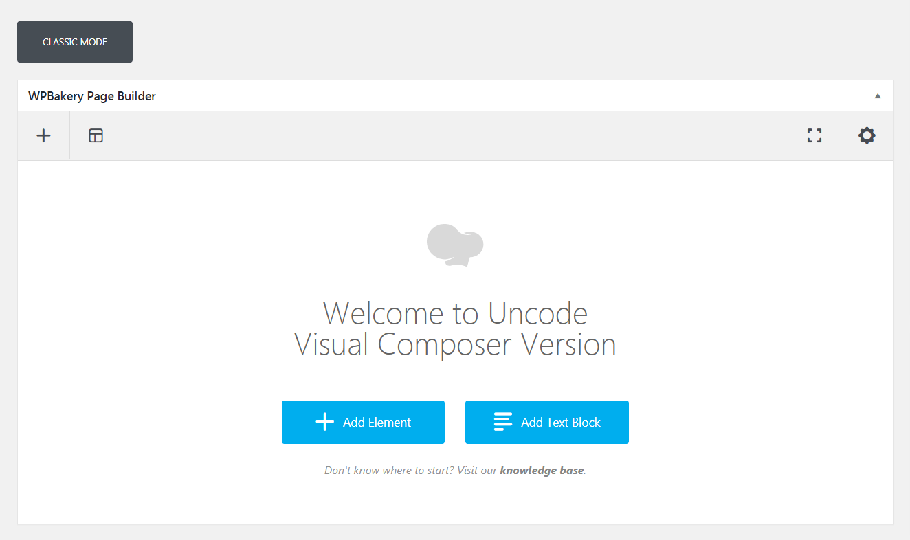
As with building any page in Uncode, you’ll want to begin by placing your first module. To do this, click on the Add Element button:
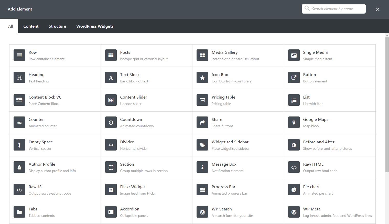
For now, just select the Row option. This will place an empty row on your page. Continue to add rows underneath, until you have one for every section you want to include in your scrolling design:
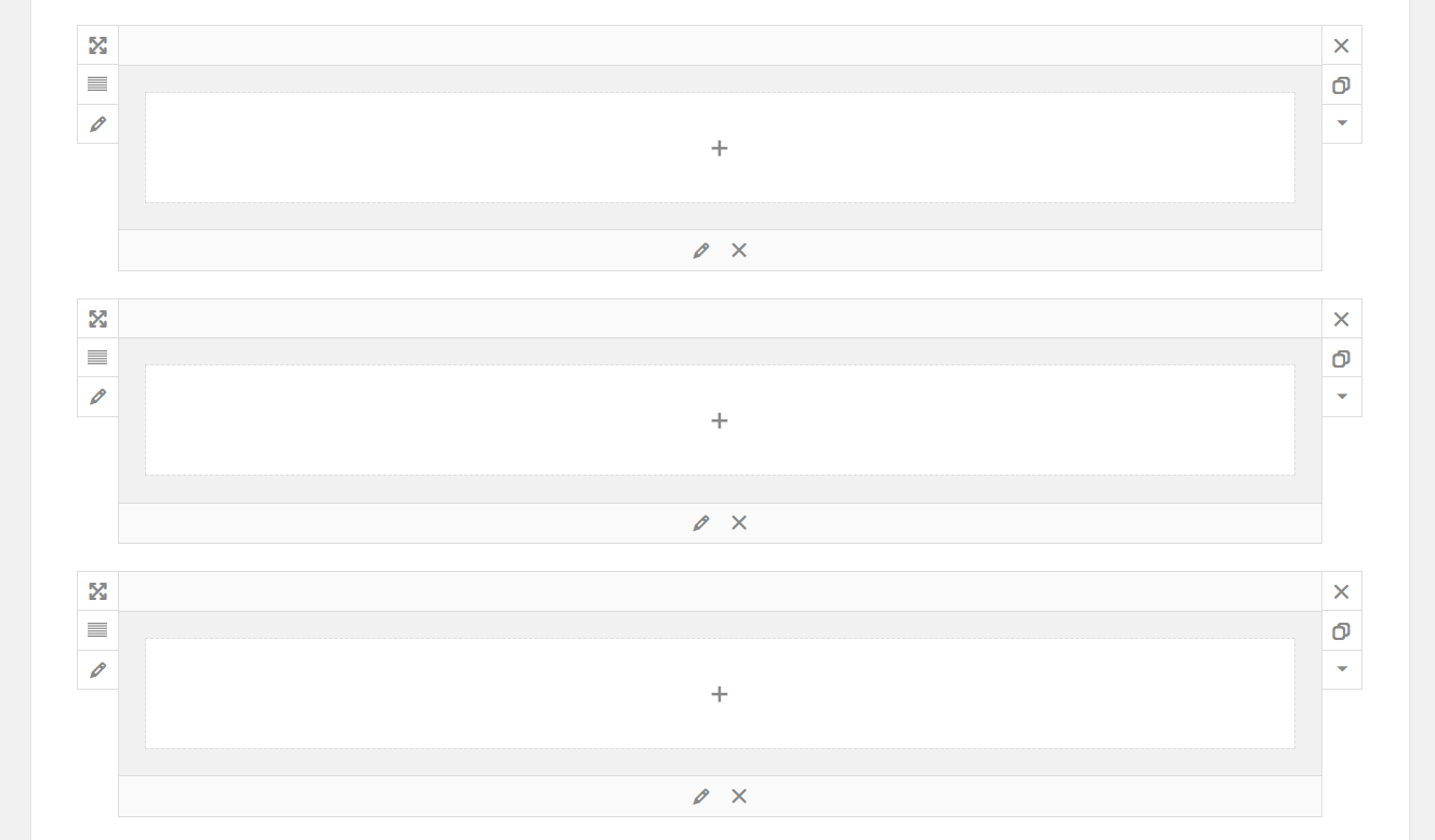
Then, click on the Edit this row option for the first row (this is indicated by a small pencil icon on the left side of the box). Find the Height setting, and make sure it’s set to Full by moving the slider all the way to the right:
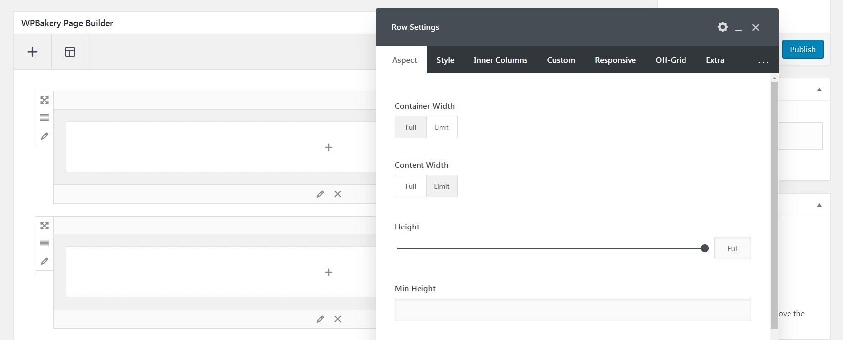
Do this for every other row on your page. This is important – if your rows aren’t set to their full size, the Slides Scroll feature won’t work properly.
After, you can go ahead and customize each row as you see fit. Use the plus icons within the rows to add new modules – you can include text, images and other media, and so on.
In fact, you can add just about anything you like to your one page site. Just make sure each section is fully contained within its own row. Other than this, you have complete creative freedom. You can check out the following video for more details:
At the end of this process, you should have something looking like the following:

Once you publish your page, visitors will be able to visit your one-page site and scroll effortlessly from section to section. That’s all you need to do to implement a scrolling design using Uncode!
Conclusion
A scrolling design is a stylish and efficient way to display your content, particularly if space is limited. Visitors will be able to move through your page quickly and see everything you have to offer. For one-page sites and landing pages in particular, this design can be incredibly effective.
What’s more, setting up this type of page is simple with the right tools. To recap, here’s how you can implement a sliding design using the Uncode Theme’s Slides Scroll feature:
- Install Uncode on your site.
- Create a new page and activate the Slides Scroll feature.
- Configure the Slides Scroll feature.
- Build your scrolling page.
Do you have any questions about how to design your scrolling page? Let us know in the comments section below!
Image credit: Pixnio.
The post How to Create an Advanced Scrolling Design for Your One-Page Website appeared first on Torque.
