There is a lot of hate out there directed at the new WordPress block editor (aka Gutenberg). I’ve been frustrated with aspects of it myself. And change is difficult. Much of the frustration may stem from familiarity with the old editor and having to learn new ways of doing things in the block editor.
As a blogger myself, and someone who’s company manages many WordPress websites, I actually find that I really like Gutenberg, overall. In adopting the block editor, we’ve traded some frustrations with the classic editor for some new frustrations with Gutenberg. Personally, I quite like the trade and will take the new frustrations over the old.
Here are the features of the block editor that may have not been on your radar, that I think make the new block editor quite awesome. I’m writing this post in Gutenberg. My experience is based primarily on WordPress 5.1. So some of what follows may change in future updates to WordPress, or may already have improved in the Gutenberg plugin. Here’s what we’ll cover:
- Pasting from Google Docs “Just Works”
- Drop Images Right Where You Want Them
- Easily Rearrange Your Paragraphs
- All the New Layout Options Work with Old Themes
- Quickly Add Anchor Links, CSS Classes, & Convert Blocks
- Room for Improvement
1. Pasting from Google Docs “Just Works”
I love Google Docs! It’s by far the best place to collaborate on writing posts. Its real-time editing by multiple people makes it a breeze to collaborate on posts with people who might be on the other side of the world from you.
The “Suggesting” mode is equally powerful. I can go through one of my writer’s docs and mark the heck out of it. Like a teacher with an angry red pencil, I can really go to town on their post, all without actually changing the post at all. It’s pretty wonderful. They just have a bunch of suggestions and comments they can go through and either accept or redo in a way that they feel is most appropriate.
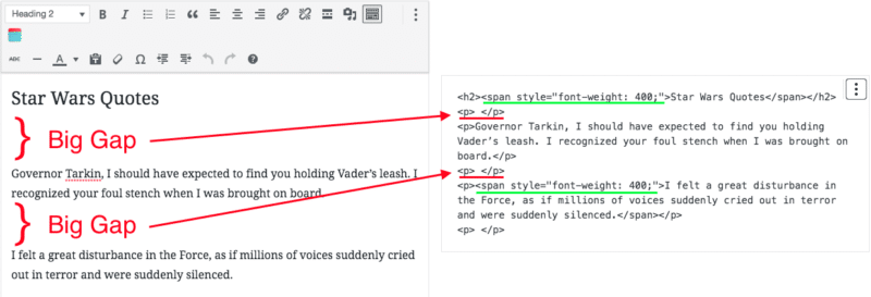
There’s always been this huge problem though: when it’s time to take that collaborative, thoroughly-edited post and put it into the WordPress editor for publishing. You can just copy and paste into the Classic Editor (with the plugin or on WP 4.9 and before), but you’ll notice some big gaps between paragraphs. If you look at the HTML/text view, you’ll see lots of spans setting the font weight, as well! The gaps are not okay! Sometimes the spans are fine if your blog is set to use the same font-weight. But it’s kinda a mess and not ideal at all.

Caption: What you get when you paste from a Google Doc in Classic Editor
One option in classic editor is to paste without formatting. But when you do that, then you have to go back through and turn all the headers back into H2, H3, and set all italics, bold, etc, back. It’s a lot of work!
Gutenberg was built with this problem in mind, and it solves it completely! Just copy the entire Google Doc and paste into a blank post in the block editor. It’ll just work. No weird, inline styles and formatting and everything converts over. Your headings are still intact, your bold, italics, and other stuff transfers over just great, and even the images paste over. It’s amazing and such a huge time saver! I’ve heard it works just as well with Microsoft Office Word docs as well.
The one caveat here is that the images are hosted by Google. If you want them to load from your site (recommended), you’ll need to delete them out of the post and upload the images into your post from your hard drive.
2. Drop Images Right Where You Want Them!
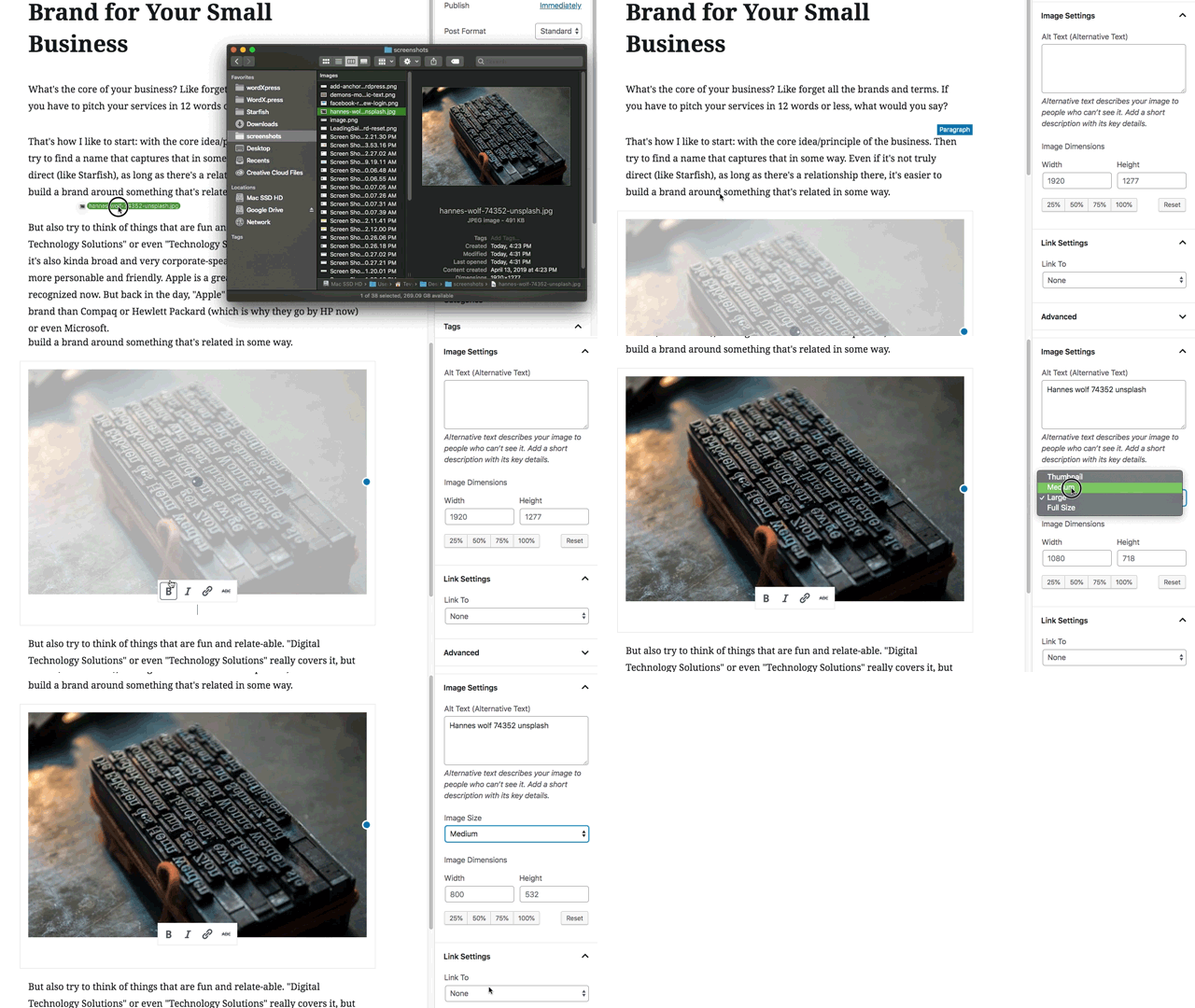
That leads me to my second great feature of Gutenberg: you can just drag images right from your local computer and drop them where you want them in your block-based post. So when you’re re-inserting those images from the Google Doc, so that they’ll load from your WordPress website and not from Google’s servers, it’s actually really easy.
Anytime you want to insert an image, just grab the file in Finder on Mac, or Windows Explorer, or even off your desktop, and drag it to the spot you want it to appear in your post. You’ll see the blue line that indicates where it’s going to land when dropped. Just drop it there and Gutenberg handles the rest! It even gives a little preview as it uploads and prepares the image.

Maybe best of all, you can keep on working on your post while it does this! No more need to have the Insert Media window open over the top of the classic editor, so you can’t do anything until the image is uploaded and inserted. Just drag and drop, then continue working. Though you may want to come back and change the size of the image once WordPress has had a chance to process it and produce the various sizes (Large, Medium, etc), as well as link it to the full-size image or elsewhere.
3. Easily Rearrange Your Paragraphs
I think this one’s probably obvious to anyone who’s used the block editor, but you can rearrange paragraphs very easily. There are actually two ways to do it with the mouse: you can click the little up and down arrows that appear on the left of a block when you hover over that block. Or you can grab the little dots that appear between those up and down arrows, and drag it where you want it to go.
At first, I didn’t think this was a big deal, but the more I’ve written using the block editor, the more I’ve come to appreciate how much this helps my writing. I often have thoughts and write paragraphs that don’t fit where I wrote them, but then I realize they’d go much better in a different place. In the old editor I’d have to cut them and then paste into the new location. The drag and drop mentality makes it feel much more “hands-on” and tactile as I try those paragraphs out in new locations or rearrange them into a different order.
4. All the New Layout Options Work with Old Themes
My main business is a WordPress support and maintenance company. That means we maintain and do content updates for a vast variety of WP sites that have a lot of different themes. One thing we often struggle with is laying out pages on sites with older themes.
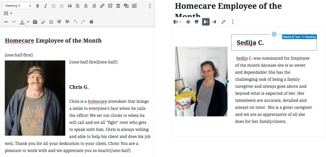
In one recent example, we wanted to put text next to some photos, in a 2 column layout, where the photos would all appear on the left half of the page and the text all on the right. You can’t do this in the classic editor’s native functionality. You can right/left align images, but then the text will flow back beneath them. Fortunately, this particular theme had shortcodes that allowed us to do this. But it’s difficult to visually see what’s going on, and even more difficult to explain how to update it, without breaking the layout, to the client.

Caption: Classic Editor on the left, Block Editor on the right
Gutenberg solves all of this. It includes column blocks that can then have blocks inside of them. In this case, I just rebuilt the layout in the block editor and dropped the content in the right places. Now there’s a 2-column layout that’s easy to see, edit, and manage. And guess what? It all “just works” even with this fairly out-of-date theme. I’m happy because it’s quicker to create these kinds of layouts for our members, and our members are happy because they’re able to easily edit those layouts themselves.
5. Quickly Add Anchor Links, CSS Classes, & Convert Blocks
This may seem like a bit of a cop-out since it’s several things. But they’re just the little enhancements that I’ve found very helpful in the block editor. You can change the background and text color of most text blocks, but I don’t like to manually do that sort of thing in posts. I prefer to set those things in the theme/CSS for a consistent look across all posts. Though it is nice to have when one of our members wants a certain thing a certain color, in only that post or page.
However, this section isn’t about the “Color Settings” section of the block editor. It’s about some other cool tools that like the color settings, might get overlooked easily:
- You can easily add anchor links to the heading block. Just select the header block, then put the name of the ID that you want to appear there under Advanced > HTML Anchor in the settings sidebar. Now you can link to that spot on the page, by adding #your-id-here on the end of the URL of that page or post.
- In the same way, under Advanced, you can add a CSS class to pretty much any block. I find this helpful to do things like adding a border to some images that have white edges and need visual separation. I can write a little CSS and then just add that class to any image that needs that border on it.
- Lastly, you can quickly convert blocks to other, similar blocks. For example, this bulleted list block can be converted to a normal paragraph or a quote block. No more having to do all those tricks with deleting the bullets until everything lines up as a normal paragraph again! Just 2 clicks and “viola!” no more bullets.

Room for Improvement
The Gutenberg team has been very clear that’s an evolving, changing product. As such they’re always working to improve it. Here are a few things that I personally find frustrating and am really hoping will be improved in the near future.
- Can’t drag a block straight vertically. When dragging a block, the arrows make it seem like you should be able to move your mouse straight up and down. If you do this, the blue line indicating where it will drop never appears. Instead, you have to swerve to the right some to get your mouse over-top of the blocks, before the blue “drop” indicator appears.
- Drag and drop can be kinda hit and miss. If you drop when that blue bar isn’t indicating where it should land, it will go back where it was. The difference between a droppable spot and one that’s not is unclear and difficult at times. I’ve seen other instances where after dropping, the editor suddenly scrolled to another place in the post and I was lost for a moment and unsure if it had dropped where I’d intended.
- No header keyboard shortcuts? It’s easy to create a new block that’s a header without your hands leaving the keyboard. Just hit enter anywhere to start a new block then the “/” key to select what kind of block you want and “h” for header, then enter to select it and start typing your header. However, it defaults to H2. if you want an H3 or H4, there’s no way (that I could find) to do this without using the mouse. I prefer to keep my hands on the keyboard for maximum writing speed.
- Double-clicking an image does nothing. Almost all document and image editors let you get to the image settings via double-click. I find myself double-clicking the image in Gutenberg, and nothing happens. I think it should do the same thing that the “Edit Image” button currently does: opens the “Select or Upload Media” modal.
The Block Editor is a Joy To Use
Despite the above frustrations, I find the block editor a joy to use. I think that like many things in life, you get out of it largely whatever attitude you put into it. If you go into the block editor with an “I hate change and I’ve heard all these bad things,” attitude, you’ll find plenty to support that position. I choose a positive, “I love new things, that’s what got me into WP in the first place, and I’m excited to see where it’s headed.” I’ll take the frustrations I have with Gutenberg over the limitations and frustrations of the classic editor.
As far as writing a post goes, or changing the layout on pages for our members, the Gutenberg editor has helped me and my team work much faster than we could before. It’s got great visual tools that let you create things in a logical, block-based way. It’s not a replacement for a good visual builder, and probably won’t be anytime soon. However, it is great for writing posts, simple page layouts, and an overall improvement in the way we compose content on WordPress.
Give it a try! If you’re open minded and remind yourself that you have frustrations and time-consuming processes on the classic editor, you might find you actually like Gutenberg. What’s your favorite feature of the new block editor?
The post 5 Reasons the New WordPress Block Editor (Gutenberg) is Great appeared first on Torque.
