As a veteran WordPress user, you are probably aware that every year since 201o WordPress developers have given us a new default theme. In the past, it came with the last major release at the end of the year and was a highlight for many of us. This tradition picked up again with the release of WordPress 5.0, which, among other things, brought us Twenty Nineteen, the new WordPress default theme.
Anyway, the theme’s arrival was reason enough for us to load a copy into a testing environment and give it a spin. In the following Twenty Nineteen theme review, you will learn everything you need about the new WordPress default theme. We will look at its design, outstanding features, how it plays with the new Gutenberg editor and more.
Let’s get going.
Twenty Nineteen Installation
You can install Twenty Nineteen like any other WordPress theme. Simply log into your WordPress website and go to Appearance > Themes > Add New. You should already see the theme under the Featured and/or Popular section.

Click Install to get it onto your site and don’t forget to activate it when it’s done.
If you have recently updated your site to the latest version of WordPress or set up a fresh new website, the theme will automatically appear on your site. In that case, you don’t have to do anything except activate it.
A First Look at the Front End
When you first look at Twenty Nineteen’s design, you will notice that it is a rather plain single-column layout.
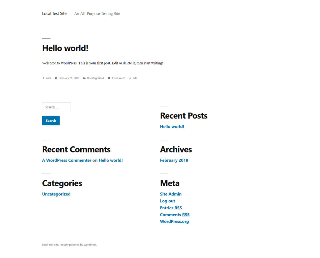
Sure, there are some bold typography choices (especially for the widgets below the content) and a lot of blue but overall the page remains quite empty.
This minimalism is on purpose. Because Twenty Nineteen ships with Gutenberg, the goal is to give users a blank canvas to implement their own vision via the new editor.
The theme’s aesthetic is minimal and non-prescriptive, allowing the theme to work well in a variety of applications. For example: it is effective as a minimal, typography-driven blogging theme, but can also be adapted for use as a static business website. – Allan Cole, Twenty Nineteen Lead
Does it live up to its promise? Let’s find out.
How to Customize Twenty Nineteen to Your Needs
For those wanting to make the theme their own, Twenty Nineteen offers plenty of customization options.
Set a Site Logo and Favicon
One of the first stops in changing the design of your site is the WordPress Customizer (Appearance > Customize). Here, Twenty Nineteen offers a number of interesting options.
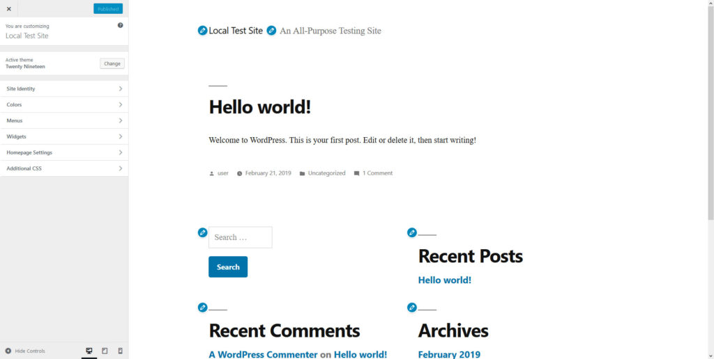
First of all, it allows you to set a site logo. This needs to be a square (recommended size 190 x 190 pixels) or a rectangular image that you will crop to the right dimensions during upload.
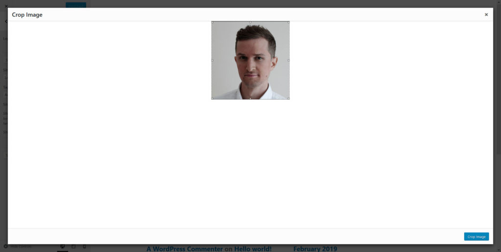
Once you have set a logo, it will show up in a circle in the header section.
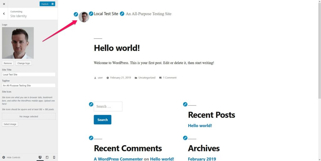
This is quite a nice touch and, especially if you use it for a personal blog, is reminiscent of the Google Authorship icons. It will also be sufficient for most company logos.
In the same menu, you can also set a site icon (favicon) that will show up in browser tabs and bookmarks. It, too, needs to be square and the recommended size is 512 x 512 px.
Customizing the Colors
If you are not a fan of the blue that the designers picked, you can change it to any color you like in the Colors section.
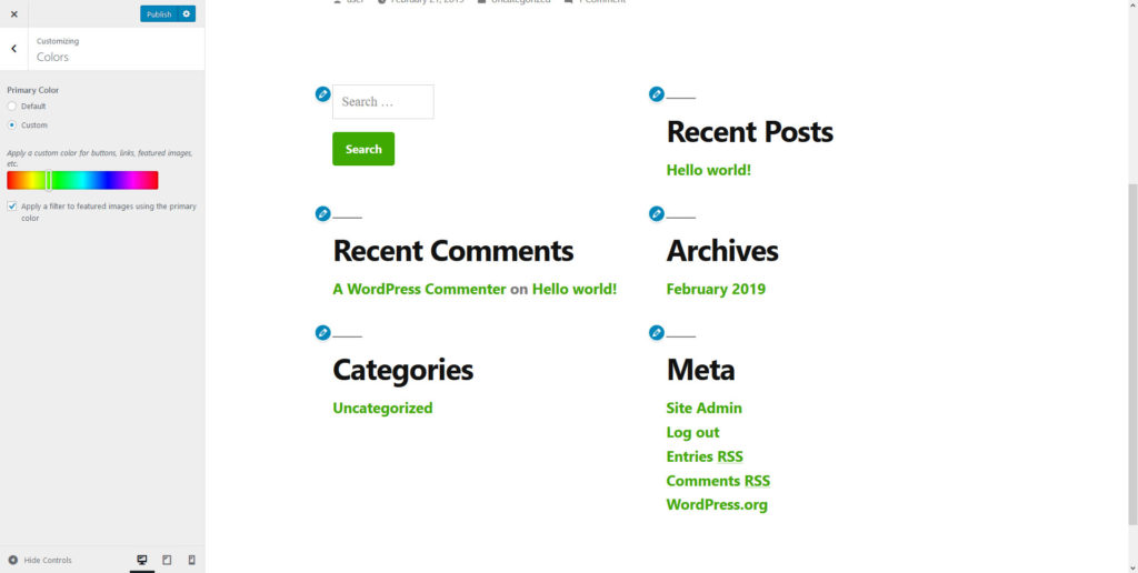
Just set the radio button to Custom and use the color slider to pick something to your liking. This hue will then apply to links, widget titles and other site elements. Unfortunately, there is no option to input hex values, so, if you want to use a particular brand color, you are either out of luck or need to implement it via CSS.
The Color section also has a checkbox for whether to use the primary color in a filter applied to featured images. This will become important further below.
The Social Menu
Under Menus, besides populating the header and footer, you also have the ability to create a social menu.

That means, when you add links to your social presences here, the theme will automatically turn them into fitting icons.
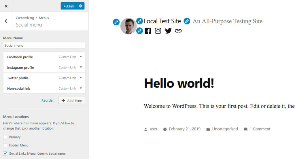
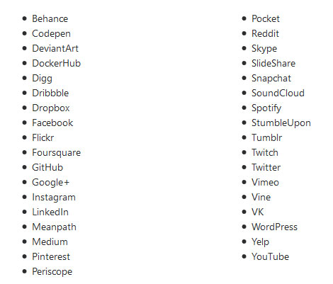
Here is a list of social networks it supports:
You can also include links that point to other places. In that case, they will receive a simple link icon as seen above.
The primary menu shows up right below the site branding (but above the social menu) and the footer menu at the bottom of the page.
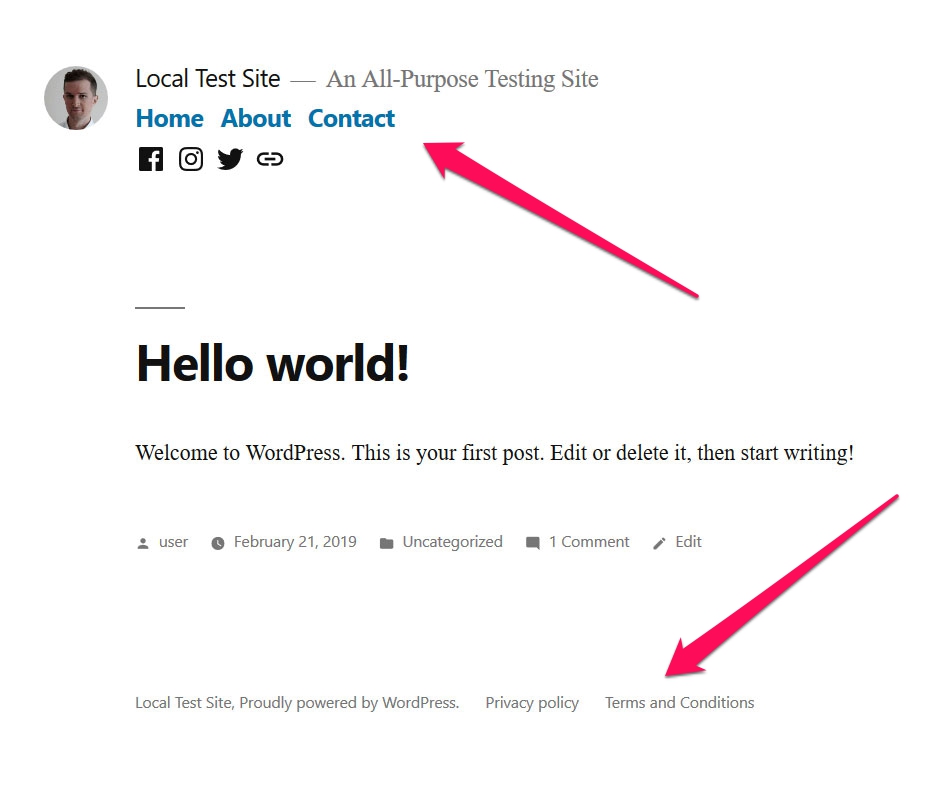
The latter is especially suitable for things like a link to your privacy policy, terms, and conditions, etc.
Widgets
The rest of the Customizer settings are rather standard. The only other thing that stands out is that there is no sidebar. The only widgetized area is below the page content, above the footer. Although, it should be noted that you can also input widgets into your posts and pages. More on that below.
Twenty Nineteen and Gutenberg
As mentioned in the beginning, Twenty Nineteen was purposely built to work well with Gutenberg. How is that reflected in the editing experience with the new default theme? Let’s find out.
Front End and Back End Styles Correspond to Each Other
Including the same styles for the back end editor as for the front end has been good practice for a while. This was already possible with the classic editor and gave users a closer experience of what their content would look like on the page. The goal was to get closer to a true “what you see is what you get” experience.
Twenty Nineteen and Gutenberg try to do the same thing. Any styling that is present on the front of the website is also visible in the back end.
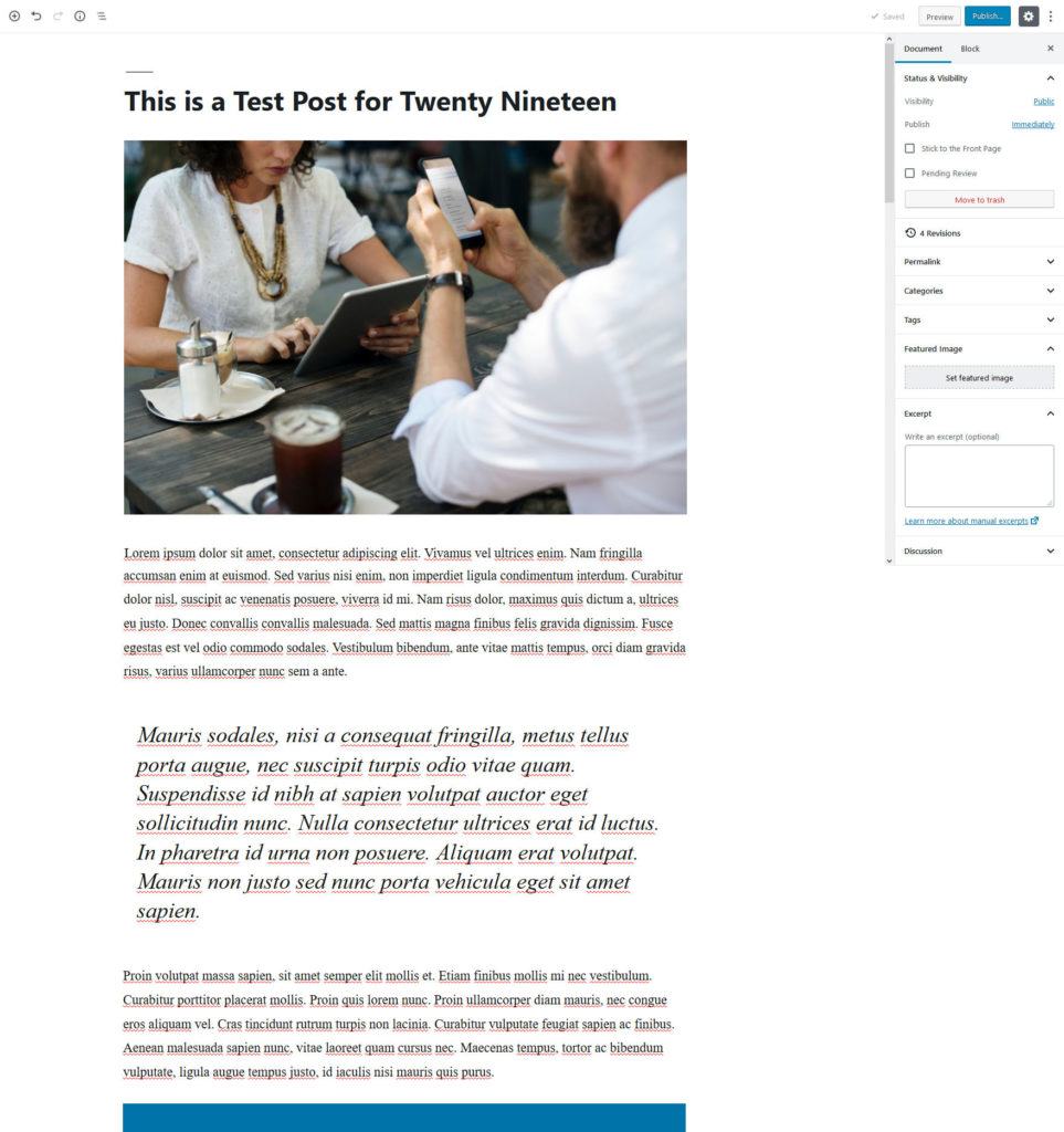
As a consequence, we are very close to seeing what the final product will look like in the block editor.
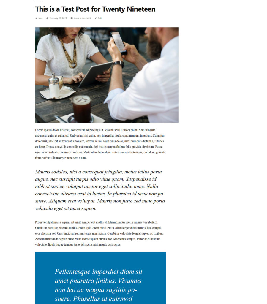
This lets Gutenberg come off as more of a page builder, which is one of the things that its makers promised and that is meant to make it easier for beginners to build sites. It’s nice to see it put into practice.
Full-screen Featured Images
One of the most noticeable features when working with Gutenberg in Twenty Nineteen is the featured image that you can set for both posts and pages.
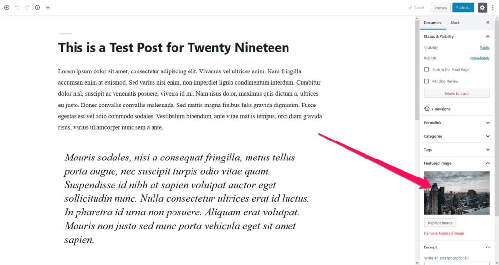
As usual, these will appear on the homepage and in other archives.
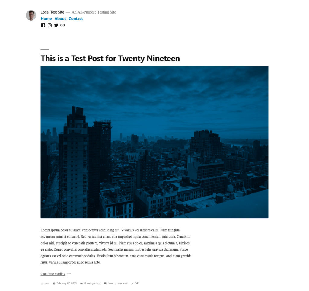
However, they achieve their most striking effect in single posts and pages. Here, the featured image stretches all the way across the screen.
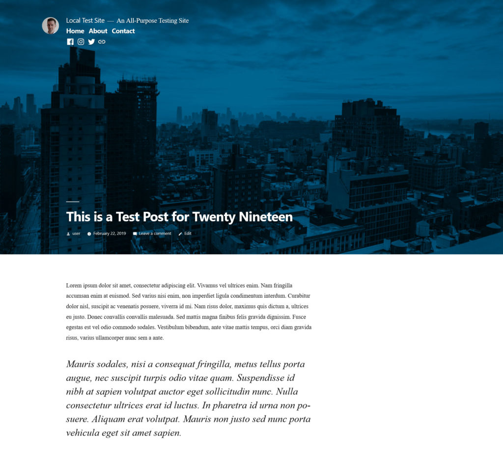
This creates a big change in the otherwise minimal theme and has a nice effect. To achieve it, the developers recommend using visuals that are at least 2000 x 1200 pixels.
However, you will also quickly notice the filter overlay over the image. This is the aforementioned effect that you can control in the WordPress Customizer. Note that when you switch it off completely, there will still be a slightly dark filter present for images. This is to ensure legibility for the text on top.
Add Widgets to Posts and Pages
Finally, you might remember the earlier point about minimal available widgetized areas in Twenty Nineteen. To make up for that, you also have the ability to add widgets to posts and pages within Gutenberg. For that, simply add a new block (click the plus symbol) and scroll down to Widgets.
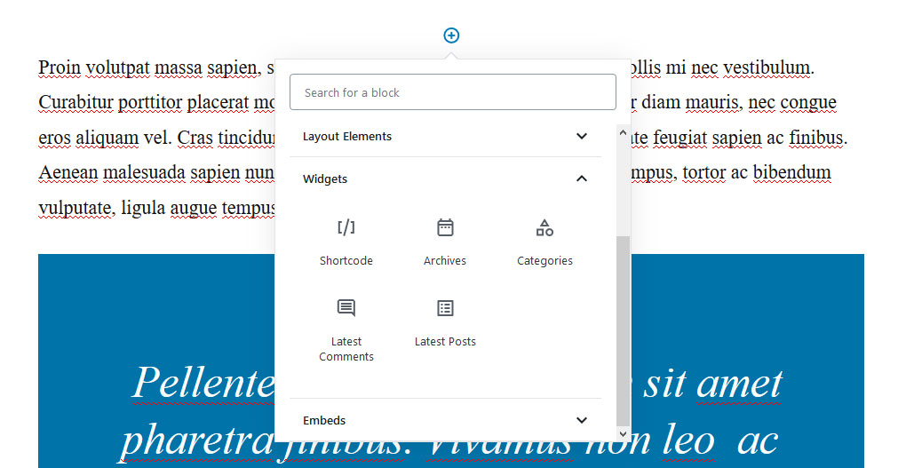
While you don’t find as many choices here as in the normal widgets menu, it might make up for the lack of other opportunities. Plus, you can extend this block with different plugins that are already on the market like Atomic Blocks or Advanced Gutenberg.
Twenty Nineteen Theme Review in Conclusion
Twenty Nineteen is the latest entry in the long line of WordPress default themes. It comes as a blank canvas for users to build upon as they wish with the help of the Gutenberg editor. Its clean, minimal design is the perfect vehicle for that.
Above, we have given you an introduction into what Twenty Nineteen is and how to get started using it. It comes with a few standout features, including:
- Clean, bold typography
- Social menu
- Back end styles that correspond to the front end look
- Large, full-screen featured images
- Featured image color overlay
Overall, it’s obvious that the theme is not aimed at one particular purpose as other entries in the series. We are looking forward to see what people will make of it.
What is your opinion on Twenty Nineteen? Have you given it a spin? Do you like what you see? Let us know in the comments section below.
The post Twenty Nineteen Theme Review – The New WordPress 5.0 Default Theme appeared first on Torque.
