The Google mobile first index is upon us and it will further change the way we optimize our sites.
Since mobile devices have surpassed desktop computers as the dominant Internet devices in 2016, the search giant has increasingly put emphasis on mobile friendliness. These days, if you don’t know how to make your WordPress website mobile friendly, you are likely already missing out on traffic.
This development will increase further with Google’s latest update, the mobile-first index. As you can glean from the name, it will prioritize mobile pages in the search index even more. If you are not prepared for things to come, your rankings might take a hit.
To help you get ready, in this article we will examine the Google mobile first index more deeply. We will have a look at what the mobile first indexing is and what it means for you. After that, we will give you actionable tips on how to prepare your WordPress website for the change.
Ready to hear more? Then just keep reading.
What is Mobile First Indexing?
To get ready for the mobile first index, you first need to understand what it is.
A Long Time in the Making
Google first announced their plans for mobile first indexing in 2016. Back then the official party line was that they would roll it out slowly and after a period of thorough testing. That period has now ended. Since March of this year, Google has officially started implementing their new mobile-first index.
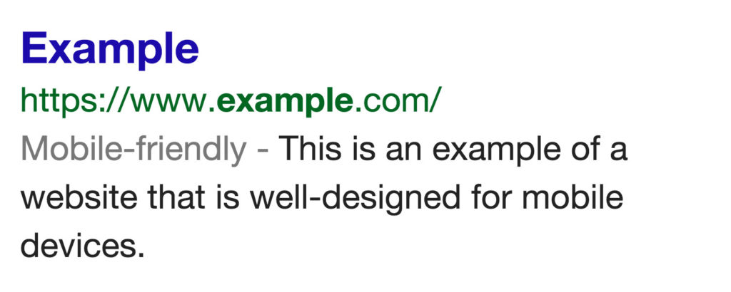
This isn’t a huge surprise. When mobile devices started getting more important, the search results increasingly skewed towards websites that could cater to phones and tablets. You could first see this in the mobile-friendly tags in Google search results.

Back then, having a mobile version of your site (or a site that adapts to smaller screens) was a reason to boost the ranking of your (primarily desktop) site. Later, however, the search engine started actively punishing websites in their search results that didn’t offer a proper mobile experience.
All of this is nothing new. We have collectively been talking about it around the digital water cooler for years.
Fast Forward to Today
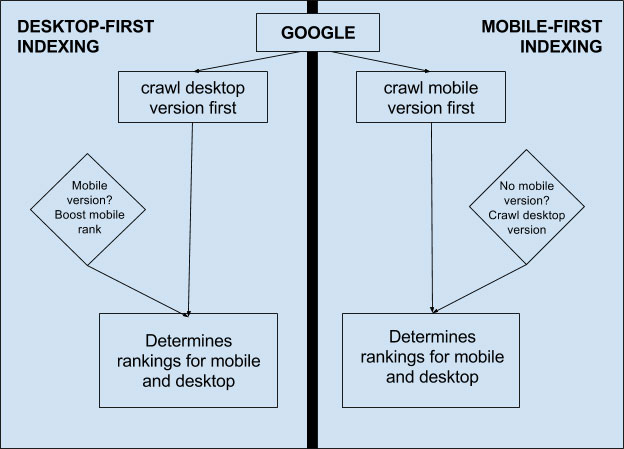
The mobile-first index takes this familiar concept a bit further. Basically, it means that Google will start prioritizing the mobile version of pages over everything else. Or in their own words:
To recap, our crawling, indexing, and ranking systems have typically used the desktop version of a page’s content, which may cause issues for mobile searchers when that version is vastly different from the mobile version. Mobile-first indexing means that we’ll use the mobile version of the page for indexing and ranking, to better help our – primarily mobile – users find what they’re looking for.
So, in the past, the desktop version was the standard Google would judge your site by. In the future, the search engine will evaluate your website by the mobile experience first. For the entire site, not just the mobile version.

That does not mean that the search engine will have two separate indexes or a “mobile-only” index. They simply continue their quest to deliver users the best information and results regardless of the device they are on. Since users prefer their mobile gadgets, so does Google.
What Does the Google Mobile First Index Mean for You?
So, you might be rightly wondering how those changes will affect you and your website. That mostly depends on how well prepared you already are.
If you have been paying attention to Google’s changes throughout the past years, you should be in a good position. However, the less optimized your site is for mobile, the less well you will be treated in the SERPs after the update takes hold. That means:
- If you only have a desktop version of your site, it will still be indexed. However, Google will look at it through the eyes of mobile users and thus probably won’t like what it sees. For that reason, you should prepare to see a decline in your search ranking.
- With separates sites for desktop and mobile, the latter will take precedence. Here, your main task will be making sure its quality is just as good (if not better) than the desktop counterpart. Otherwise, you may also see negative consequences.
- In the best case scenario, you are already equipped with a responsive website. In that instance, you should be relatively safe. However, there may still be room for improvement. More on that below.
In short, as a WordPress user with a modern theme (that includes responsive capabilities), you should be mostly fine. If that is not the case, it’s high time you read our primer on responsiveness and how to make any WordPress theme responsive.
While the new index is not rolling out universally (yet), Google has announced that they have begun moving sites over in batches. If you have Google Search Console connected to your site, it will also tell you once your site has been included in the mobile-first index. When that time comes, you better be prepared.
Google Mobile First Indexing – How to Prepare
If you feel horribly underprepared for the upcoming changes, don’t worry. What follows is an emergency protocol to get your WordPress site in ship shape for the Google mobile first index. See what applies to you and your site and make sure to implement it ASAP.
Invest in Mobile Friendliness
We have already alluded to our detailed article on how to make WordPress mobile friendly. We recommend you check it and follow its advice. Here are the broad strokes:
- Have a mobile version of your site in place, either via responsive design or a plugin. Hint: the first option is highly recommended!
- Check your plugins for mobile compatibility
- Optimize images to display correctly and load fast on mobile
- Focus on making your site as fast as possible
- Avoid full-screen popups on your mobile site, use alternative methods to collect email subscribers
- Test your site for mobile compatibility
With the above tips (more details in the article) you will satisfy most requirements of Google’s mobile-first index. However, there are additional steps you can take.
Don’t Just be Mobile Friendly, Be Mobile Optimized
Giving a truly optimized experience to mobile users goes beyond the technical aspects. You can implement all of the above and still not provide a great mobile user experience.
In order to properly cater to phone and tablet users, you need to examine your entire website through their eyes. That means in particular:
- Prioritize content — Mobile devices offer much less real estate for you to take advantage of. For that reason, you need to make absolutely sure you use it as well as possible. Look at all aspects of your content (text, video, images etc.) and decide what is necessary and what should be the focus of your site. Then make that happen.
- Ensure mobile usability — Mobile devices come with their own usability challenges, namely that you use them with fingers instead of a mouse. Therefore, it’s important to offer finger-friendly design and follow other important mobile design rules. Also, if you use sliders, make damn sure they are usable on mobile.
- Look into flat site architecture — Users behave differently on mobile than on desktop. The same site design might not be equally useful for both. Screens are smaller, people on the go and thus less inclined to click through several pages deep to find what they need.
- Optimize landing pages — Optimally, pages on your site should not just be scaled down versions of their desktop pendents but meticulously optimized for smaller devices. At the very least, look at the most important pages of your site with a mobile-first approach and see how you can simplify them and cater further to users on mobile devices.
In short, to be ready for Google’s mobile-first index always ask yourself how you can make your site more optimized for your mobile users. Look at everything they way they do and see how you can further address their needs.
Make Sure Your Structured Data Works on Mobile
We have already talked about Schema.org structured data and how to implement it on your site in detail. What we didn’t stress in that post is that structured data also matters for mobile. Just like for the desktop version, it helps Google figure out your content and deliver additional information to searchers.
To make sure your rich snippets can be read properly by mobile devices, check with Google Search Console. Under Search Appearance > Structured Data you find all the information you need.
Pay attention that your structured data is crawlable without errors. If there are any problems, Search Console will also tell you how to solve them.
Make Speed a Priority
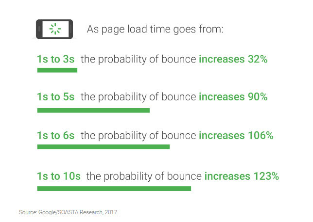
We have already mentioned speed as an important element further above. However, it bears repeating as page loading time is especially important for the user experience on mobile devices.

Website speed influences everything from bounce rates to the likelihood of people returning to your site (hint: it does not increase it). It’s also part of Google’s ranking algorithm. With their increasing focus on mobile devices, its weight might even swell.
Lucky for you, we have several articles on this topic:
- 13 Performance-Boosting Site Speed Tips for WordPress
- 10 Easy Ways to Speed Up Your WordPress Website [Case Study]
- How to Reduce HTTP Requests in WordPress (Make Your Website Faster!)
- 9 Advanced Techniques to Make WordPress Faster
- How To Easily Enable Gzip Compression For WordPress
In addition to that, you can use the following tools to gain insight on how to speed up your site:
Besides that, your browser developer tools also come with tools for evaluating site performance.
AMP Up Your Site
One of the ways to deliver your content to visitors faster is to implement Accelerated Mobile Pages (AMP). This technology provides stripped down versions of your web pages that load blazingly fast.
WordPress has an official plugin to implement AMP on your site. In addition to that, you also find several articles on this topic here on Torque:
- Making The Most Of AMP For WordPress
- What You Need To Know About AMP And Instant Articles
- Why Your eCommerce Store Needs AMPs ASAP
In Short, It’s Time to Go Mobile First
Google’s mobile-first index is coming. There’s no way around it. In the future, your mobile site will no longer be an addendum to your “normal” site but your primary web presence. It’s crucial that you prepare for that or pay the price.
Above we have talked about how to make that happen. At this point, you need to double down on the mobile optimization of your WordPress site. Realize that by now mobile visitors are your standard users and you need to think of their needs first.
If you keep that in mind, you should be fine. While mobile first indexing won’t happen tomorrow, you’d best get on it now and gain an edge while you can. Otherwise, you will have a bad awakening in the near future.
How do you plan to prepare your WordPress site for the Google mobile first index? Let us know in the comments section below!
The post The Google Mobile First Index and What It Means for Your WordPress Site appeared first on Torque.
