Landing pages are an all but necessary part of marketing campaigns. Yet, crafting one that actually gets you conversions isn’t easy. There’s a lot that goes into a successful landing page, from the images you include to the copy you write to even the text you use in your call to action. Every little element can make the difference.
Understand what makes a landing page work, and you can seriously increase your conversions and earn new users. In this guide, we’ll tell you the crucial elements of landing pages, show you how to build one, and help you optimize it for success.
What is a Landing Page and Why Do You Need One?
In a marketing campaign, a landing page is where users arrive after clicking a link in an email, social media post, or advertisement. Though technically anywhere you link to could be called landing page, most are specialized, standalone pages focused on turning that click into a conversion.
They do this by centering the design around a call to action, a form, or any other action you want a user to take. Landing pages do a much better job at retaining visitors and making conversions than simply linking to the homepage. That’s why they are an essential marketing tool.
Most pages on your site – especially the homepage – are distracting, filled with links and things to click on and pages to explore. A proper landing page is designed around a single goal, free of anything that could move users away from it.
They can also reinforce the message of your initial advertisement. If visitors click a link and are taken directly to where they wanted to go, you’re very likely to get a purchase or a sign-up out of them. But if they have to dig around searching for your offer, it’s sure to be a frustrating experience and likely a lost conversion.
Landing Page Best Practices
While there are many different types of landing pages, the goal is always the same: to get conversions. With that in mind, it’s possible to nail down what elements make them successful. Follow these design guidelines and best practices, and you’re sure to see your conversion rates shoot up.
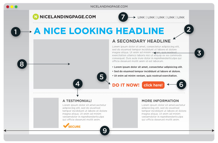
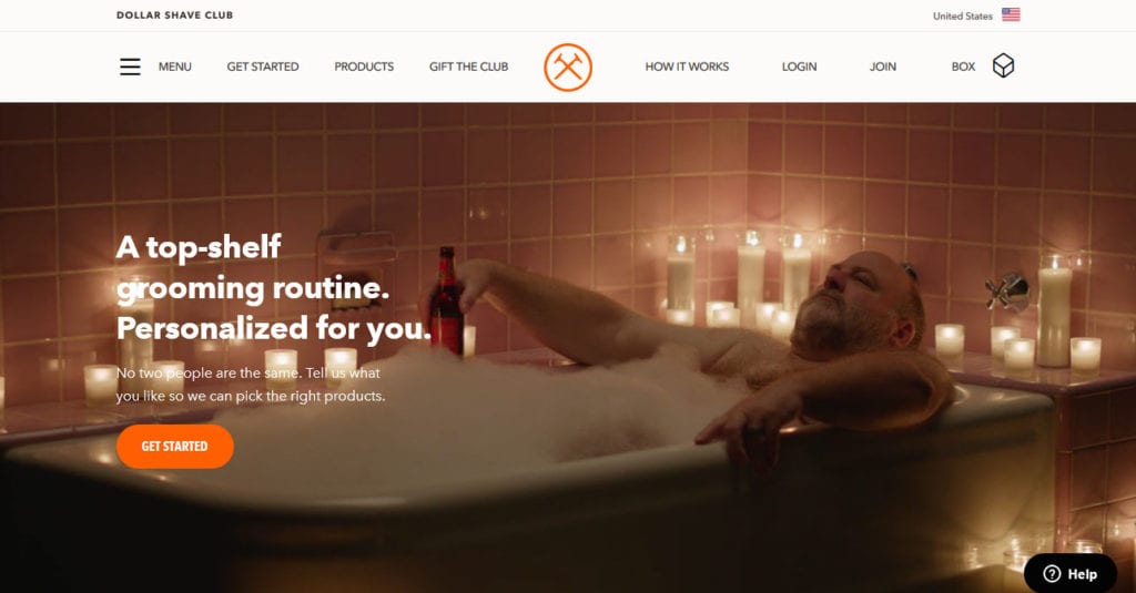
Eye-Catching Images and Design
First impressions are 94% design-related. You’re going to need a compelling offer to secure those conversions. However, a badly-designed landing page will turn people off before you can even get that far.
Use visuals to introduce your pitch and break up long periods of text. Everyone’s eyes will instantly snap to the hero image, video, or animation you’ve placed at the top. Therefore, make sure it’s high quality, on-brand, and supports your conversion goal.
Once they’ve clicked that link, they’re at least interested in your offer. Keep them considering it by making the design clean, breathable, and non-overwhelming. Keep the focus on that single call to action.
To achieve that, it’s also best practice to remove all navigation and unnecessary links to prevent distraction. It might be tempting to leave these in, but chances are, you’re just funneling people away from your ultimate goal.
Usually, your landing page should be short and sweet. Keep scrolling to a minimum, and put everything important above the fold. Generally, you don’t need a long page unless you’re asking for a significant investment from your users and need to prove that you’re worth it.
For more input, check out our research-backed web design tips.
Headlines and Copy That Convert
Images and design may be important, but they’re worth nothing without great copy backing it up. It’s time to get your ad writing on and pitch your offer in an exciting, compelling way.
A headline, a few paragraphs of copy, and a call to action (more on that below) are what you’ll need to create a succinct and effective landing page.
Your headline needs to pack a punch in just a few words. It should instantly give people a reason to keep reading, with the paragraphs right below supporting your opening statement. Like the page itself, keep text brief and to the point, but powerful and packed with useful information.
For copy, identify your unique selling proposition, the combination of what you have to offer and what your customers want, then focus your landing page entirely around capturing that ideal. What really makes you different from the competition? Figure that out, and you’ll win over everyone.
One last tip: ensure that your landing page matches the user’s expectations. If you sent out an email advertising your new product launch and offering a freebie to anyone who pre-orders, the headline, images, and copy should reinforce that message.
Don’t funnel everyone into a single landing page that doesn’t match the link they clicked. Break it up based on the link source and the conversion goal.
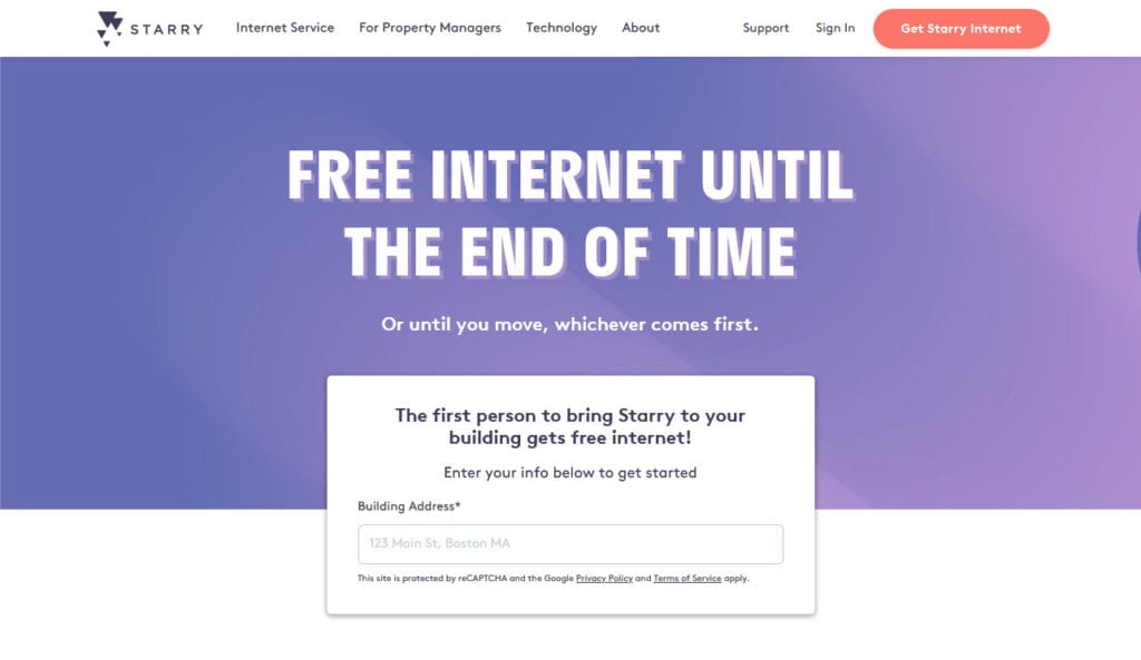
A Compelling Call to Action
And here we have what really makes a landing page: the call to action. The CTA is a button or link that prompts users to do something, like “learn more” or “buy now”. A click on your CTA means you’ve successfully made a conversion.
If you take away one piece of advice from this article, it should be this: make your call to action stand out. It should be the highlight of your landing page, what it’s primarily designed around.
Use the page’s design to your advantage. Most CTAs exist as a button for a reason: you can color it. Use contrasting colors to draw eyes directly to it. For instance, if your page has a dark theme, make the button white. If your brand has green colors, try red. Users should directly understand what is the central element of the landing page.
Also, make use of white space. The CTA shouldn’t be smashed in among other elements; give it space and eyes will naturally fall right on it. It should also exist above the fold, so you can see it immediately without scrolling.
The wording of your CTA is important too. Too many people create a button that just says something generic like “Click here.” Instead, use active, exciting, action-oriented language like “Get it for free” or “Shop new items.” Even something simple like “Join” will do.
Lastly, while you can include multiple buttons, don’t use more than one conversion on the same landing page. Keep it focused on a single goal. If you want people to subscribe to your newsletter, follow you on social media, and shop for new products, create three landing pages, not one.
For more detailed tips on calls to action, check our dedicated article on the topic.
Mobile Responsiveness
Mobile devices now account for over half of all online traffic. Since landing pages are just a single, usually short-term page on your site, many neglect to design for mobile too. But that can be a huge mistake.
Responsive landing pages get more conversions. Whether you’re creating your landing page all by yourself or using a page builder, responsiveness should be the first thing on your mind.
Don’t lose out on conversions because of simple design oversight, and look for responsive templates to build on. If you are not sure how to make a page mobile-friendly, this post has answers for you.
Other Important Elements of Landing Pages
The above sections list the most key aspects of a landing page. Yet, there are several other elements you’ll want to know about too. Not every page will make use of these but it’s good to understand them nonetheless.
- A Form — The most common type of landing page to use forms is squeeze pages, where you’re usually looking for a newsletter sign-up. The form submission button is your CTA in this case, so keep it above the fold. Also, include a lead magnet like a free ebook or other goodie – it can earn you a lot more conversions.
- Feature Lists and Bullet Lists — Variable formatting breaks up your page and catches the attention of skimmers who aren’t interested in reading long paragraphs. Plus, a feature list is just a good way to advertise your product and convince people to click that CTA. Read our post on content formatting for more info.
- Social Proof and Testimonials — Users trust other users, as well as the opinion of authorities in the industry. If you have any glowing testimonials to share, do so! It can help to mention how many users you have if the number is impressive too. Just leave the social sharing buttons out – that’s too distracting and clutters the page.
- An FAQ — If you’re asking for a significant investment from users, include an FAQ addressing their potential concerns. A few drop-down sections that preemptively answer questions about how it works and why they should trust you can be convincing enough.
Testing Your Landing Page and Tracking Success
Even once you’ve carefully crafted your landing page, your work still isn’t finished. You might think you’ve built the perfect end to your conversion funnel, but only testing can tell you the truth. This essential feedback will also help you do small adjustments to increase your conversions even more.
- Set up analytics post-launch — Tools like Google Analytics let you create event trackers to see how many clicks your CTA gets, how long people spend on the page, and how far down they scroll. Choose a great email marketing platform that has event trackers of its own, and you’ll have a solid idea of how well your campaign is doing.
- Do user testing — Anonymized data isn’t always enough; user testing is the best way to get that crucial info on what’s working and what isn’t. (And you can do it before you even go live with your marketing campaign!) Try tools like Five Second Test, User Testing, or Convert.
- Try A/B testing — This lets you test out something different – a new CTA button color, a shorter page length, headings worded differently – and see which gets the most conversions.
The Best Landing Page Creation Tools
Now that you know how to create a landing page that converts, you’re going to need some tools to help you build and optimize it. There are many landing page creation tools that come with user testing, analytics, and A/B testing all in one hub. Here are a few:
- Unbounce — Unbounce is one of the leading landing page creators, and for good reason. Its drag-and-drop builder can be used by anyone, no design or development experience necessary. It also comes with A/B testing, popups, and hundreds of templates included. Also, try the free landing page analyzer.
- Instapage — Instapage is a suite of advertising tools that claims to increase conversions by up to 400%. The starter plan is a bit pricey, but you get a ton of helpful resources, including a feature-rich landing page builder.
- Landingi — Code-free landing page creation, automation, and lead management, all at very affordable pricing for small businesses. This is one definitely worth trying.
- VWO Landing Page Analyzer — Want to check how well your landing page is doing for free? This free test analyzes it and gives you suggestions on what you can do better.
- Leadpages — Made for small businesses, Leadpages offers affordable pricing and an effective, easy-to-use landing page builder.
- Launchrock — Launchrock is all about speed with its easy-to-use builder and helpful starter templates. It has a free plan too, and if you do want to try the premium version, pricing is simple and easy with a single plan.
- Mailchimp Landing Page Builder — Most builders don’t come cheap. Mailchimp has one of the few free solutions out there, and it integrates perfectly with your email marketing campaign.
- Wishpond — With landing pages, popups/forms, marketing automation, and A/B testing, Wishpond has everything you’ll need to launch a successful marketing campaign.
Landing Pages That Convert
Effective landing pages are the key to a successful marketing campaign. Too many companies just link to a homepage that’s just too distracting to productively make conversions.
You’re missing out on a huge chance to target your audience and capture more leads. Therefore, don’t skip out on the landing page. Follow these design tips and keep a close eye on the effectiveness of your campaign, and you’ll find success in your marketing endeavors.
Have you tried out creating a landing page before? How did it work for you – and after reading this, what do you think you can do to improve? Let us know in the comments!
The post Landing Pages – The Ultimate Guide (Best Practices, Examples) appeared first on Torque.
