In a nutshell, the Americans with Disabilities Act (ADA) compliance is mandatory for any reputable web designer. After all, if your clients suffer a lawsuit because they don’t meet ADA regulations, it’s your responsibility. When enough of your clients suffer, you may experience complaints and get a bad reputation that could cost you future income.
Fortunately, there is a simple solution to see your websites become ADA compliant within 48 hours. With a few tweaks, such as color contrasting, adding legible text, and additional navigability, you can ensure your designs are accessible. There are even companies that can help you get the job done.
In this article, we’ll go over why ADA compliance is a necessity. Then, we’ll discuss some non-negotiable accessibility concerns, and show you how you can implement accessible design. Let’s dive in!
What ADA Compliance Is (And Why It’s a Must)
Essentially, ADA compliance means that your website is accessible to everyone, including visitors with disabilities. This includes physical disabilities – both temporary and permanent – but also auditory, cognitive, and visual disabilities, too. After all, those who are color blind may struggle to see your text without the proper contrast.
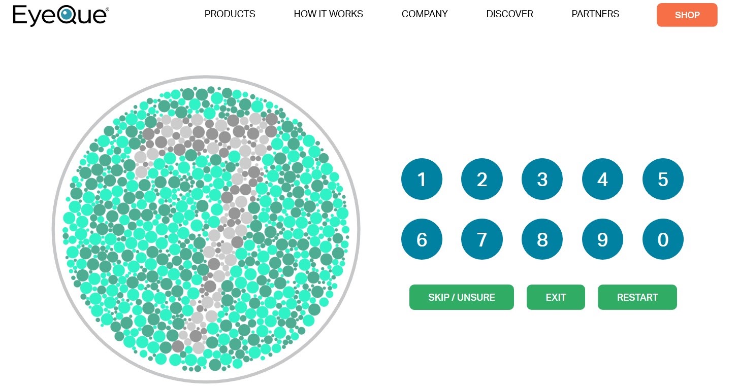
While some Content Management Systems (CMS), such as WordPress, have their own pushes towards accessibility, it can be a struggle to know where to start. Even using projects designed to help, like a11y, can leave you feeling confused.
Unfortunately, part of that confusion stems from a lack of clarity surrounding web accessibility and ADA compliance. One reason is that the ADA does not mention websites specifically. However, Title III of the ADA is often interpreted to extend to the web, as it concerns ‘public spaces.’
Thankfully, there are some standards you can apply to your website designs to keep you protected. They were made by the Web Content Accessibility Initiative of the World Wide Web Consortium (W3C) to make disabled lives easier.
These recommendations are called Web Content Accessibility Guidelines (WCAG) 2.1, and can make your designs accessible! Some of the recommendations are:
- Text alternatives for media and other sensory experiences
- Captions for video and audio content
- Non-restricted display orientation
- Color not being used to convey information
- Ability to pause or stop audio after three seconds of auto-play
If this sounds opaque, you’re not alone. Many web developers have struggled to navigate the waters of ADA compliance, and have been left feeling concerned about where they stand legally.
Some Common Concerns About ADA Compliance
The concerns you have are likely shared by others. The threat of lawsuits over ADA compliance are on the rise for web design agencies and the web development community at large.
In fact, they’re a primary cause for lawsuits against design agencies in particular. When an agency creates a website for their client, they expect the product to not only be great for their business but to adhere to ADA accessibility standards.
Even if you don’t get sued, you run the risk of getting bad reviews on search platforms such as TrustPilot, G2, or Capterra. These can negatively impact your business, and lead to lost revenue. Worse, you might find it difficult to attract recruits, as they may be scared to work with a company that has a bad reputation.
Unfortunately, there’s no easy fix. As the ADA standards are vague, it’s up to individual judges to decide what is and isn’t accessible. This means you must be prepared for anything and everything.
4 Accessibility Implementations Your Design Agency Should Make to Stop ADA Compliance Lawsuits
Accessibility work is time- and labor-intensive. It can be difficult to muddle through and can leave even experienced developers feeling lost in an endless sea of programming.
However, there are a few prominent areas you should begin with. Here are four important implementations that can help you avoid ADA compliance lawsuits.
1. Ensure Your Designs Can Be Easily Navigated
To be accessible, a website needs to be able to be navigated without the use of a mouse. Those with motor limitations or paralysis might not use one and may rely on the keyboard entirely.
As a means to make navigating easier, you could create anchor links to let users jump around your page easily. This prevents them from endlessly scrolling using other methods.
It’s also a good idea to keep menus accessible by not having any ‘mouseover’ content. Instead, let all menus be accessed easily through the keyboard alone.
Overall, you can help those who can’t use a mouse most by using proper page structure. This means enabling skip links, using header hierarchies, and coding accurate semantic HTML.
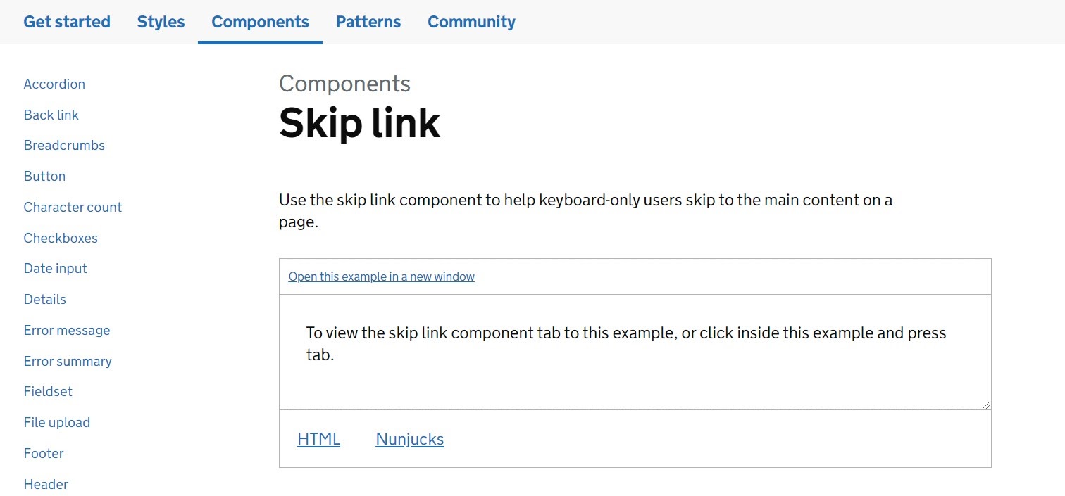
To test the functionality of your sites quickly, simply Tab through it as an impaired user would. You can also try Shift + Tab to go between links and buttons. Otherwise, you could use a Web Accessibility Evaluation Tool to test things automatically. Simply put in your URL, and let the tool analyze it.
2. Make Sure the Text and Font You Use Are Readable
Those with visual impairments will sometimes need a screen reader to properly understand your website designs. This impairment can be especially ‘spotlit’ if you don’t use a font that is both clear to see and scalable. After all, if someone has difficulty seeing, they’ll need letters to be easily discernible and to be able to resize text at will.
While you won’t always have control over the content provided on each web page, you can ensure that the fonts won’t provide hurdles to those with disabilities. With this in mind, it’s prudent to choose fonts that are legible, not just readable.
This means ditching fancy fonts that may look exquisite but are actually complicated. Instead, go for something simple, and try not to add more than three font types per page. Also, look to set your fonts to a size large enough to be easily distinguished by those with poor eyesight. By doing so, you’ll be making mobile navigation easier, too.
A quick and easy way to check how fonts look on the screen is to use a tool such as Type Scale:
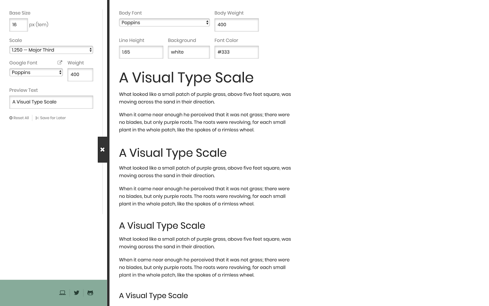
This offers a huge selection of Google Fonts and enables you to adjust sizes based on either a custom setting or a multitude of preset scale ratios. You can also grab permalinks for your settings to send to clients or other team members.
3. Be Conscious of How You Use Color
Color-blindness affects seven to ten percent of all men (and a small number of women,) and usually involves ‘red-green’ confusion. However, there are many kinds of color-blindness affecting a variety of people.
When it comes to web development, you may want to incorporate colors that offer plenty of contrast into your design. For example, if you’re using a white background, you might opt for a dark blue (or #112e51 on the color palette), muted red (#cd2026), black (#212121), or gray (#494440) for fonts.

Another way you can help those who have difficulty differentiating between hues is to not rely on colors as indication. For example, links can be underlined, and required form fields could be indicated with an asterisk.
Overall, try to create an adequate contrast between the foreground and background. Doing so can ensure that your website is easy to see, and text is effortless to read.
4. Test Your Websites Thoroughly to Ensure Compliance
No website design is truly finished until it has been thoroughly tested for ADA compliance. While this may be a lengthy process, it’s one that can benefit you, your clients, and all who rely on accessible features.
First, you may want to test your website to see how screen readers handle it. A screen reader will typically read your HTML and HTML5, but adding Accessible Rich Internet Applications (ARIA) to describe how your website is laid out can smooth the process.
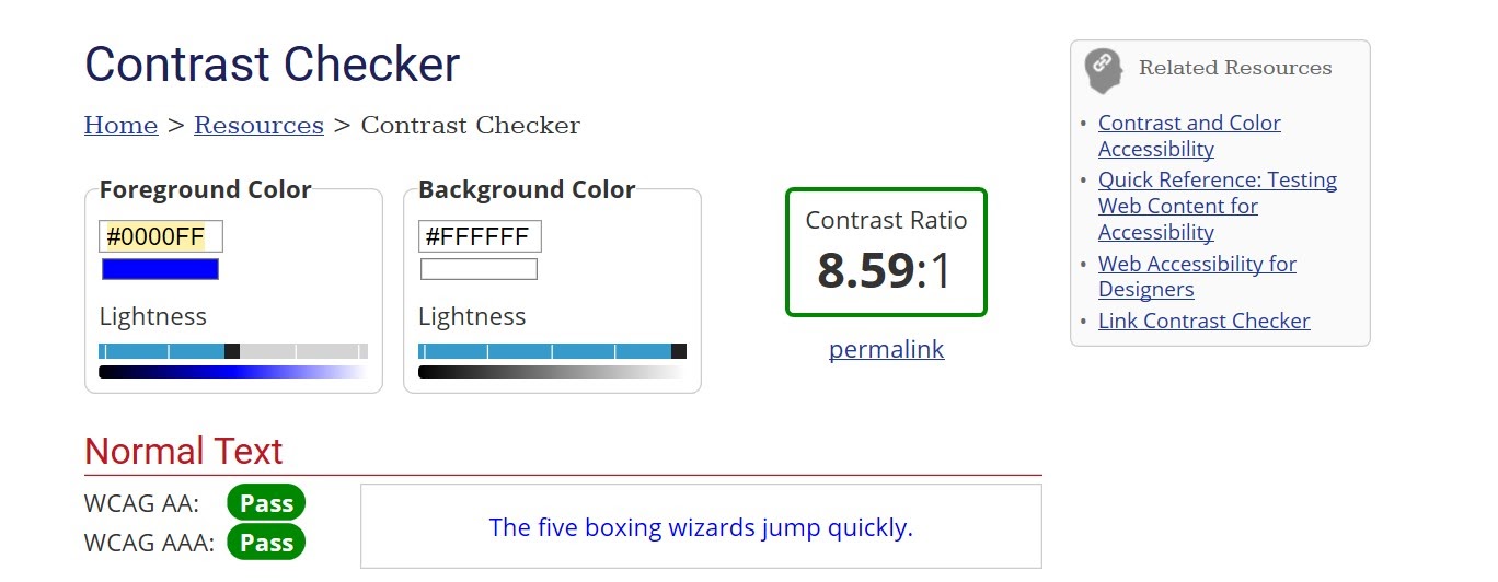
Next, you might use a tester for color contrast to determine if you meet all ADA standards. Simply add specific hues to the tester’s foreground and background colors, and it will tell you how acceptable your contrast is.
However, you can take the hassle out of the entire accessibility process by employing a leading Software as a Service (SaaS) solution, such as accessiBe. It’s an AI-powered platform that will scan, analyze, and transform every page of your website to meet accessibility standards.
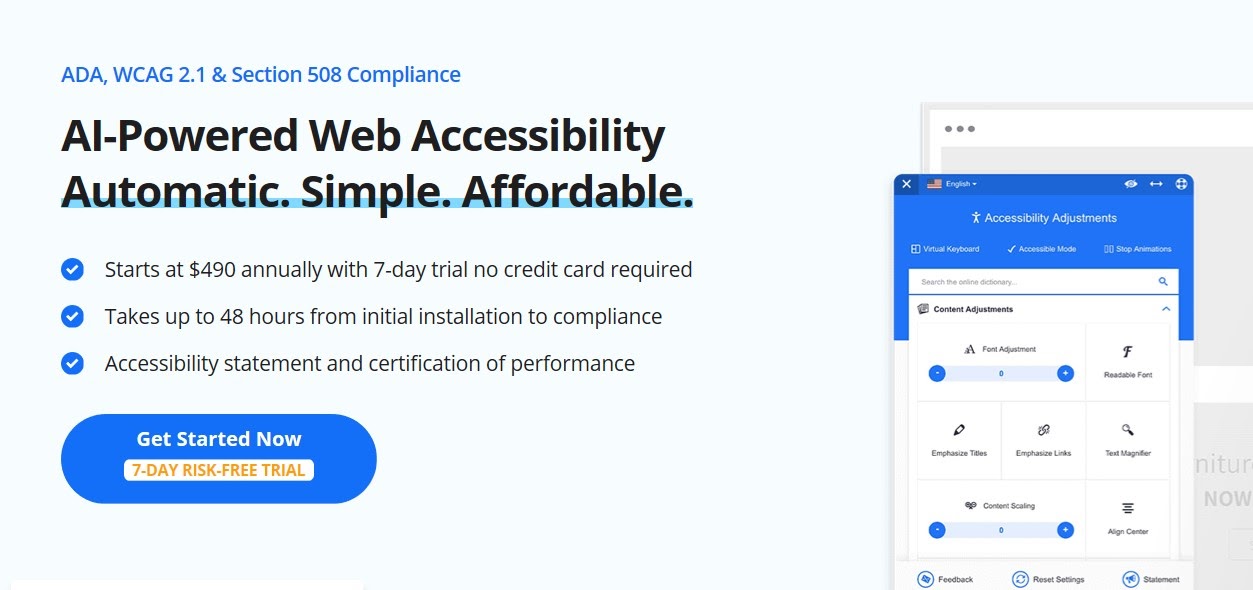
The software will go through every page on your website, analyze them, and then implement any changes you need to be up-to-date with accessibility standards. That means it will adhere to Accessible Rich Internet Applications (ARIA) attributes, and adjust your site as needed.
These changes that the AI will make include adding descriptions for actionable icons, providing accurate labels, making font and color adjustments, and placing alt-text where it needs to be. Best of all, accessiBe’s AI will allow users to make the changes they specifically need, rather than creating a single, monolithic accessible website.
Furthermore, accessiBe software will use its AI to scan your entire website to optimize for both screen-readers and keyboard navigation. While that may sound like an intensive process, they’ll carry out all of this work within 48 hours.
They offer different plans, depending on your needs. If you need less than 1,000 pages scanned, you could choose their Pro option, which costs $490 annually. However, there are also plans that cover unlimited web pages, starting from $990 a month.
Conclusion
Ensuring that the websites you design are accessible may seem like a long process, yet it’s entirely necessary. Not only will you protect yourself and your clients from avoidable lawsuits, but you’ll also protect your reputation.
There are many steps involved to making your websites ADA compliant. Let’s recap four of the ways you can do so:
- Ensure that each website is navigable without a mouse.
- Choose legible texts with larger sizes.
- Use color wisely by picking hues that have plenty of contrast.
- Test all websites after you’ve implemented changes to gauge your success.
Do you have any questions about how your design agency can protect itself against ADA compliance lawsuits? Ask away in the comments section below!
The post 4 Accessibility Implementations Your Design Agency Should Make to Stop ADA Compliance Lawsuits appeared first on Torque.
