When it comes to online marketing, landing pages are a great way to drive your campaign goals. However, creating a successful landing page is different than other types of pages and posts on your site.
A powerful landing page is one that is carefully crafted with a few select (yet essential) elements. Whether you’re building one to generate leads, boost sales, or promote a product, there are certain features and techniques you can use to maximize their effectiveness.
In this post, we’ll discuss some of the important elements of landing pages. Then we’ll walk you through the process of creating one in five simple steps. Let’s get started!
The Important Elements Every Landing Page Should Include
Regardless of the type of campaign you’re building the page for, there are a handful of elements that should be included in the design of your landing page. The most important elements include:
- A catchy headline to grab the visitors’ attention.
- Clear, concise copy to help persuade the reader.
- High-quality images to break up the page.
- A Call To Action (CTA) that stands out.
Nauto provides a good example of a landing page that effectively combines the above elements:

The purpose of a landing page is to inspire and drive action from the visitor. Therefore, it’s important to make sure that each element on the page serves a specific function to help further the mission.
How to Create a Strong Landing Page With WordPress (In 5 Steps)
Now we’ve covered some of the essential elements of a landing page, it’s time to put them to use. Let’s take a look at how you can create a strong landing page with WordPress in five steps.
Step 1: Create Your Landing Page Template (Manually or via Plugin)
Of course, there are workable methods for creating a landing page template. If you’re comfortable working with CSS, you can create your blank page template within an existing WordPress theme.
You can do this by creating a child theme, then adding in new style.css and functions.php files. Next, you can create a custom page template, saved as page-landing.php.
However, if you don’t want to worry about coding, you can use a plugin such as Landing Page Builder (although many options exist). Plugins such as this can make the process of designing your page quicker and easier.
Once you install and activate the plugin, go to LandingPages by PluginOps > Add New Page within WordPress, and launch the editing panel. Next, click on Templates:
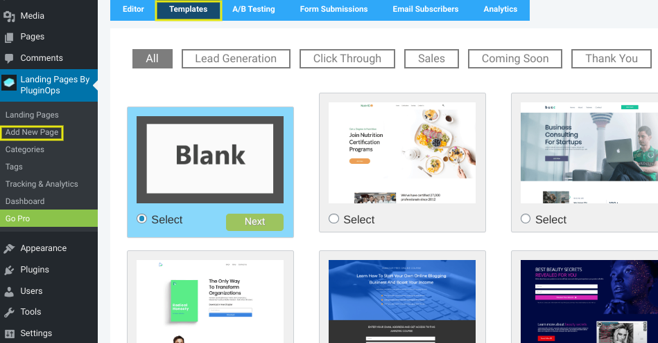
You can choose a template based on the type of campaign you’re building it for. If you want to work with a clean canvas, we recommend the ‘Blank’ option.
You’ll find similar processes for all popular page builders, and some will even include landing page templates to help get you up and running quickly.
Step 2: Customize Your Layout and Eliminate Unnecessary Elements
As we noted, landing pages should only include the most necessary elements. Even leaving in the default page title and sidebars included with WordPress pages and posts can be a distraction.
There are plenty of different methods you can use to remove the page title in WordPress. For example, two options are to leave it blank or to modify your CSS. A simple display: none; property and value gets the job done in a pinch.
Depending on the theme you’re using, you may also want to change the page layout to full width to eliminate unnecessary sidebar elements or padding:
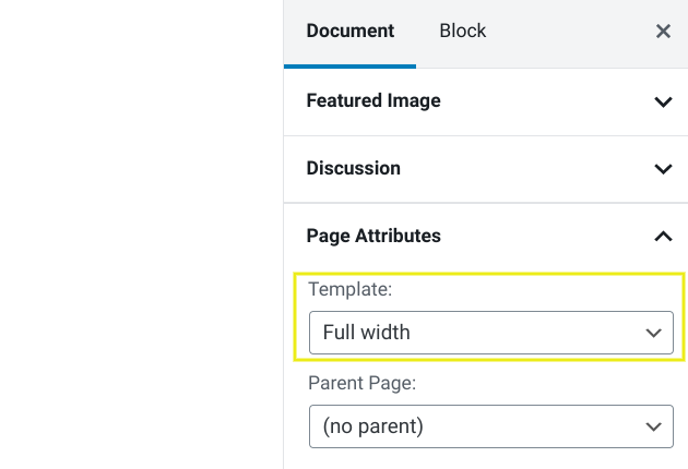
Some pre-set templates from plugins (such as the blank template from the Landing Page Builder plugin) will sort this for you. You’ll usually be presented with a blank canvas for you to create your own layout:

However, you’ll want to be sure to delete any unnecessary links, buttons, and other elements before continuing. This could give you more work than if you started from scratch, so it’s worth bearing in mind when you make your initial decision on which approach to take.
Step 3: Write Clean, Concise Copy Using Action-Based Language
Landing page copy should be straightforward, clear, and specific. This includes a brief, attention-grabbing headline that quickly explains the offer.
For the page copy, focus on the benefits of the promotion. Think small, digestible paragraphs and bullet lists that make for easy scanning. It’s also a good idea to incorporate action-based language, such as ‘download your e-book now’ or ‘start your free trial today’.
If you’re using the WordPress editor, you can insert and format your copy as you would any other page. Page builders usually let you insert your own using the design blocks:
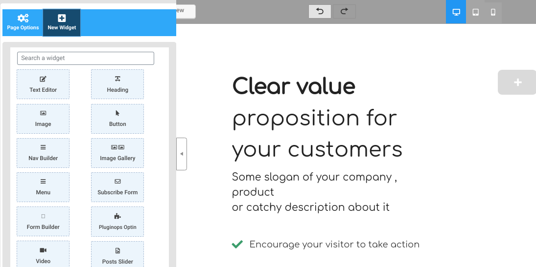
With the advent of the Block Editor, the boundaries are becoming blurred. Both this and page builder plugins include modules for inserting body copy, headlines, lists, icons, and much more.
Step 4: Add Images or a Video That Accurately Depicts Your Offer
Using high-quality images and videos can make your landing page more engaging and scannable. As a general rule of thumb, aim to use media that is representative of your offer. It’s also best to use unique, creative images rather than generic, stock photography.
Again, if you’re using the WordPress editor, you can insert media via the content blocks:
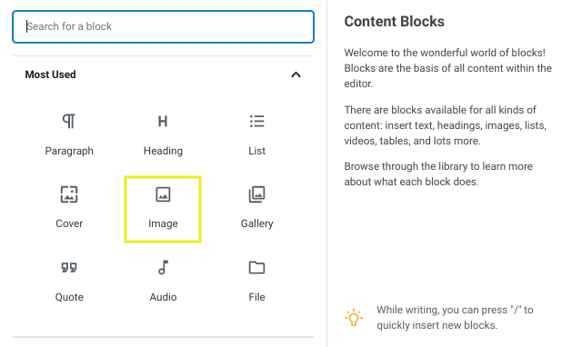
If you’re using a page builder plugin, there’s usually a similar offering, and you may find more power under the hood. For example, you could add a background image and overlay the landing page text:
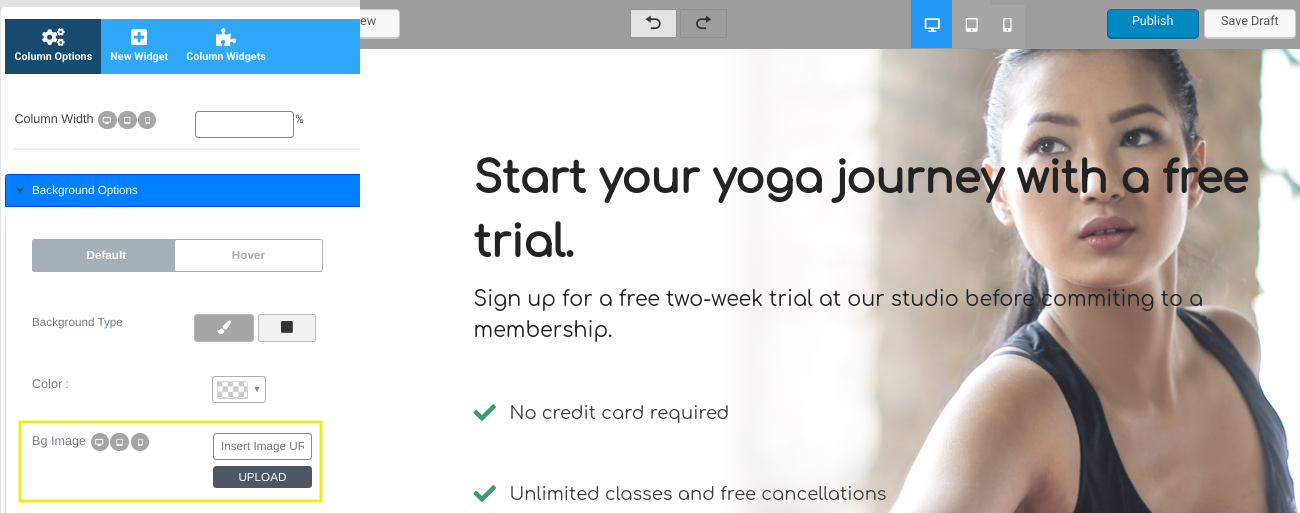
When choosing where to place your images, it’s important to consider your CTA and lead forms. Let’s look at this now.
Step 5: Strategically Place Your Lead Form and One Call To Action
Landing pages are usually purpose-driven, making the CTA arguably the most important element on the page. Whether it’s a download button, a sign-up form, or something else, the CTA should stand out on the page to capture the visitor’s attention.
Best practice is to keep it ‘above the fold’ – in other words, so that it’s visible without scrolling. This way it’s immediately visible and accessible, and also becomes the focal point of your landing page.
When creating and styling your CTA button, consider using a contrasting color that stands out against the rest of the page. We also recommend using clear language so your visitors know exactly what they need to do.
It’s worth taking some time to work on your CTA formatting and style, as it’s such an important part of your landing page:
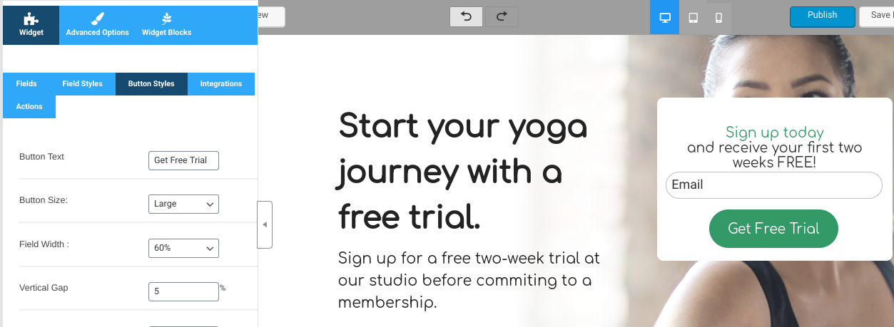
It’s a good idea to work closely with your client (if that’s the working relationship dynamic,) given your CTA’s importance and value to the success of your promotion.
Conclusion
Landing pages are an effective way to generate leads and drive conversions. However, if you want them to be the most effective, there are certain ‘must-have’ elements to include during the design and creation process.
In this post, we explained how you can create a strong landing page with WordPress in five simple steps:
- Create your landing page template (manually or via a plugin).
- Customize your layout and eliminate unnecessary elements.
- Write clean, concise copy using action-based language.
- Add images or video that accurately depicts your offer.
- Strategically place your lead form and one CTA.
Do you have any questions about creating a landing page with WordPress? Let us know in the comments section below!
The post How to Create a Strong Landing Page With WordPress (In 5 Steps) appeared first on Torque.
