As web design has progressed, there have been different standard ways to arrange elements on a website. CSS flexbox is a relatively new yet powerful way to create layouts and something every web developer and designer should be familiar with.
If you don’t know how to use it yet, this in-depth flexbox tutorial aims to change that. The post below will talk about what flexbox is, why it matters, and its underlying concept. After that, we will go over the CSS properties and values associated with flexbox in detail and finish up with an example of a use case.
Alright, we have a lot to cover and it’s going to be a bit technical, so put your CSS goggles on and let’s get going.
What is CSS Flexbox?
Flexbox stands for flexible box. It’s a layout module for CSS aimed at giving you an efficient way to arrange, organize, and size website elements to create highly adaptive designs.
Of course, the technology to place web components on a page is not new. Since the beginning of the Internet, web designers have used different ways to place images, text, and other content where they wanted it to be. However, these were either not suitable for responsive design (tables), were never intended for as a layout tool in the first place (float), didn’t allow you to define equal heights for elements (inline-block), or had other issues.
So, while designers and developers made do for a long time, there were still a bunch of design patterns that were either impossible or needed JavaScript to work. Common examples are vertical centering and equal columns, two of the holy grails of web design.
How is Flexbox Different?
The way flexbox works is quite simple on the surface: You have a container (flex container) with children (any elements contained within, called flex items), which are placed along flex lines.
Lines and items can be manipulated in layout, size, spacing, and more along both the vertical and horizontal axis using a multitude of operators. This allows you to best take advantage of the available space and lets elements arrange themselves automatically according to it.
If that is hard to visualize, here’s a schematic (courtesy of W3.org) to make things clearer:
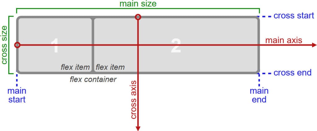
Still not entirely sure? I can’t blame you. Let’s talk about it in more detail.
The Underlying Concept
As mentioned, flexbox is a whole CSS module, not a single property. Therefore, it comes with a whole lot of its own operators, some for the parent container, some for its children.
To understand how they work, it’s important that you know the concepts and terminology of flexbox, which are displayed in the image above:
main axis— This is the axis at which the items are laid out. Important: it can be both vertical or horizontal, depending on theflex-directionproperty.main-start,main-end— These represent the start and end point of where items are arranged.main size— This denotes either the width or height of the flex items, depending on the direction of the main axis.cross axis— The axis perpendicular to the main axis. Its direction, too, depends on how the main axis is defined.cross-start,cross-end— Start of and direction in which flex lines will be filled.cross size— Denotes the other dimension of flex items that is not defined bymain size.writing-mode— Allows you to switch the direction of writing from left-to-right to right-to-left or even to vertical. It’s a work in progress with little to no browser support, however, it’s important to know for some of the properties further below.
As you can see, a lot about flexbox is rather abstract and not absolutely defined. Consequently, much of the CSS below is dependent on your setup.
When to Use Flexbox
While you can use flexbox to build entire web pages, however, that’s not the recommended use case. For larger layouts, consider Grid (more on that some other time). Flexbox, on the other hand, is most appropriate for small-scale layouts and applications, such as:
- navigation menus
- card layouts
- media items
- web forms
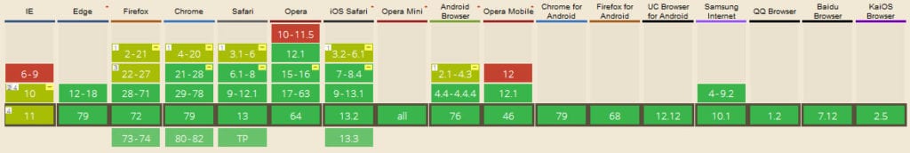
Browser Support
Flexbox was first proposed at the beginning of the past decade and recommended by the W3C for adoption in 2012. Since then, browsers have started supporting it and, by now, all modern browsers are able to deal with flexbox.
Available Flexbox CSS Properties
Alright, now that we have settled the theory, let’s see what flexbox can do. With the properties below, you can manipulate your layout both by assigning traits to the container and also to items individually. We will start with the former and then move on to the latter.
flex-direction
This defines the main axis and, as a consequence, the direction in which your flex items are placed. This also allows you to change the order of items, which used to require altering the underlying HTML.
Available properties are:
row— The default. Arranges flex items left to right unless you are in a right-to-left environment due towriting mode.row-reverse— Arranges items horizontally but in reversed order.column— The same asrowbut vertical with items arranged top to bottom.column-reverse— You can probably guess this one.column-reversedisplays items bottom to top.

flex-wrap
The default behavior of items within a flex container is to arrange themselves in one row. flex-wrap allows you to change that.
nowrap— The default value that places all items in one line.wrap— If a single line isn’t enough, with this, items will arrange themselves into multiple lines from top to bottom.wrap-reverse— Same aswrapbut with items ordered from bottom to top.

flex-flow
This is a shorthand for flex-direction and flex-wrap. Usage:
.flex-container {
  display: flex;
  flex-flow: row wrap;
}
The flex-flow property allows you to define both main axes of the container. The default value is row nowrap, all possible values from the two properties above apply.
justify-content
The next flexbox CSS property defines the item alignment on the main axis. It decides what happens with any available free space and has some control over the alignment when items get wider than their container. Here are the values you can choose from:
flex-start— Default value. Items align towards the front offlex-direction.flex-end— Places items at the end offlex-direction.start— Defines the beginning ofwriting-modeas the starting point.end— Moves items towards the end ofwriting-mode.left— Aligns flex items towards the left edge of the container. If that doesn’t make sense due toflex-direction, it behaves likestart.right— The same asleftbut for the right edge.center— Items center horizontally.space-between— Distributes items evenly within the container. The first towards the start, the last toward its end with even space between them (hence the name).space-around— Items are evenly placed with equal space around them. Note that it behaves likemarginorpaddingwhere you have double the space between items as towards the edges.space-evenly— Items reside evenly placed within the container but the spacing between each and toward the container edges is even.

Beware that browser support for these values is a bit spotty. For example, space-between is not supported in some versions of Edge and start/end/left/right aren’t in Chrome yet. The safest values are flex-start, flex-end, and center.
align-items
This property controls how items align across the cross axis. It’s the equivalent of what justify-content is for main axis. Here are the available values:
stretch— Default value that stretches items to fill the container.flex-start,start,self-start— Aligns flex items at the start of the cross axis.startandself-startadhere toflex-directionandwriting-moderespectively.flex-end,end,self-end— The same as above but placing items at the end of the cross axis.center— Items reside at the center of the cross axis.baseline— Aligns flex items along their baselines.

Here, too, it’s important to note the browser support.
align-content
This property is responsible for controlling flex lines if there is extra space available on the cross axis. It’s similar to justify-content. You need more than one row of items for the values below to take effect.
stretch— Default value. The lines stretch to take up all available space.flex-start,start— Items align at the beginning of the container.flex-startadheres toflex-direction,starttowriting-mode.flex-end,end— Same deal asflex-startandstartonly that items move to the end of the container.center— Centers items on the cross axis inside the container.space-between— Evenly distributes flex lines inside the container with the first row being placed at its start, the last at the end.space-around— Even distribution with even space around each line.space-evenly— Even distribution with equal space around items.

order
Beginning with this one, the remaining rules all apply to flex items instead of the container. The order property controls in which order items appear inside their container.

For example, the default value for all flex items is order: 0;. If you want to move a particular item to the front or back of the line, you can do so by giving it a value like 1 or -1. This also works across row or column boundaries unlike row-reverse or column-reverse which will reverse the order per line individually.
Here’s the code for the example image above:
	1
	2
	3
	4
flex-grow
Controls the ability for flex items to grow within the container as necessary. flex-grow takes a number that describes a proportion.
Example: if all items are set to flex-grow: 1; they are all evenly distributed inside their container. However, if one is set to 1 and another to 3, the latter will try to take up three quarters of the available space.

flex-shrink
Similar to flex-grow but defines the ability of items to shrink in relation to other items. The higher the number, the more an item will reduce in size and vice versa.
flex-basis

Defines the default element size (height or width depending on the axis). It can be a relative value like 15% or absolute like 30px. Here’s how I achieved the above:
	1
	2
	3
	4
Other possible values:
auto— This is the default.content— Sets the size according to the item’s content. It’s not well supported yet, same asmax-content,min-content, andfit-contentthat also exist.
flex
Shorthand for flex-grow, flex-shrink, and flex-basis together. Only the first parameter is mandatory and the default value is 0 1 auto.
	1
	2
	3
	4
It often makes sense to use this property instead of flex-grow, flex-shrink, or flex-basis individually as it applies sensible values to the operators you are not using.
flex can also take initial (adheres to the defined size if there is one), auto (making it fully flexible), and none (making all items inflexible). You can use this, for example, to set some items to a fixed width (via initial) while having others adjust themselves to the available space.
align-self
This allows you to override the alignment of individual items. It has the same values as align-items.
Flexbox Example: Columns with Equal Height
As a last step, we will go over an example of how to use the above. Let’s create a flexbox layout with columns of equal height. You can build it with HTML like so:
		Column 1
		Lorem ipsum dolor sit amet, consectetur adipiscing elit.


		Column 2
		Lorem ipsum dolor sit amet, consectetur adipiscing elit.
		Morbi interdum et ex a efficitur.
		Nam consequat elementum tellus,
		at varius lectus condimentum vulputate.


		Column 3
		Lorem ipsum dolor sit amet, consectetur adipiscing elit.
		Morbi interdum et ex a efficitur.
After that, add this CSS markup to it:
.flex-container {
	background-color: #aa278c;
	border-radius: 10px;
	display: flex;
	margin-bottom: 10px;
}

.flex-container > div {
	background-color: #F7941F;
	border: 1px solid;
	border-radius: 10px;
	flex: 1;
	font-size: 20px;
	font-family: tahoma;
	line-height: 40px;
	margin: 10px;
	padding: 16px;
	width: 60px;
}

.flex-container > div h2 {
	text-align:center;
}
And here is the result:

Why does this work? Well, the only important parts are actually that the flex container is set to display: flex;, while its children take on flex: 1;. All the other markup is just for styling.
As you may recall, doing this sets flex-grow and flex-shrink both to 1 and flex-basis to auto. As a consequence, all items take up the same amount of space inside the container and their initial size automatically adapts to the available dimensions. The result: effortless columns of equal height.
Flexbox in a Nutshell
In web design, there are many different ways to create layouts and arrange elements. Flexbox is one that has become more and more common. The CSS module offers a lot of benefits, especially for dynamic layouts, smaller page elements, and mobile design.
Above, we have gone over what exactly flexbox is, its abilities, and how to use it. Next time you find yourself wanting use float or inline-block, take a second to think whether or not flexbox might be the better solution.
Have you used CSS flexbox before? What do you like/dislike the most? Let us know in the comments section below!
The post A CSS Flexbox Tutorial for Beginners – What It is and How to Use It appeared first on Torque.
