Do you feel like your website just isn’t optimized, but you aren’t sure where to begin in fixing the problem? Do you think it would make a huge difference if you knew where your visitors are going, what they are trying to get to, and common areas where they get stuck?
Luckily, there is a way to find out. Not just to see what pages people land on, but what they’re doing once they get there. With heatmaps, all of this information is available to you. You can map out what part of your site is “hot” and where people are directing their attention.
Heatmaps were made to collect this data and display it as an easy-to-understand graphic. Ready to try it for yourself? We’ll explain what heatmaps are, how to use them, and the best places to get them.
Let’s get started.
What are Heatmaps?
Heatmaps are a type of data visualization tool, similar to charts and graphs. Whereas graphs help you measure two or more variables in an easy-to-understand way, heatmaps are a little more complex.
They record certain user actions, such as clicks, scroll length, or mouse hovering. They then display this data with an overlay that lights up the places that got the most attention. The “hotter” an area on your site according to a heatmap, the more users interact with that part of a page.
While you may be able to collect data like what links people click on with programs like Google Analytics, heatmaps provide a way to visually examine that data. You can then make adjustments based on what people are clicking, looking at, and hovering over.
But how exactly do they work? How are they able to collect data like that?
How Do They Work?
You might be wondering how heatmaps gather this data without tools like screen recorders or eye trackers.
Every program works differently, but many will need you to install them onto your site directly or with a tracking code. This gives them the ability to record what users are doing.
Depending on the type of heatmap, it will record different information. Most tools will be able to track the elements on your page, like images, buttons, and text blocks. In addition, they register user input like clicks, pauses, and hovers.
This data is then made into a report and output as a readable chart.
Types of Heatmaps
There are many ways to track and measure user interactions, but you’ll most likely run across four major types of heatmaps. These are click, hover, scroll, and attention heatmaps, and they all do very different things.
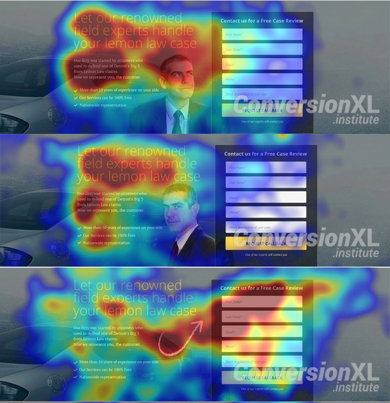
- Click maps — As the name implies, these track where users click on the screen. This mostly shows what links people are gravitating towards, and which are going unnoticed. However, it also tracks clicks on images and other parts of the screen. That means you can tell what other elements they except to link somewhere or when they get confused by the UI.
- Hover maps — Seek to emulate eye-tracking technology by showing where people most often rest their cursor, but it can be a bit hit or miss. People do tend to look where their cursor hovers, so it can be helpful, but the data isn’t perfectly accurate.
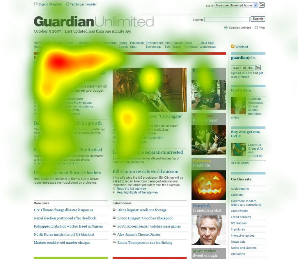
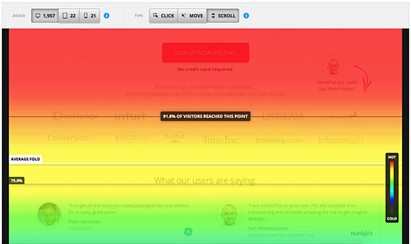
- Scroll maps — Record how far users scroll down a page before leaving. This is a huge aid since it helps you understand what content most users miss out on. If a majority of people never even reach your call to action, it’s time to move it up or redesign your page.
- Attention maps — These are kind of like scroll, click, and hover maps combined. They show what parts of a page got the most engagement, as well as the number of time users spent there. These are all about pointing out which areas are the most viewed.
Many heatmapping tools combine all of these into one. Of course, to make the most out of that data, it’s important that you know how to understand it.
How to Read Heatmaps
Heatmaps are arguably one of the easiest types of graphs to read once you know how. Most maps overlay splotches of color on a screenshot of your website.
The darkest areas, usually red, represent the spots that got the most clicks, hovers, or other engagement. Orange to yellow spots get less but still significant amounts of interaction, and green to blue areas get only a small amount. Spots with no color got little to no engagement at all.
Scroll maps work a little differently. Instead of small bubbles of red and orange, you’ll instead see entire blocks of color. This has the same idea: red areas are parts of the page almost everyone saw. You should see it drop off to yellow and green the further you scroll down, meaning fewer people saw that part of the page.
Look at it like it’s a fire, where the hottest areas saw the most attention, while cool-colored areas got the smallest amount of interaction.
What They Can’t Tell You
One thing to understand about heatmaps is that they’re all but useless before you have a large amount of data. Be careful about making huge changes before you have at least hundreds of click reports, and smaller sites should tread carefully.
In addition, heatmaps can only show you the results of a visit, not the cause of your visitors’ behavior. It’s up to you to figure out why someone clicked on or hovered over what they did, but that means you need to be wary before jumping to any conclusions.
When users decide to switch to keyboard control, repeatedly click on a button that’s broken and doesn’t do anything, ignore your homepage because they return frequently, or take any action with an intent you misunderstand, heatmaps can’t give you that information. They can only show where people interacted and where they didn’t.
You have to be careful, but they can still be a valuable source of data. Next, we’ll show you how to put these analytics to good use.
How to Use Heatmap Data to Make Improvements
Heatmaps aren’t for everyone and every situation. Like any other type of data visualization, they’re made for a specific set of needs. These include:
- You want to know more about your users’ behavior and how they’re engaging with your website.
- You’re not getting engagement and aren’t sure why or what users are doing instead.
- You need to better observe the effects of A/B testing.
- Your site just isn’t working and you need direction towards how to improve it.
First of All, Be Careful
There are times when you should consider not installing a heatmap. For example, if the software you use doesn’t respond to screen size or dynamic elements on a page such as menus and popups, you’re going to get a slew of confusing data.
Speaking of confusing data, if you don’t know how to interpret heatmaps and jump to make changes without checking what your other analytics are saying, you could end up in trouble.
But heatmaps are versatile and will work in most situations as long as you think carefully before making changes. When analyzing user intent, don’t jump to conclusions. Use session replays if the service offers them to see what’s really going on.
Take It One Step at a Time
Even once you’ve pinpointed something to improve, always make small adjustments. Shift something around or change a button color before you go overhauling your whole homepage. Use A/B testing to see if your hypothesis is right, and make more changes only once you see results.
Here’s a list of common user problems you’ll encounter when using heatmaps, and suggested solutions.
- They ignore my CTA or something else — Is your CTA “above the fold”, or visible without scrolling? You should have at least one CTA button above the fold. Otherwise, you may need to change button color, size, or style to make it more prominent.
- They don’t scroll down far enough — Are people suddenly dropping off the page, or not scrolling down at all? That can be a sign of a problem with the content right at the cutoff point. Otherwise, you may want to move your important content further up the page.
- They click on images or icons — The user seems to think that the image is interactive. This can be an issue with your UI layout. You can correct this by simply using the image to link to the page you think they’re trying to reach.
- They’re not clicking what I want them to click on — Often this one can be corrected by simply shifting things around. Move the content further up the page, or try subtly placing elements differently to highlight the link you want people to click.
Most issues won’t require a whole redesign. A few slight tweaks and continued monitoring should solve the majority of your problems.
How to Add Heatmaps to Your Website
Ready to install a heatmap program onto your website? There’s a lot of different software out there, so we’ve compiled a handful of the best and most popular few.
1. Hotjar

This popular heatmapping program offers a lot of functionality. It comes with click, scroll, and move maps so you can have the whole package in one, along with replay sessions that create a real-time recording from the actions your visitors took.
Hotjar has a free version for very small websites, an inexpensive plan ($29/month) for startups, and affordable monthly fees for larger established businesses (starting from $89/month for 20,000 daily pageviews).
2. Crazyegg
With Crazyegg you can use three types of heatmapping, a session recorder, and built-in A/B testing to figure out exactly where things are going wrong.
With cheap monthly fees starting at $24/month for one website, Crazyegg comes with pretty much all the features you’ll need. It also integrates with WordPress and Shopify.
3. Mouseflow

This tool wants to help you figure out why your visitors aren’t becoming recurrent customers. It does so by tracking a variety of different areas, with heatmaps being just one of its major features.
Mouseflow is more expensive (starting at $29/month), but it does have a free plan for small websites.
4. Inspectlet

Built for simplicity, this contender offers three types of heatmapping, session replays, and even a filtering system so you can hone in on the data you need to examine the most. Inspectlet has free and paid plans with monthly and annual pricing available, starting at $33 per month.
5. Lucky Orange

The final entry on this list is all about conversions. Make visitors interested and turn them into customers by understanding where they get hung up
Its heatmaps are special in that they adapt to dynamic websites, unlike basic heatmaps which can get confused by drop-down menus.
Lucky Orange has very affordable pricing, especially if you go with annual plans. You can get started for as little as $7 per month.
Use Heatmaps to Improve Your Design
Understanding what your visitors are interested in and where they’re getting hung up is crucial. This is among the most valuable information you can gather, and it’s info that’s easy to act on.
People are not clicking on what you want them to? Make that element more prominent. They are never scrolling far enough to reach your form? Move it up.
If you don’t understand what your users are doing, your site will remain unoptimized. That means more people getting confused, lost, or losing interest, and you’ll never even know or have the chance to fix it.
There’s no way to truly and fully understand what your visitors’ intentions are, but by using heatmaps, you can take actionable steps to improve your website. There are plenty of analytics tools available to you, but heatmaps can give you more specific intel about what people are doing.
Heatmapping may have some issues, but it’s still a valuable resource for webmasters to improve their websites. You should definitely try installing a heatmap program and see what it can tell you about your user base.
What’s your favorite heatmapping app? What made you decide to stick with it? Let us know about your experiences with heatmaps in the comments!
Nick Schäferhoff
Nick Schäferhoff is an entrepreneur, online marketer, and professional blogger from Germany. He found WordPress when he needed a website for his first business and instantly fell in love. When not building websites, creating content or helping his clients improve their online business, he can most often be found at the gym, the dojo or traveling the world with his wife. If you want to get in touch with him, you can do so via Twitter or through his website.
The post How to Use Heatmaps for Website Improvement (Examples, Tools, Etc.) appeared first on Torque.
