Building a website, you can go for a good template, a better template or for a super-cool one. You can even go for the very best template in the market. However, how do you learn which theme is currently the best? Template market is vast, and it’s hard to single out the best among best-selling themes.
To make the lookout for the best template of this year simpler, we ran a criteria-based comparison and leadership contest for Monstroid2, Divi and Avada. You’ll see the leading-edge templates 2018 compared based on most vital criteria, such as visual customization ease, abundance of user interface components, performance capabilities and more.
So, it’s time to see which theme is the most powerful out there. Let’s get started!
Bestselling Themes Background
There are both big names and long stories behind the bestselling templates, such as Monstroid2, Divi and Avada. To make an informed choice, it’s vital to know who produced these most popular themes and when they were last updated. Let’s figure all this out.
Our first contestant, Monstroid2 took the ZemezJet team a year to produce. The in-house team of TemplateMonster marketplace worked ardently to analyze the trends and tendencies of the market and incorporate only the best features to their WordPress themes. Starting this August, they delivered the updated Monstroid2 with an even more prolific set of features and supercharged theme customization experience.
The second template market juggernaut is the renowned Divi. The theme was produced by ElegantThemes, a reputable worldwide template provider for 10 years. This theme saw its inception and launch back in 2016. Later on, its functionality was extended with the new update this April.
The third theme vying for supremacy is Avada, a long-lived ThemeFusion brainchild, released in 2012. In fact, Avada was the first template this provider released ever. In 2018, Avada’s development still remains the main focus of the team, with minor updates and new skins becoming available with pleasing frequently.
Monstroid, Divi, and Avada Leadership Contest
1st Criterion: Visual Customization Convenience
With Gutenberg being widely discussed, Elementor conquering the market, and other visual editors popping up like mushrooms, it’s not hard to guess that WYSIWYG editing matters a lot this year. Every good theme claims to be WYSIWYG-ready. However, the quality of delivered experience differs significantly. Let’s see what kinds of a WYSIWYG splendor Monstroid2, Divi, and Avada bring you.
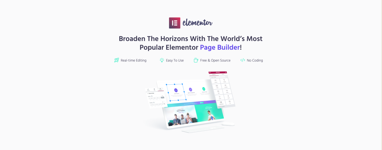
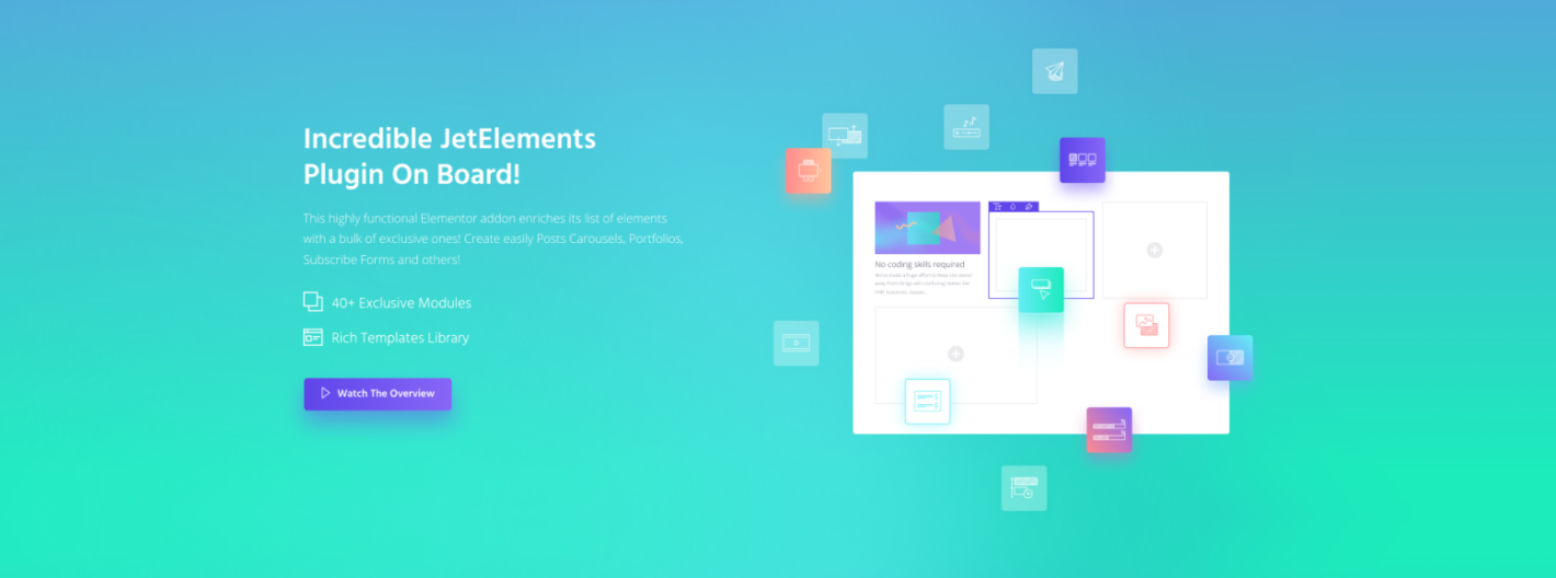
When Monstroid2 was released back in 2017, it had a custom Power Builder editor. One of the many, this editor was ditched with the 2018 update in favor of the most popular WYSIWYG editor for WordPress, i.e. Elementor. The basic free version of this builder yields a whole new level of freedom to website creators, making skin mixing and elaborate pre-set libraries a ladder to fast project completion and web success.
Now, Monstroid2 is packed with the most comprehensive and powerful editor and already sees excited feedback of its users.
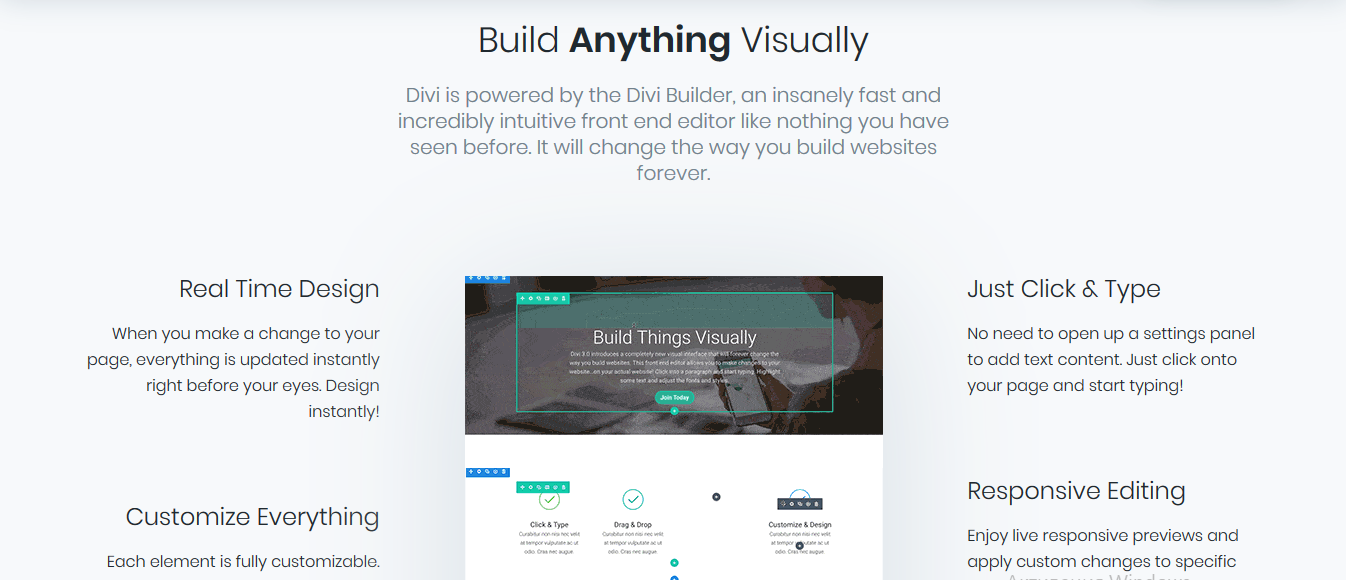
When Divi theme was initially released, its editor, the custom Divi Builder, was some kind of a Divi’s major attraction. The most winning things about Divi Builder were seeing the content the way it appears on the site’s front end and a chance to edit content there in live mode. In 2018, the builder is still great, though it now loses to Elementor in terms of flexibility and abundance of features it offers.
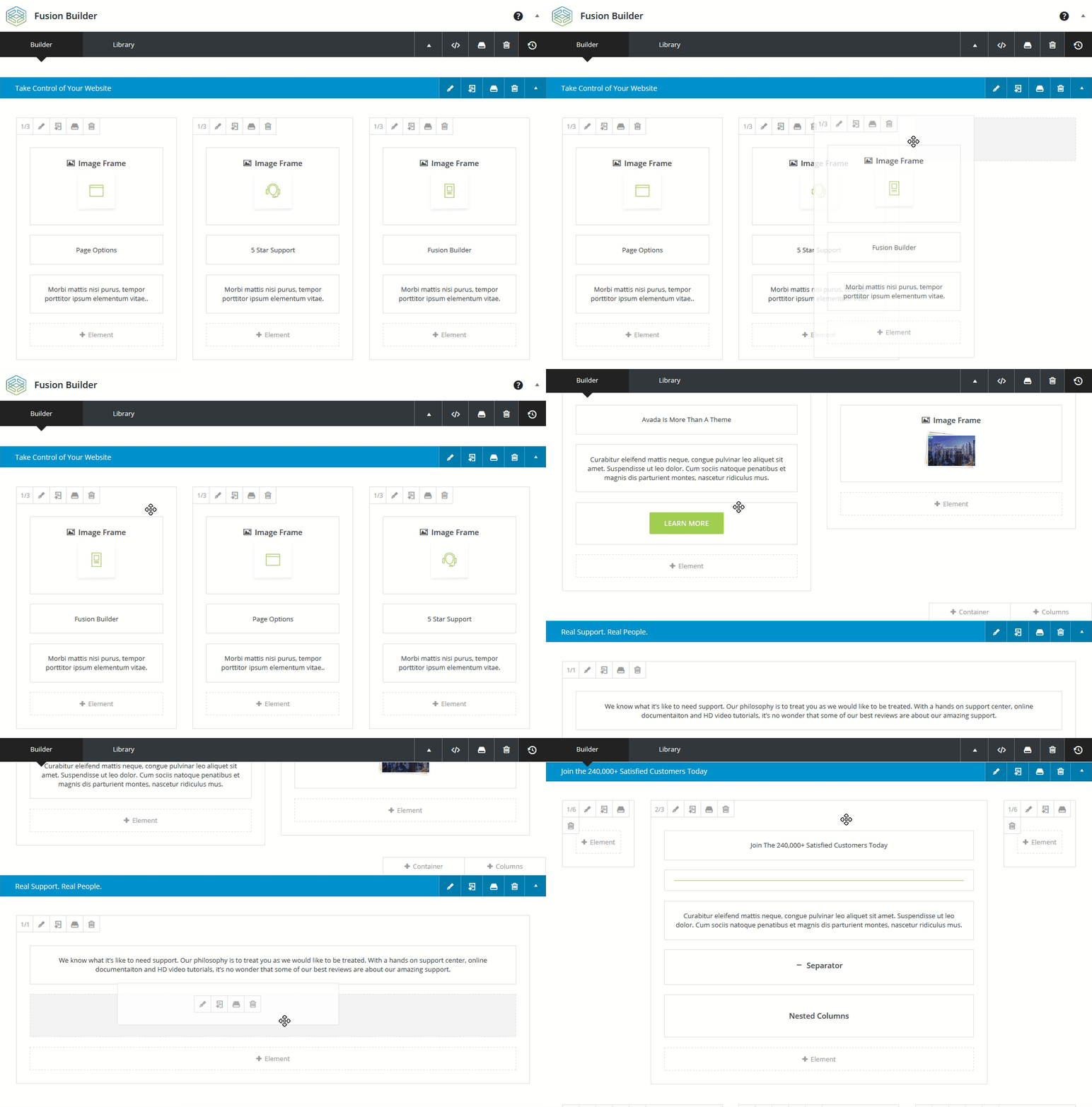
Avada’s WYSIWYG builder, the Fusion Builder is nowhere near as good as the Elementor or even Divi Builder. Within the Fusion Builder interface you see the blocks with their names on white tiles that you can drag-n-drop around. As a result, you get no chance to preview site content in live mode, which is quite disappointing for users.
2nd Criterion: Amount of Skins/Templates
Well, who wouldn’t want to build their website quicker? When choosing a template, every modern website owner appreciates a good skin. Let’s see, how well our template market leadership contestants score in terms of skin abundance.
The recent integration of Elementor website constructor, allowed the Monstroid2 team to take the theme’s inner structure to a new level. Currently, Monstroid2 is one of the pioneering modular themes on the market. All the premade UI components of the theme (block presets, ready-made pages and even skins) are available within the builder as templates.
This approach ensures you the freedom of combining ready-made components of different skins to your liking. You’re not limited to one website design – you can pick all the elements that best fit your professional vision without mulling over which skin to choose.
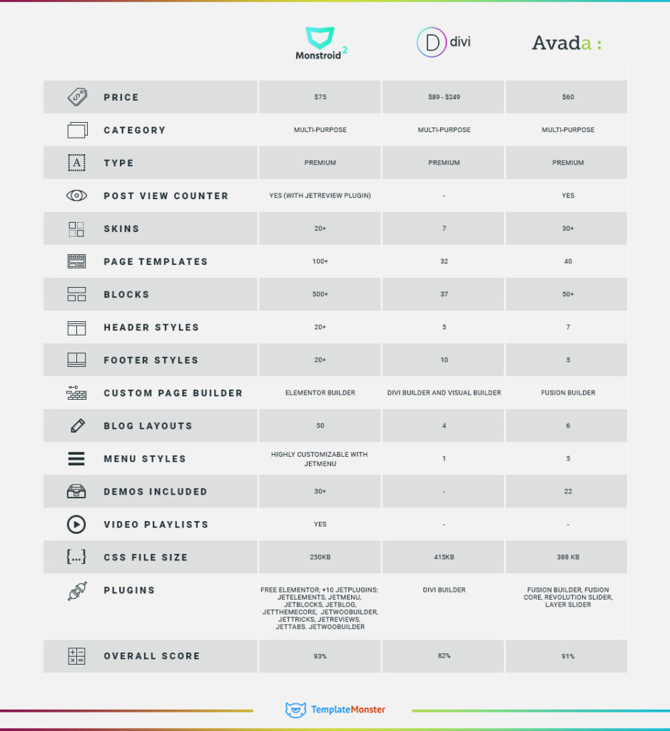
Getting down to numbers, Monstroid2 brings you 28 premium skins, all designed this year and embracing the current trends of web design. So, you just pick one basic skin that you can transform as you wish, incorporating the most stunning components of other skins.
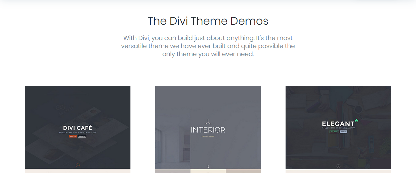
Going all-in with Divi Builder development, the ThemeFusion team didn’t lose sleep over Divi skins. They provide you with seven skins. Good for you if you find a matching one.
The Avada theme compensates for a weak visual editor with 30+ skins for different industries. Such a vast collection of skins took over five years to develop. You’ll find some older skins, along with the new ones that feel more crisp and appropriate for a 2018 website.
3rd Criterion: Prebuilt User Interface Components
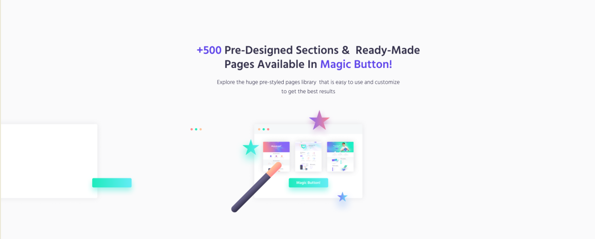
Preparing the new Monstroid2 update, the team was heavily invested in boosting Elementor experience with user interface components. They created more than 500 section designs that fit into more than 300 pre-designed pages. Frankly speaking, this is one of the largest template UI sets ever known.
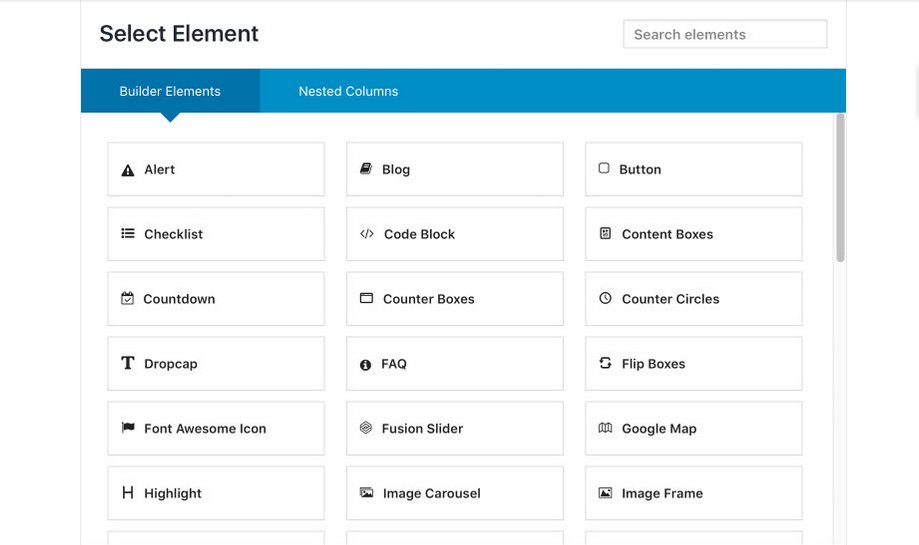
The Divi template brings you 37 user interface components that serve as the basic building blocks within the Divi Builder. Combining them, you’re welcome to create unique sections and custom blocks of your liking.
The Avada theme offers you 50 ready-made content blocks. However, to add one of these blocks, you have to generate a shortcode using the prompts available once you press the ‘Shortcode Button’. So, with Avada you get a pretty sufficient user interface toolkit, but have to resort to the not so comprehensive shortcode tools.
4th Criterion: Plugins On Board
Having a sound set of custom plugins with your template means that you save your money on purchasing additional extensions and prevent compatibility issues. Updating their brainchild, the Monstroid2 team used only the plugins created by their team. By this, they secure the highest quality of all theme components, as well as maintain full compatibility with Elementor and the theme.
In a word, Monstroid2 brings you Elementor, WooCommerce, and nine recently developed Jet Plugins that function in full concord with Elementor and enhance its default capabilities. These plugins help you beautify the display of a number of website sections and UI elements, as well as sprinkle in Parallax effect, CSS animation tricks, switchers, toggles and other engagement-boosting goodies.
In contrast to Monstroid2, Divi has a single plugin on board, Divi builder. What’s more, with Divi, you get free access to two custom plugins developed by Elegant Themes: Bloom E-mail Opt-Ins and Monarch Social Media Sharing. Quite vital, these2 plugins are just the minimum of what you can expect from a best-selling template.
Lastly, Avada comes with 4 pre-built plugins. Fusion Builder and Fusion Core mostly empower and enhance WYSIWYG editing, while Revolution Slider and Layer Slider are similar solutions that let you have a modern and appealing image slider.
5th Criterion: Speed and CSS File Size
The performance craze shattered the terrain of web design. At the same time, template CSS files get leaner to ensure faster loading times. Monstroid2 has the leanest CSS file of 250kb and performs the fastest with A93 Google Speed Rate and 1.2s loading time. Then, Avada is a runner-up with 388kb CSS file. Divi scores lowest with a CSS file of 415kb.
6th Criterion: Pricing Policy
Monstroid2 and Avada have similar pricing policies. To run Monstroid2 on one website and enjoy lifelong support, you pay $75. With Avada, you pay just $60 and get the template for one website with 6 months of support.
Things work differently with Divi making this template more expensive. You can use Divi on an unlimited number of websites for $89/year or $249 one-time payment.
Afterword
Competing for leadership, best templates strive to incorporate the most-wanted features and provide the most convenient customization experiences. For the ultimate comparison of Monstroid2, Divi and Avada, check the infographics below.
All things considered, it becomes evident that Monstroid2 (with its new update) takes precedence and has the highest potential. It delivers website owners the most useful functionality and pushes the boundaries of what a template is even further. We hope that you found some answers to your questions reading this article. If you have some experience with any of these themes, share your feedback in the comments section below. This can help others arrive at the right decision. Stay tuned for more!
The post Best WordPress Template: Monstroid2 vs. Divi vs. Avada appeared first on Torque.
