If you give even a quick glance to any popular web design blog, you’ll see tons of gorgeous and easy-to-use designs that appeal to readers and developers alike. However, there’s a growing trend of turning back the clock (in a manner of speaking), to an age where web design was in its infancy and web-safe fonts ruled the online world.
On paper, ‘brutalist design’, takes the worst elements of web design and showcases them to the fullest. However, that’s not the complete story. Much like minimalism, brutalist adopters have clear goals in sight with their designs. At the same time, these sites are designed to challenge the status quo.
In this post, we’ll look at this trend in more depth, and clarify what makes for a brutalist website. Plus, we’ll talk about how you could use these techniques in your own projects. Let’s get to work!
An Introduction to Brutalist Web Design
Let’s begin with a history lesson. Brutalism may sound like a violent term, but that’s far from its true connotation. It actually derives from the French term for “raw concrete.” In fact, brutalist architecture was popular in Europe around the end of World War II.
Brutalism was a means to an end. Few people had much money to spare, and this was a quick, cheap, and direct way of rebuilding the damage done to many structures in the war’s conflicts. However, that’s not to say there were no attempts to beautify the style:
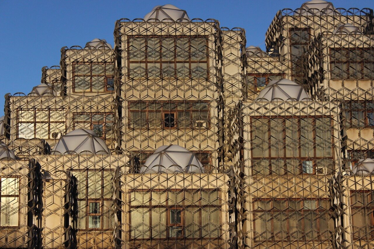
Brutalist web design follows a similar philosophy, in that it’s ‘raw’, direct, and unforgiving in style. Many designs that fall into this category can be seen as hard and even uncomfortable.
We’ll introduce some real-world examples soon, and outline the key signs of a brutalist site. However, it’s worth taking a minute to discuss what has caused mid-1900s architectural philosophies to creep into modern web design.
Why Brutalist Web Design Exists
As it turns out, WordPress is probably part of the reason for the rise in brutalism. Even the platform’s biggest champions can’t deny that the ‘WordPress look’ is a thing, which has eventually caused a number of designers to grow tired of building the same kinds of sites:
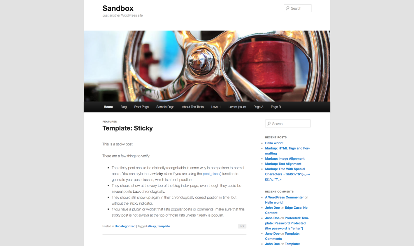
Those same designers have also become tired with the ‘cookie-cutter’ approach to designing websites as a whole, not just when it comes to WordPress. In fact, you could probably recite the basic, common design elements that are now associated with various niches: a mosaic gallery and lightboxes for photography websites; a hero image, Call To Action (CTA), and one-page layout for business sites, and so on.
It’s this reality that has caused some designers to want to turn back the clock and make websites that are not just minimal, but functional and single-purpose as well. To clarify exactly what we mean, let’s take a look at a few examples.
Examples of Brutalist Web Design ‘In the Wild’
At this point, we want to offer some examples of common elements in the types of designs we’ve been talking about. You can consider this the website spotter’s quick guide to brutalism. If you want to get an overall feel for what the philosophy is all about, you can head over to Brutalist Websites:
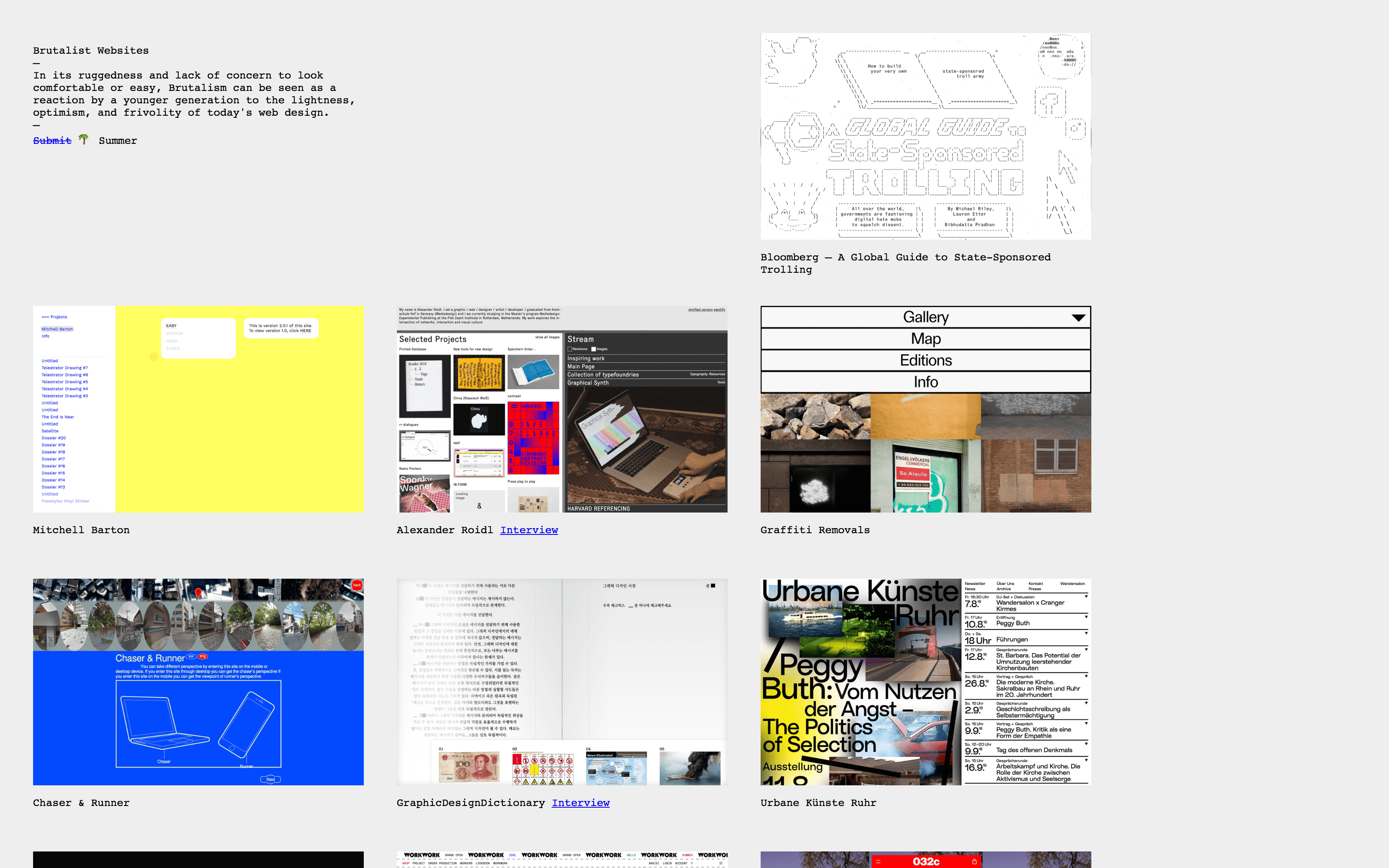
This is a platform-agnostic scrapbook of brutalist sites, which gives you a clear vision of what this type of design involves. Just by scrolling through, you’ll see garish color schemes, odd font choices, weirdly-placed page elements, ASCII art, and much more.
For example, take a look at this website:
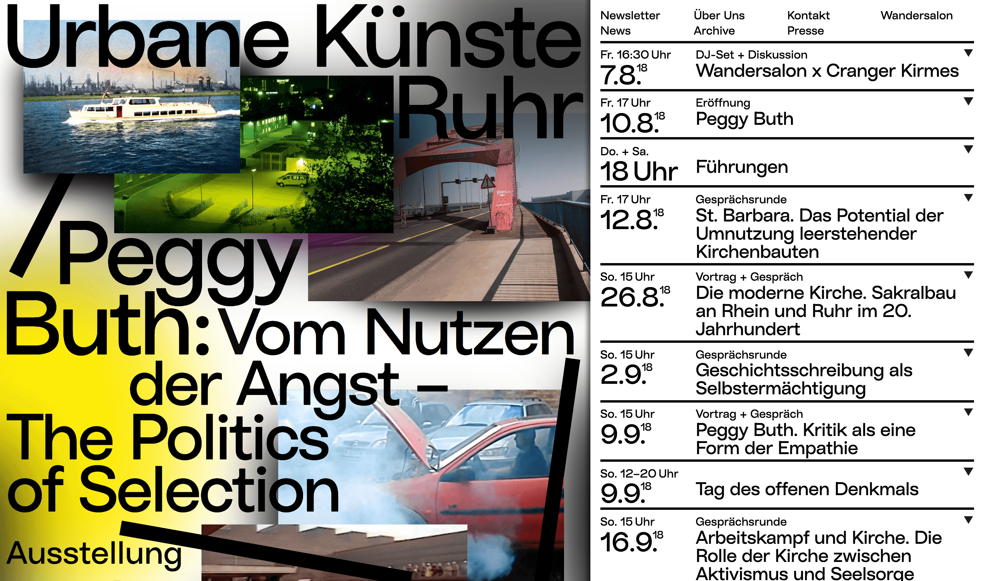
This page alone ticks all of the boxes for what a brutalist website tends to include. Oversized, web-safe fonts? Check. No concept of layout or positioning? Check. Wonky rollover elements that don’t quite work? Three in a row.
You can compare this site to another, more famous website that is based around brutalism – Craigslist:
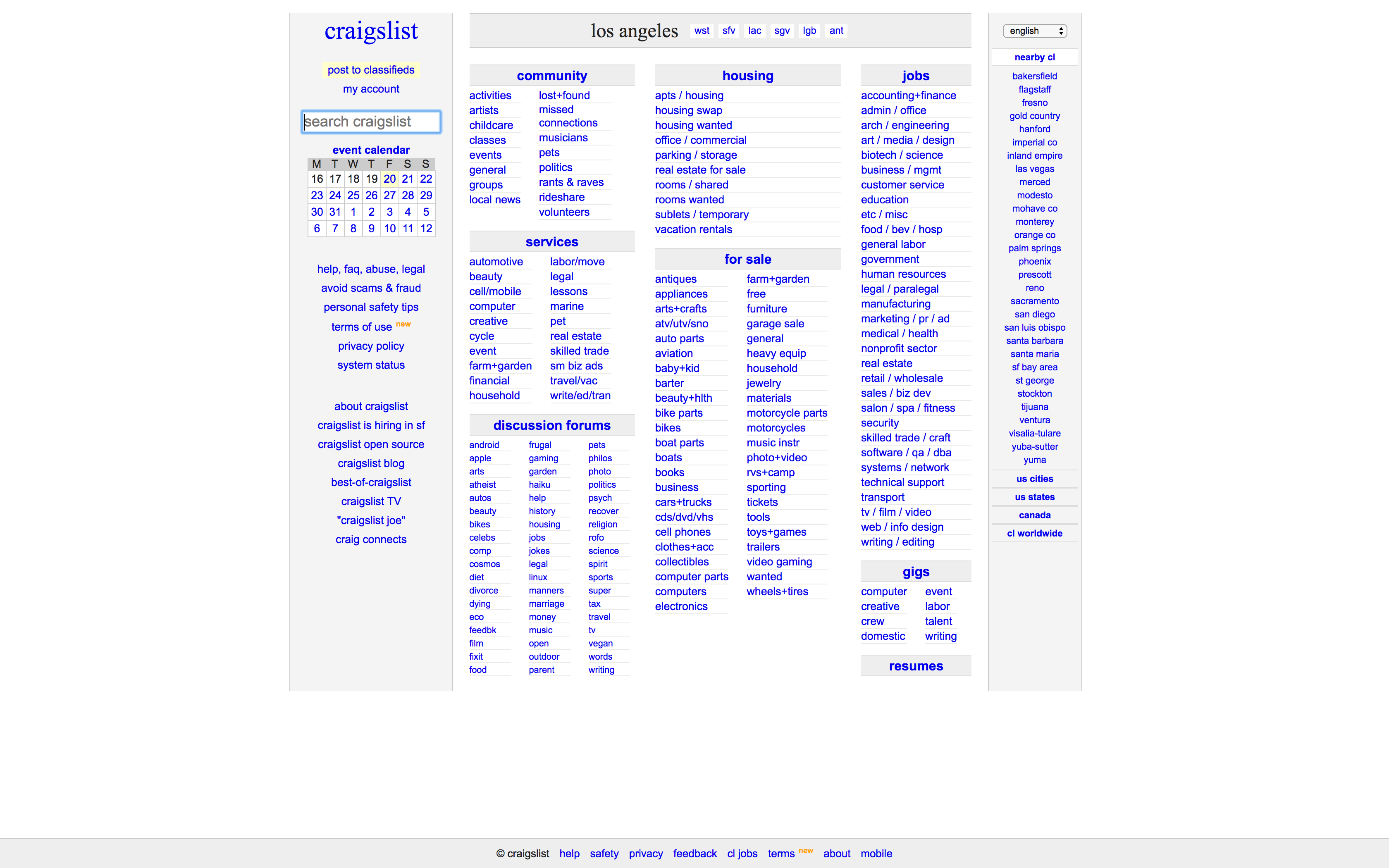
There’s obvious a completely different feel here, but this page still has brutalist elements. For instance, it’s highly functional, and is showing ‘honesty’ in its approach by not including any unnecessary or distracting features. These subjective elements are just as important to brutalist web design as the more concrete design concepts.
Finally, let’s look at Fiorucci, a popular Italian fashion label:
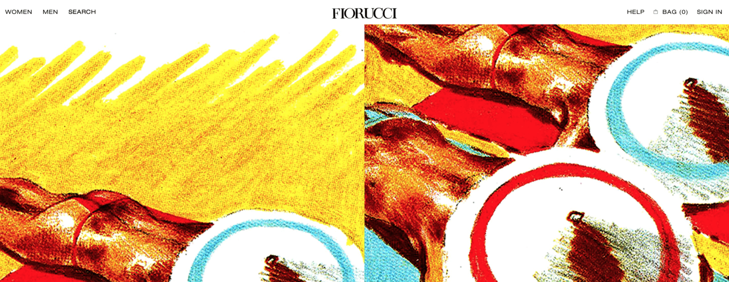
Much of this website has a traditional e-commerce feel to it, which is understandable given that usability often equals conversions. However, prominent elements have been turned ‘brutal’, in order to guide the visitor towards vital elements such as sales pages and a newsletter sign-up:

This last example comes from the Awwwards website – a source of the very best website designs and implementations. As such, their curation of brutalist sites is worth scouring for inspiration.
How to Get Started with Brutalist Web Design
Finally, let’s get a bit more practical. If you’re new to this type of web design, we’re guessing that you won’t want to create a completely brutalist website. More specifically, your clients probably wouldn’t appreciate it. Instead, you may want to experiment with the elements of brutalist design, working them into your current personal or professional projects.
There are two main approaches you can take here. First, you can choose a WordPress theme with brutalist elements as your foundation. However, there aren’t too many choices on offer just yet. Based on our own research, only a handful of themes (such as FlowMag, Glitch, and Brutal) fit the bill.
Instead, you’ll likely get more mileage by hand-carving your brutalist design. This makes lots of sense, given how much you’ll be ‘hacking away’ at the design in the first place.
If you opt for this strategy, you’ll likely want to start from a reasonably flat base. Choosing a very minimalist theme here will be important, because you’ll want lean and mean code under the hood. Many free themes can fit the bill, especially some of the earlier WordPress default themes, or anything from Automattic:
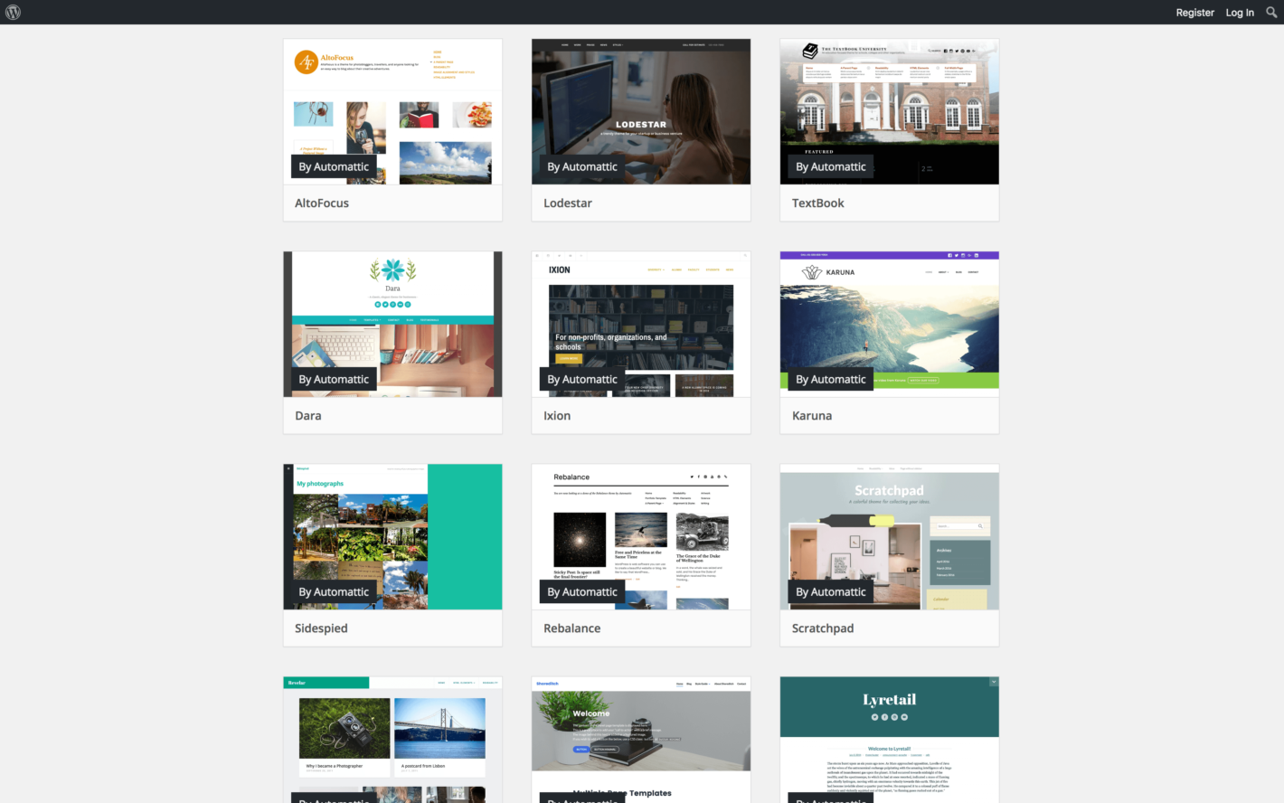
While you could hand-code your site, using a solid page builder tool will help you get the job done quicker. If you choose a solution without ‘lock-in’, you can even roll back your changes if clients are uncomfortable with what you’re presenting them.
In our opinion, Elementor is a standout choice here for many reasons. More specifically, its ‘blank-slate’ default theme gives you the ultimate foundation with which to create your brutalist design.
Once you have a base to build on, you can start experimenting with your site’s on-page elements. Colors should be garish and obtrusive, for example – think deep blues and reds, as well as clashing hues. Ideally, your colors should also be ‘web-safe’:
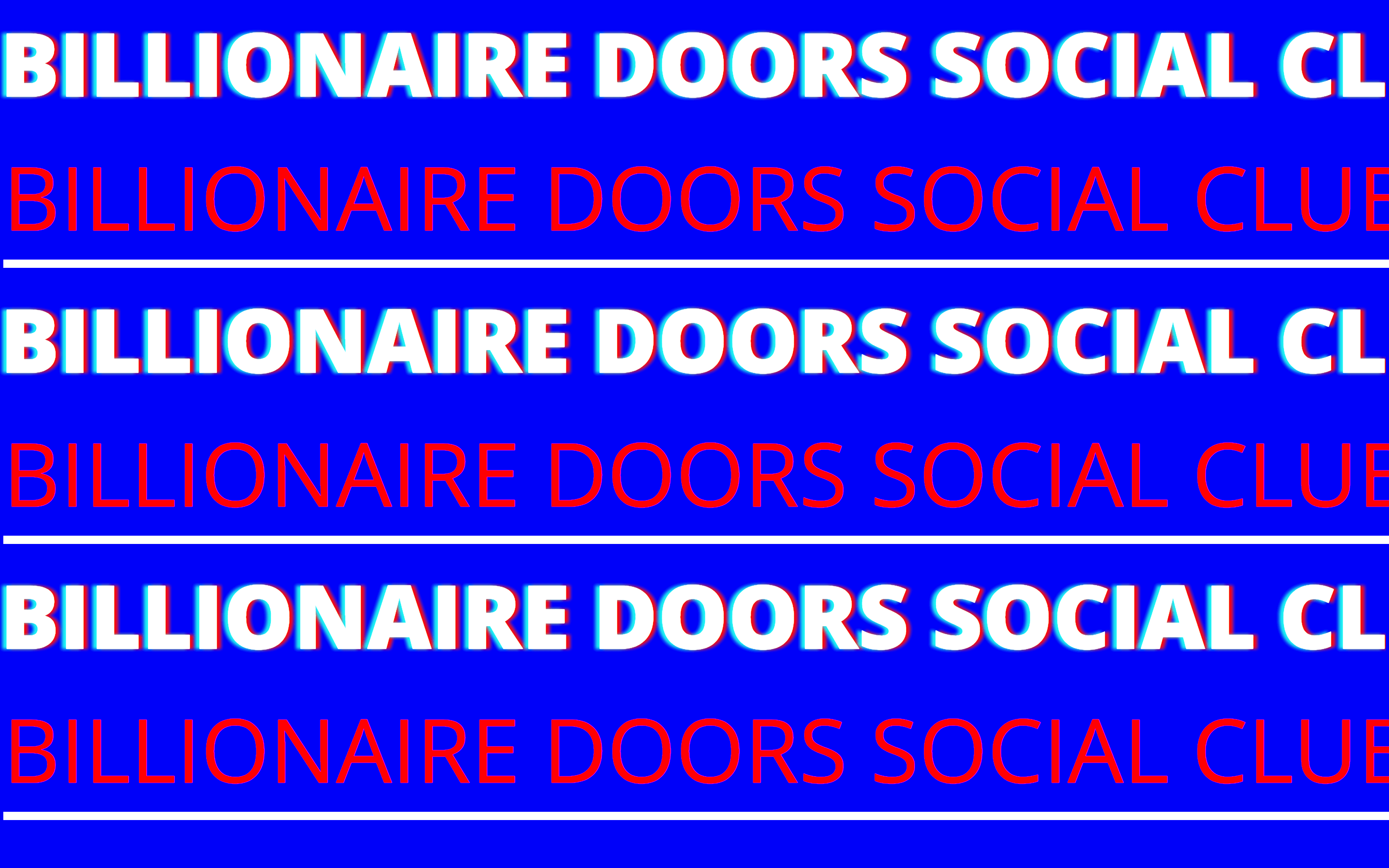
The same goes for fonts. You’ll want to make them almost awkward in their implementation, and web safe. If in doubt, we have two words to help you out: “sans-serif” and “big”:
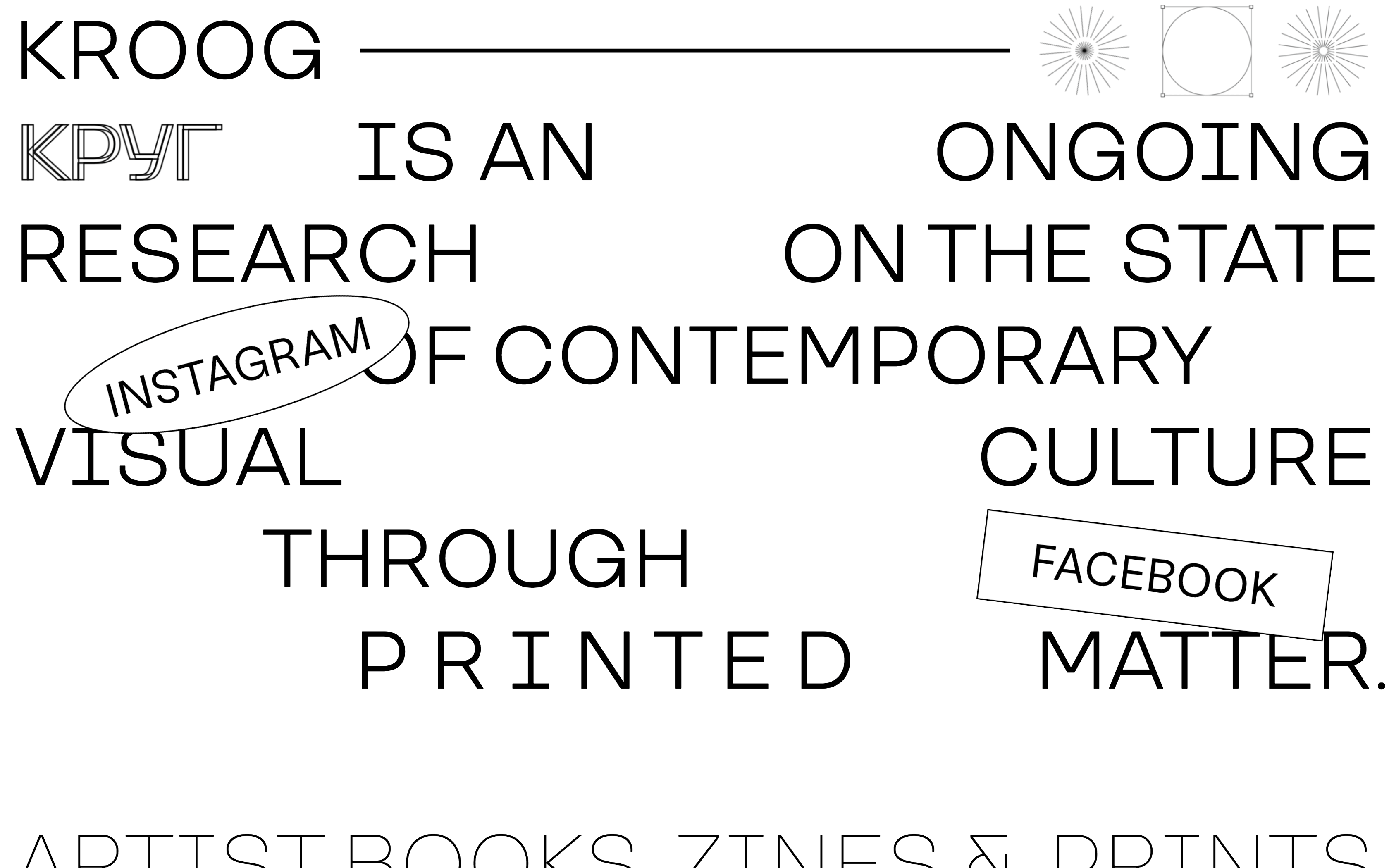
As we mentioned earlier, creating brutalist layouts is all about mind over matter. In other words, you’ll need to make a few mental shifts in order to align your thinking with this unconventional philosophy.
As such, there are plenty of tutorials and think pieces that can help you learn more. We encourage you to read as much of this material as possible, if you really want to understand and use brutalist web design.
Conclusion
Brutalist web design isn’t just an ugly, edge-case philosophy when it comes to website layout. It’s a return to a more functional way of presenting content that doesn’t rely on the same old layouts and clichés, and it does have a place depending on what you’d like to achieve with your designs.
In this piece, we’ve looked at what brutalist web design is and why you should care about it. If you take a look at some of the prevailing examples of the approach, you’ll see an early 90s web aesthetic, coupled with garish elements that may be hard to look at. You’ll also realize quite quickly that there’s a tongue-in-cheek aspect to all of this, in accordance with the philosophy that websites should be what they (and you) want, rather than following what’s expected.
Are you a fan of brutalist web design, and would you employ some of its techniques in your own designs? Let us know your thoughts in the comments section below!
Featured images: ifinnsson, yisus10.
The post A Developer’s Guide to Brutalist Web Design appeared first on Torque.
