Creating button design guidelines might seem redundant. After all, you already know what website buttons look like, don’t you? So, do you really need help creating them?
As common as buttons are, it should not be forgotten that they are a central part of web design with important functions:
- Buttons often make up the main call to action
- Buy buttons greatly influence revenue
- Email sign-up buttons help build your list
- Form submission buttons are important for lead generation
- Social buttons help share your content
Because of that, in this post, we will give you a number of button design guidelines and best practices. The goal is to help you create buttons that convert and bring you closer to achieving the goal of your website.
Just a short caveat: While the best practices below will help you create better buttons, to truly know what will increase your conversion rate, you should employ A/B split testing. Only by trying out different alternatives will you find out which kind of button will improve your site.
Button Design Guidelines to Help You Create Better Buttons
The guidelines below will help you create buttons that will attract clicks and user attention.
1. Make Sure They Go Well With Your Website and Branding
Buttons need to stick out (so that users click on them) but in a positive way.
For that reason, while following the button design guidelines, also make sure the result integrates well into the context it appears in. Take your existing branding and design into account and see that your buttons harmonize with the color palette and style of your site.
At the same time, don’t shy away from experimenting. A splash of daring color might be just what your site needs to increase conversions.
2. Stick With Established Design Conventions
This point should be self-explanatory but often isn’t. For users to click on buttons, they need to be aware that that option even exists. If your design is too far outside of the usual conventions, it might prevent users from recognizing a button even exists.
So, what are those conventions?
The first is shape. Thanks to the long evolution of computers, the most familiar shape is a rectangle (with or without rounded corners). Just look at WordPress.

Users have been exposed to style for such a long time that they will easily recognize it. Of course, by now other have also been established and are another good place to start from.
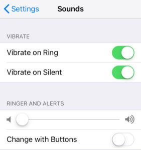
Furthermore, an important design clue for buttons are shadows and highlights. Drop shadows have become the universal signal that something can be clicked on or tapped. Therefore, don’t forget to make your buttons feel more convex.
Whichever button shape and design you choose for your website, just be sure to stay consistent. If your buttons differ too much, they will confuse users and prevent them from taking action.
3. Use Clear Labels
The next point on our button design guidelines are labels. Without a clue of what a button does, users have no way of determining whether clicking it makes sense for them. See Publish button above.
This doesn’t necessarily have to be text, icons can also be sufficient. You can see that in the social sharing buttons which have become ubiquitous.

A combination of both text and images is also possible. The only thing that matters is that the user can identify the effect a click on a button will have. If they don’t, they likely won’t take your desired action.
Be sure to make your labels descriptive and specific, use verbs that describe the action it will perform (like buy) and create urgency with words like now. This is especially important for calls to action, which are often the central part of any web page.
4. Button Size and Spacing
Getting the spacing and size right is especially important for mobile design. Using a website with your finger is less precise than with a mouse, simply because the “cursor” is much larger.
The important part here is to create buttons in a way that a) makes them usable and b) prevents users from accidentally tapping the wrong thing.
When it comes to size, the average human fingertip is 16-20mm. This is roughly 45 – 57 pixels. To accommodate that, Apple recommends a button size of at least 44 x 44 pixels (make that points for retina displays). The link also states recommendations from other manufacturers, most of them say around 10mm.
There seem to be no concrete rules for spacing. Just make sure your buttons are arranged in a way that makes it unlikely to hit the wrong one. Providing enough space can also help set apart more important buttons like calls to action.
5. Implement Feedback
Once you have designed your buttons in a way that users can clearly identify, the work doesn’t stop. The next question is: what happens when they use a button? As it turns out, these design elements have more than one state:
- Normal — You can clearly see that it’s a button, the element invites interaction
- Focused — Typically mouse hover effects, confirms that interacting with the element is possible
- Pressed — Rewards the user for taking action, confirms something is happening
- Busy — Shows activity taking place in the background
- Disabled — Makes it clear that other actions are possible, just not currently

By providing feedback, you can make the interaction clear and more exciting. It’s a visual reward for users to see that their action has an effect.
6. Position Them Visibly
Of course, when you have designed your buttons, the final step is to make sure users can find them. Otherwise, how will they click on them? For that reason, picking the right button location is also important.
Here, too, it makes sense to go with established conventions. For example, most people expect the main call to action to be above the fold, so that’s a good place to put it.
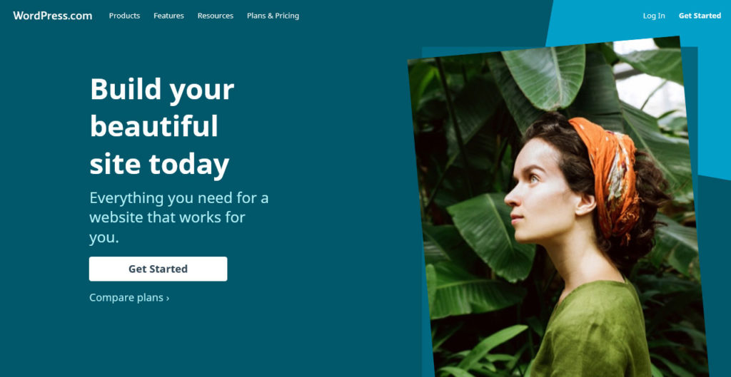
Other buttons might also have conventions like this, such as social media buttons in the footer.
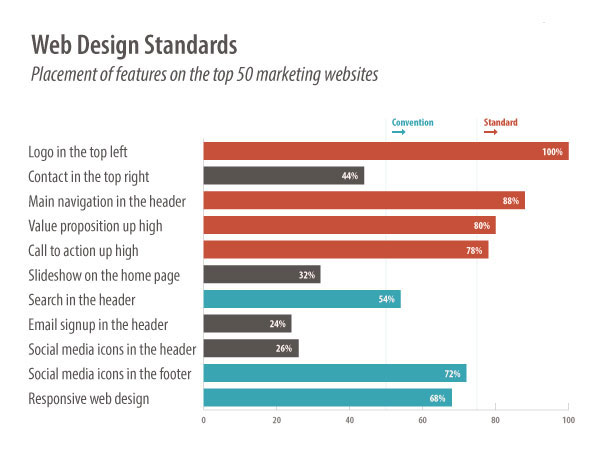
While it can make sense to break conventions every now and then, you always run the risk of confusing users. This, in turn, highly affects their perception of your site. Test different possibilities to settle on the one that works best.
7. Contrast From Rest of Design
Positioning your buttons well also means providing enough contrast. By making buttons stand out from the rest of the design, you make it clear that interaction is possible and desired. It also prevents your buttons from getting lost.
Here are your general tools for creating contrast:
- Color — Use contrasting colors, including for the button label
- Size — Bigger elements stand out more
- Typography — Bolding text or using a different font can attract attention
- Whitespace — More breathing room around an element means more focus on it
A good way to figure out if the contrast is high enough is to use the squint test. For that, simply move away from your screen, squint your eyes and see if the button still stands out.
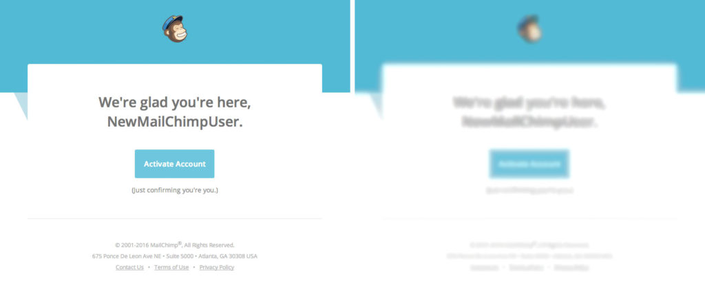
Sounds weird but is a tried and true technique among web designers.
How to Create Buttons in WordPress
Now that you know how to make buttons look good, the question is, how do you get them on your site? Fortunately, the new Gutenberg editor makes this really easy.
1. Create the Block Element
You can create a button in Gutenberg like any other block element. Simply click on the plus symbol on the left. When the menu opens, scroll down to Layout Elements to find the button.
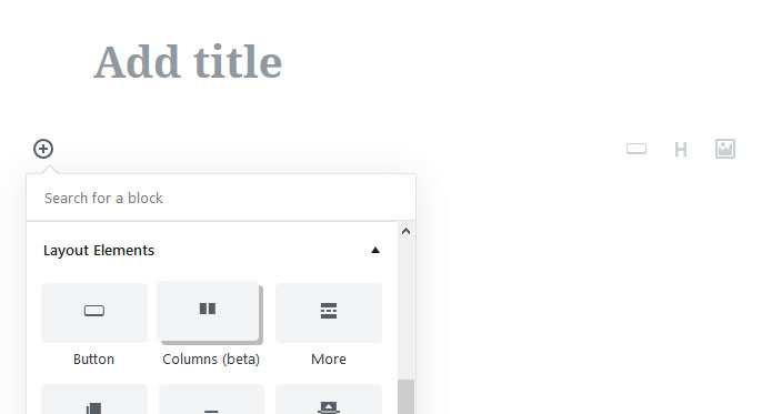
Click it to add it to your page.
2. Configure Button Text and Destination
Upon click, WordPress opens up this menu.

You have the following options here:
- Change orientation — Use the symbols at the top to align the button to the left, center or right of your page
- Edit button text — Simply click into the button to change the text to whatever you want, setting the text to bold, italic or strikethrough is also possible
- Input destination — Where it says Paste URL or type, you can determine where the button will take visitors upon click
3. Edit the Design
Once done with that, it’s time for styling. For that, you find the option to change the button and text color with just a few clicks on the right side.
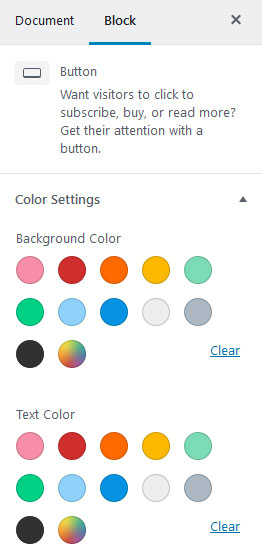
Either select one of the available options or use the color picker to generate a new shade. You can also input a hex code of a specific hue you want. The editor even warns you if you pick a color combination that will be hard to read.
In addition to that, under Advanced you have the ability to add a custom CSS class to the button. That way, you are able to create a custom design with some CSS markup including hover effects and more.
And that’s it – the simplest way to add a button in WordPress.
Button Design Guidelines in a Nutshell
Buttons can be sidelined a bit in web design as many think of them as common elements. However, the role they play should not be underestimated. Buttons influence everything from conversions and sales to email signups.
Above, we have given you button design guidelines you can use to make yours more effective. Let’s recap them real quick:
- Make sure your buttons go well with rest of your site
- Make them clearly identifiable as buttons
- Add clear and distinct labeling
- Add enough size and spacing
- Provide visual feedback to users
- Place buttons prominently on your page
- Establish enough contrast from the rest of the page
Following these guidelines will help you create better buttons for your WordPress site. Plus, you now also know a simple way to include buttons on your pages.
However, don’t forget: theory can’t replace testing. Once you have created your buttons, be sure to test different alternatives in order to find the ones that work best.
Do you have any other button design guidelines you would like to share? Let us know in the comments section below.
The post 7 Button Design Guidelines for WordPress That You Need to Know About appeared first on Torque.
