Email newsletters are a great way to keep customers interested in your brand. In fact, a survey of retail professionals found that 80 percent of them use email marketing for both customer acquisition and retention.
Getting website visitors to sign up for your email list can be a challenge, however. Part of what makes this task difficult is the fact different kinds of email users respond better to different types of sign-up forms.
To get around this, try different kinds of sign-ups and designs on your site and see what works best until you find the perfect combination. Here are eight of the form types you should try as well as places to put them.
Feature Box Form
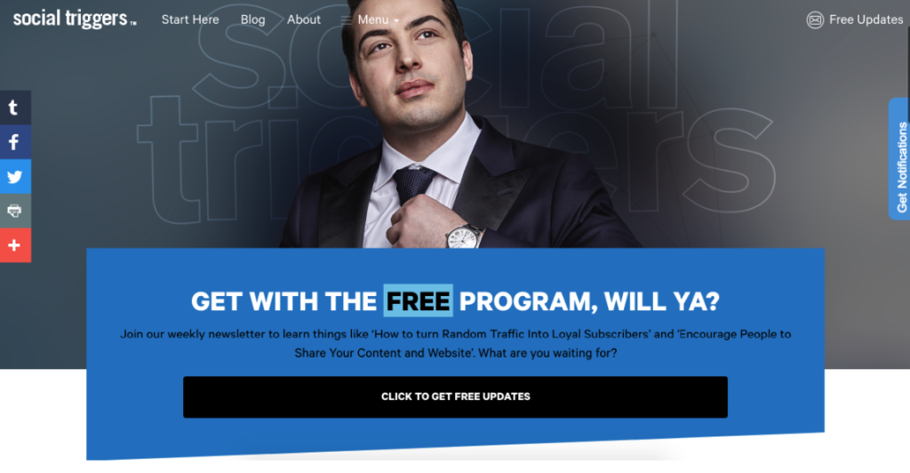
The feature box is currently one of the most popular ways to grow your email subscribers list. Feature boxes are relatively large opt-in forms that you place near the top of your website. They’re in some of the most valuable real estate on your site. Users don’t have to scroll down to see them — they spread across the width of your site. According to OptinMonster, a well-designed feature box can increase opt-ins by 51.7 percent.
Here’s an example of a newsletter feature box on the homepage on Social Triggers, a blog that teaches people about running websites and blogs.
Free Giveaway Form
Some of the most powerful email sign-ups those are those that include incentives. You can offer special deals, coupons or exclusive content, such as an eBook. This strategy is a very common one for getting email subscribers. The reason its so popular is because it works. According to one recent study, 60 percent of those who sign up for email newsletters do so to get access to exclusive offers.
Pop-Up Forms
Some people hate pop-up forms, but for the right audience, they can be a highly effective way to gain more email subscribers. The advantage is that it’s impossible to ignore, so if you use it for the right person at the right time, you could get a positive response.
Email subscription pop-ups are especially useful for users who aren’t ready to commit to a purchase but still want to keep in touch. They’re also ideal for giving visitors special inventive for signing up for your newsletter list.
You can have your pop-up appear immediately when someone lands on your page, wait a pre-determined amount of time or wait until they’ve scrolled down your page to a certain point. Test these different kinds of pop-ups to see what works best for you.
Sidebar Forms
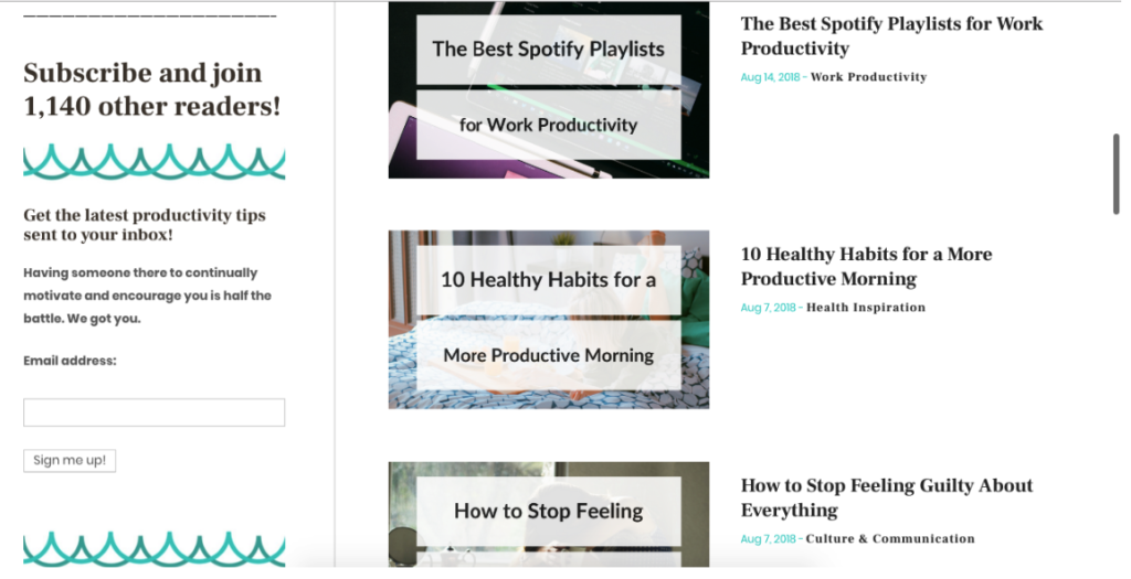
The sidebar is another great place to put a newsletter sign-up form. You can set it up so that it’s always there as the user navigates from page to page on your site. You can even have it follow the user as they scroll up and down the page. Just be careful not to make it too obtrusive if you put it on every page.
My blog, Productivity Theory, which provides tips about productivity and personal development, is an example of a site that uses the sidebar form. It’s always there and is highly visible but doesn’t distract from the main content of the page.
Ends of Posts
If someone reads all the way to the end of one of your posts, you can safely bet that they’re interested in your content. Once they finish reading your post, they’ll also likely be looking for something new to do.
To get more of these highly engaged readers to sign up for your email list, put a form at the bottom of each post. It could be a static or a pop-up that appears once someone reaches the end of an article.
Hello Bar
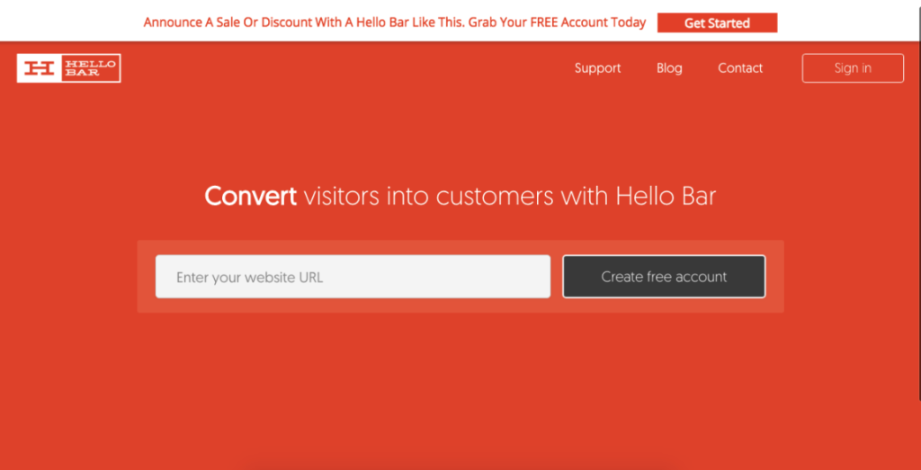
The Hello Bar is a thin bar near the top of the page that spans all the way across the width of your site. It’s unobtrusive and doesn’t take up much real estate, but its location at the top of the page helps it get seen, making it ideal for lead generation.
Here’s an example of what a Hello Bar looks like from hellobar.com. It’s the thin white bar across the very top of the page.
Website Footer
The website footer form works on the same principle as the end-of-post idea. If someone scrolls all the way to the bottom of your website, they’re likely interested in what you do. Visitors may also navigate to the footer to look for contact information since that’s where sites usually put it. Newsletters are an easy way to keep in contact, so these users are likely to give you their email addresses.
About Page
The about page is typically one of the most visited pages on a site, especially for new visitors. Because of the high amount of traffic it receives, it’s also a prime place to collect emails. Social Triggers even recommends including three opt-in forms on your about page.
There’s no one-size-fits-all solution for newsletter sign-up forms. Different methods will work best for different audiences. The best way to determine your ideal approach is to test these various sign-up forms and see which ones get you the most loyal subscribers.
The post 8 Kinds of Newsletter Sign Ups You Should Have on Your Blog appeared first on Torque.


