When you run your own WordPress website, it’s only natural to want to gain more control over its design and functionality. One of the best ways to make sweeping changes to a site’s looks is CSS. With proficiency in CSS, you can change anything from the page layout over colors to fonts and background images.
One of the most basic concepts to learn for this is the CSS box model. It’s a fundamental principle of web design. Understanding it enables you to almost endlessly customize your site’s layout to your desire.
In this post for beginners, we will explain to you what the CSS box model is and how it works. We will first go over it theoretically and then work through a number of practical examples to make it even clearer.
So, put on your web designer hat and let’s get going.
The CSS Box Model – How It Works
As a first step, let’s dive into the idea behind the CSS box model.
Boxes – Boxes Everywhere!
The first thing you need to understand to effectively use CSS is that everything you see on a web page is made up of rectangles. Any website you look at is nothing but rectangular boxes arranged next to, on top of, below and nested within each other.
Header? Rectangle. Sidebar? Rectangle. Featured image? Also a rectangle. Of course, we don’t usually call them rectangles but HTML elements instead. And there are different kinds of those.
Block vs Inline Elements
HTML elements come in two different varieties: inline and block elements. They have some striking differences that also have an impact on the usage of the CSS box model.
One of the main features of block elements is that they take up the entire space of the container they are placed in. Unless otherwise instructed (meaning via CSS), they will stretch out to occupy however much space is available, moving any other elements below them.
This blockquote is an example for a block element. I have added a background color so you can see that it stretches across the entire screen and not just the area where the text appears.
In addition to that, block elements can contain other block or inline elements and will automatically adjust their height to fit their content. Examples of them are heading tags, div boxes, paragraphs, and lists. You can find a full list here.
Inline elements are actually something that, as a WordPress user, you are likely deeply familiar with, even if you are not aware of it. When you create content and set text to bold or italic, the WordPress editor adds ... or ... around it to achieve these effects.
Just click on the Text tab of the editor to look at the code of your content and you will see it.
![]()
In contrast, to block elements, inline elements take up only as much space as they need. They also don’t move to a new line or push other elements below them. You can find more information about them in this place.
However, because of these behaviors, much of the CSS box model only applies to block elements. You will soon understand why.
So, What is this CSS Box Model Already!?
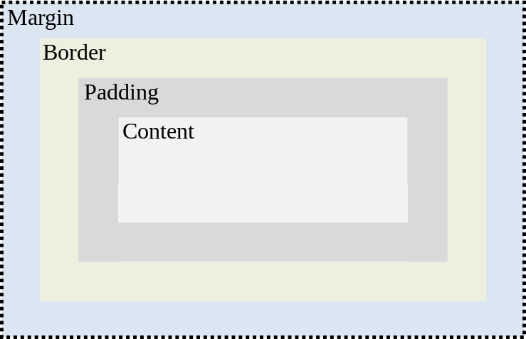
What you might not know is that whenever you create an HTML element, it basically comes with a box wrapped around it. This box consists of different layers that you can manipulate independently via CSS. Doing so allows you to arrange elements in relation to one another and style them in many ways.
Here’s what these layers are made up of:
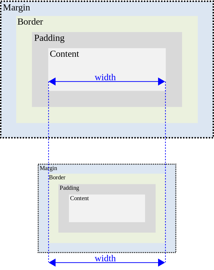
- Width — The width of the content area of an element. For block elements, this is by default 100%. For inline elements, it however much space their content needs.
- Height — As you can imagine, this denotes an element’s height. It is usually controlled by the content inside it but you can also apply a specific height if needed. Again, this only works for block elements.
- Border — Borders run around every HTML element, even if you don’t see them. They can take on different sizes, styles, and colors. More on that below.
- Padding — This signifies the space between an element’s border and the content within. This is important, for example, so text inside an HTML element remains readable.
- Margin — Finally, margin denotes the space outside of the border. It effectively controls the space between different elements and is very important for page layout, positioning and spacing.
And that, in effect, is the CSS box model. It becomes even clearer when you look at it in a diagram:

Since each of the layers above also has a corresponding CSS property, the box model represents the most basic ways to determine the size, position and look of an HTML element. As a consequence, it allows you to change a lot about you web pages. Let’s look at some examples to see how that works.
How to Use the CSS Box Model – Examples
To help you understand the theory of the box model in practical terms, I have created an example page with a block element in it.
    Example Site for CSS Box Model


    Lorem ipsum dolor sit amet, consectetur adipiscing elit.
It’s basically an HTML document with some sample text inside a div box. In the browser, it looks like this:

Note that I have also given the box some background color so you can see where it stretches on the screen. This will make it easier to understand the upcoming changes. So far, the corresponding CSS this:
.example-element {
	background-color: deepskyblue;
}
Now let’s make some changes to it.
Changing the Width
The first thing we will do is declare a width. As mentioned, right now it is automatically set to 100%. If I want to change that, I need to deal with the width property.
We have several ways of setting it. You can use a fixed width like pixels or a proportional value like percentages. The latter is really important for things like responsive design. However, for simplicity’s sake, I will go with pixels.
So, I add this here to my style sheet:
.example-element {
	background-color: deepskyblue;
	width: 300px;
}
When I now reload the page, my example looks like this:

You will quickly notice how the div box is now limited in how far it stretches to the right. You can also see that it’s height adjusted automatically to make room for the text it contains. Let’s increase that further.
Increasing the Element’s Height via CSS
While the content fits neatly within the rectangle, there are good reasons to further increase the height. For example, what if I want the element to be a perfect square? I can easily achieve this with the width property, which is next in our CSS box model.
For height, we have the same possibility as for width. You can go for fixed values or proportions. Me, I am adding this here to my style sheet:
.example-element {
	background-color: deepskyblue;
	height: 300px;
	width: 300px;
}
As a consequence, my example page now looks like this:

As you can see, the element has taken on the desired shape because width and height are now the same value.
Introducing a Border
Next, I want to change the border. As mentioned, the border is already there, you just can’t see it. Time to change that via the border property.
What’s important to know about this operator is that it takes three values: border width, style, and color. Width is the thickness of the border (usually in pixels), style can be solid, dashed, dotted and a whole lot of other things and color is either a declaration like “red” or the hex value of a color.
Theoretically, it’s enough to only define the border width. However, most of the time you achieve better results setting all three values. Here is what I went with:
.example-element {
	background-color: deepskyblue;
	border: 15px solid blue;
	height: 300px;
	width: 300px;
}
And that’s how it shows up on the web page:

Looks awesome, right? I know, I’m quite the designer.
Be aware, that you can also set different types of borders on different sides of an element via border-top, border-right, border-bottom and border-left.
Putting in Some Padding
Looking at the example, one of the main things that stands out is that the text is bordering directly on the side of the element. That makes it very hard to read and is far from pleasant to look at. Luckily, we can change that via the padding rule. Here’s how I am using it in my example:
.example-element {
	background-color: deepskyblue;
	border: 15px solid blue;
	height: 300px;
	padding: 16px;
	width: 300px;
}
And this is the effect of the code:

Much better, isn’t it? All because I introduced some padding on all sides of the element.
Be aware, however, that, just like for border, it’s also possible to set different padding values on different sides of an element. For that, use padding-top, padding-right, padding-bottom and padding-left.
You can also go with a shorthand like padding: 10px 5px 15px 10px;. The numbers denote the padding at the top, right, bottom and left respectively.
Padding is also one of the few properties on this list that can also be applied to inline elements. However, you run the risk of the top and bottom padding encroaching into other elements, so be careful.
Adding a Margin
Finally, we are getting to margin. As mentioned, this determines the space outside of an element, influencing its position on the page and in relation to other elements.
To make this clearer, I am adding the following to my style sheet:
.example-element {
	background-color: deepskyblue;
	border: 15px solid blue;
	height: 300px;
	margin: 25px;
	padding: 16px;
	width: 300px;
}
Here’s how that manifests:

As you can see, doing so has moved the elements away from the sides of the page. However, I have set it up in a way that the margin extends all around the element. You can see this even better if I copy my div box and input it into the page a second time and how the boxes relate to each other.

Right now I have an equal margin on every side. However, again, it’s also possible to define different values for different directions. This works exactly the same way as for padding. You can either use margin-top, margin-left etc. or the shorthand.
Margin also partially applies to inline elements, however, only the sides, not on top or bottom.
A Quick Note on Element Sizes
When it comes to element sizes, it’s important to note that all parts of the CSS box model contribute to it. So, if you set an element’s width to 200px that only applies to the content area.
Any border, padding and margin will also contribute to the absolute horizontal size of the element. The same is true for the height. Here, too, all layers of the box model add up.
There are ways to get around this, such as setting box-sizing to border-box for an element. In that case, defining width will include the border and everything inside will automatically adjust to fit inside those confinements.

However, margin still contributes to the overall size of the element. Just keep this in mind when working with your page layout. More information on box-sizing here.
Wrapping Up
And there you have it, the basics of the CSS box model. Learning the above will help you a lot with understanding how websites work. Doing so makes it much easier to manipulate your design to whatever you want and change the layout of your web pages.
It’s also a great springboard to learn more CSS. Once have mastered the above, it’s very easy to keep going and acquire more knowledge about how to make changes to your site. Very soon, you will find yourself building your own custom themes.
What is another basic CSS concept your think everyone should learn? Let us know in the comments section below!
The post CSS for Beginners: The CSS Box Model and How to Use it Correctly appeared first on Torque.
