Creating a successful, well-optimized website is something like throwing your own, custom-made, wide net into the ocean in the hope that you’ll catch as many fish as possible. You need to consider all the different devices that people use to browse the internet and cover all the options with a responsive web design that adjusts the content to different screen sizes. This is important because you want all of your visitors to have the ultimate user experience no matter what device they’re on.
While all of this probably makes sense to you, it might still surprise you to hear that responsive web design actually directly affects your SEO score as well. Here is a list of SEO benefits you’ll get once you implement this design.
More Mobile Traffic
The first and possibly the most important result of responsive web design is the increased mobile traffic. Mobile browsing has been growing steadily for years now and in 2016, according to an October report, managed to surpass desktop browsing with 51.3 percent lead. This means that the mobile phones have become a main focus point for numerous developers out there and mobile optimization has become the industry standard. So, by using responsive web design on your website, you open the doors for the majority of web users nowadays, which obviously improves your SEO score.
Faster Web Page Loading
Speaking of mobile browsing, speed has recently become a major SEO ranking factor with Google. With the introduction of mobile-first principle, Google announced that web page loading speed will become an important part of SEO, starting July 2018. Although the results won’t be as evident from the start, investing in faster web pages early on is a good way of preparing for the future.
So, where does responsive design fit in? Loading a full website on a smaller screen is not only ineffective and frustrating for the user, it’s also extremely slow. Responsive design condenses the pages, making them smaller and, therefore, easier to load.
Now, the question of speed is somewhat problematic. Some people argue that accelerated mobile pages (AMPs) are a better choice than responsive design because they’re much faster. However, AMPs have a couple of drawbacks, the biggest one being that they only work with static content, so RWD might still be a safer choice for now.
Lower Bounce Rate
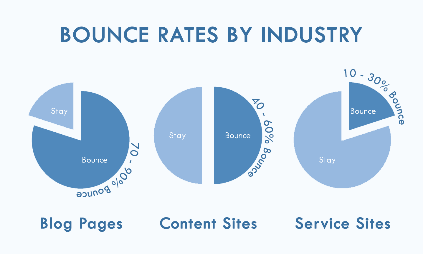
Of course, website visits mean nothing if the bounce rate is extremely high – this means that a great number of visitors that come to your website leave immediately because of the poor overall experience. A lot of professional SEO agencies recommend responsive web design as a means of lowering the bounce rate and, therefore improving your rank.
Keep in mind, though, that bounce rate is a somewhat unreliable factor because it depends on the type of website you have. For example, according to Conversion XL, service sites get up to 30 percent bounce rate, content sites from 40-60%, while blogs can have up to 90 percent. One user even addressed the unreliability of it all with an example of his site that contains mostly images and the bounce rate is extremely high because people see the image they want and leave.
Positive UX
It should come as no surprise to you that user experience affects SEO quite a lot. After all, who are you making the website for if you don’t put the focus on the people themselves? Users need to be able to see the full content on any screen and navigate it successfully. As Cody Arsenault from Key CDN points out – it’s all about those first impressions. You don’t want your visitors to struggle with zooming, scrolling or anything else regardless of their preferred browsing device.
In case you don’t feel that UX is that important for a successful website, take a look at this article by Forbes that cites a study saying that a good user interface can increase your conversion rates from anywhere around 200 up to 400%. So, it pays off thinking about the well-being of your visitors.
No Duplicate Content
Finally, one of the benefits that’s clear from the very definition of responsive website design is that it prevents the possibility of Google seeing duplicate content on your website and penalizing you for it. When you make two separate versions of your site (one for desktop and one for mobile browsing), Google can see it as two websites with the same content. Responsive design lets you use just one location that corresponds to all of the sizes.
Seeing how you have just one link for all the versions of your website, link-building becomes much simpler and, therefore, your SEO rank goes up easier. SEO Nick notes that not only is RWD a simpler and easier solution, but a more reliable as well, when it comes to link-building. Considering how mobile browsing is still relatively new, backlinks from strictly mobile websites aren’t as strong as the regular ones. Responsive web design saves you the trouble of choosing the right one.
Conclusion
In the end, it all comes down to helping the users get a better experience using your website which, in turn, drastically improves your SEO score. The beauty of responsive website design lies in its simplicity and time-saving tendencies which still makes it a somewhat better choice than the alternatives, for now. However, the world of web design is constantly changing and perhaps we’ll get to see a superior concept sometime in the future.
Nina Ritz
Nina is a digital nomad and a writer passionate about web design and marketing. If you want to find out more about Nina follow her on https://twitter.com/NinaDRitz
The post 5 Ways Responsive Web Design Benefits Your SEO appeared first on Torque.
