Mobile device users have been in their billions for a number of years now (with the number steadily rising). In fact, over half of internet users now browse the web primarily via their devices. Therefore, it’s important to ensure that the content you create for your website can be easily viewed on smaller screens.
Developing for smaller screens has progressed dramatically over the past few years, out of necessity. Making sure your site is scalable and collapsible is now easier than ever. Fortunately, there are a range of themes and plugins available that can help you accomplish those goals quickly.
With that in mind, let’s take a look at how to optimize your content for mobile devices, as well as for a few popular online platforms. Before that, let’s talk a little more about why optimizing your content is a smart strategy in the first place!
The Importance of Optimizing Your Content for Mobile Users
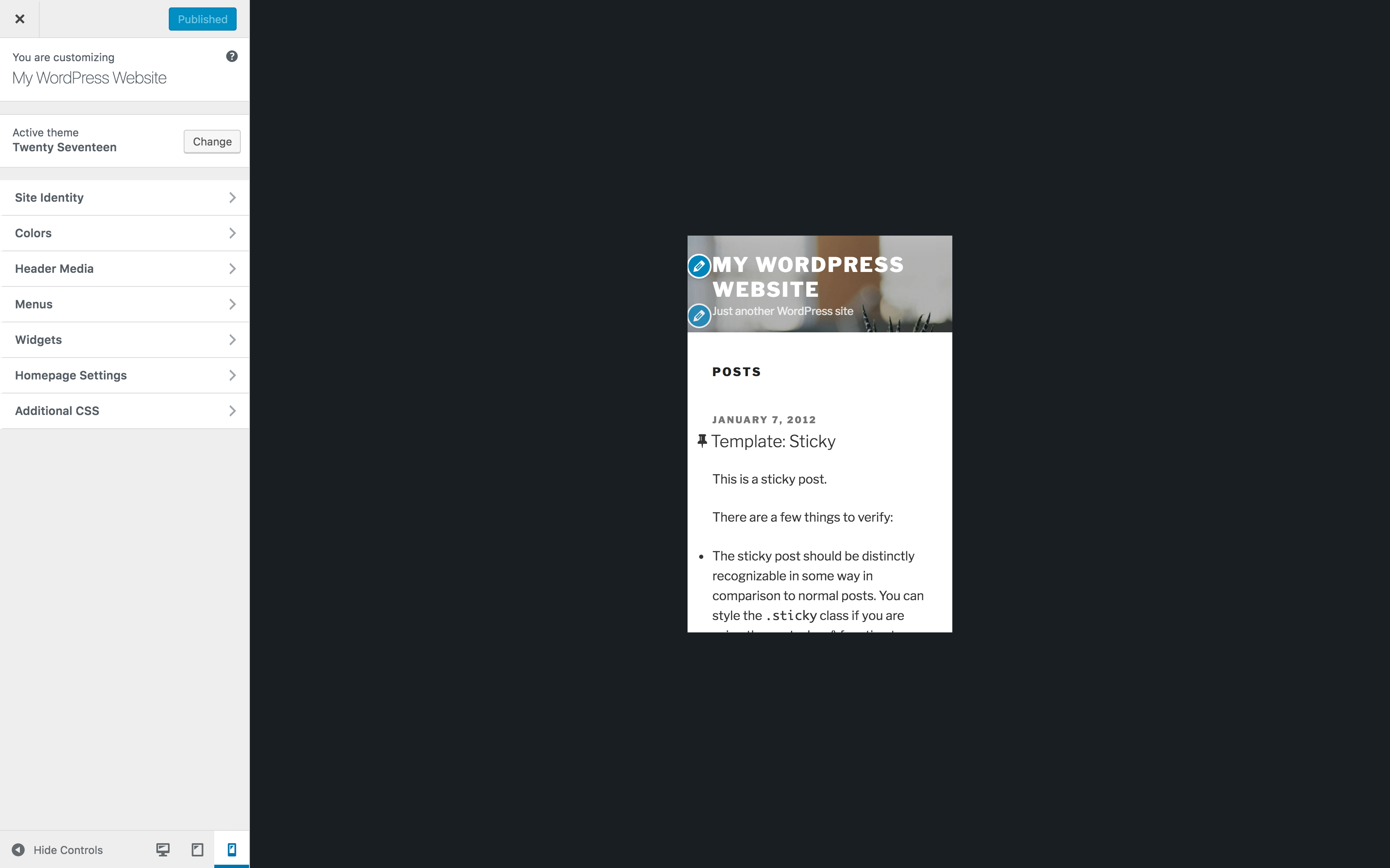
Back in the early days of the web, mobile browsing was not a consideration. It was only when devices improved during the 1990s that it became likely people would visit your website using their phones or tablets. Since the heady days of WAP pages, internet browsing on smart devices has progressed to the point that it can offer nearly 100% parity with the desktop experience.
Even so, while mobile devices now pack a lot of power behind their smaller screens, optimizing your website for them is still necessary. This is due to various factors, such as the difference in processor speed for various devices, and delays in functionality found in desktop browsers making its way to the mobile versions. At the same time, you probably don’t want to travel the traditional route of developing multiple websites, one for desktop and one for mobile.
Optimizing for smaller screens requires balance. On the one hand, you’ll want to make sure your site loads quickly, and features clear and readable content. You’ll also want to make sure that any functionality pertinent to User Experience (UX) works equally well on all devices. Let’s talk about how to do that.
How to Optimize Your Content For Smaller Screens
Actually optimizing your content isn’t simply a case of making your site responsive and calling it done. Having a responsive layout is part of the package, of course, but there’s a process you’ll need to follow in order to properly optimize your content for smaller screens.
First, you’ll need to test the site you want to optimize. The simplest way is to use Google’s free Mobile-Friendly Test site:
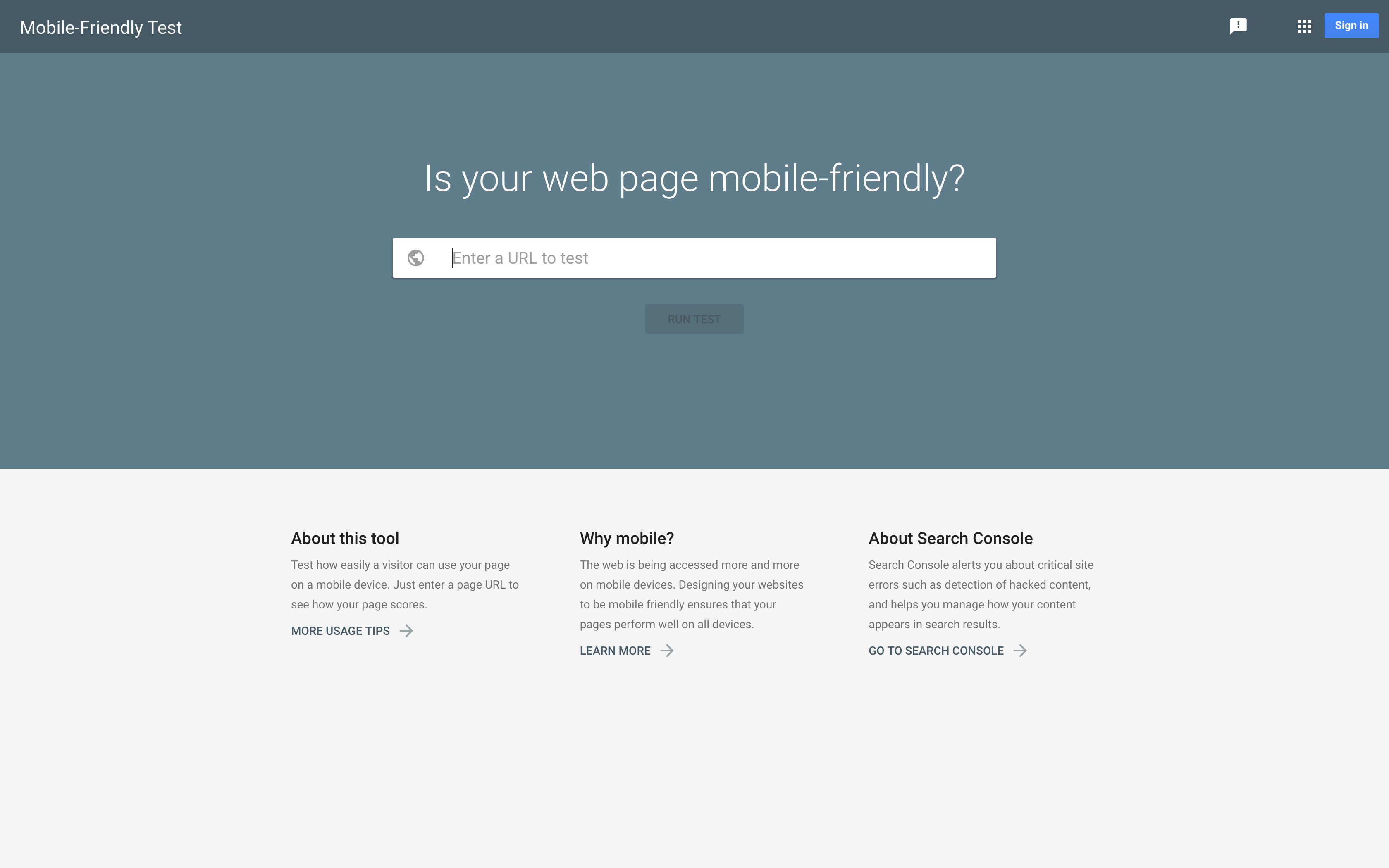
Once you enter a URL and click Run Test, the site will analyze and test your site. When it’s finished, you’ll see a simple breakdown of the results:
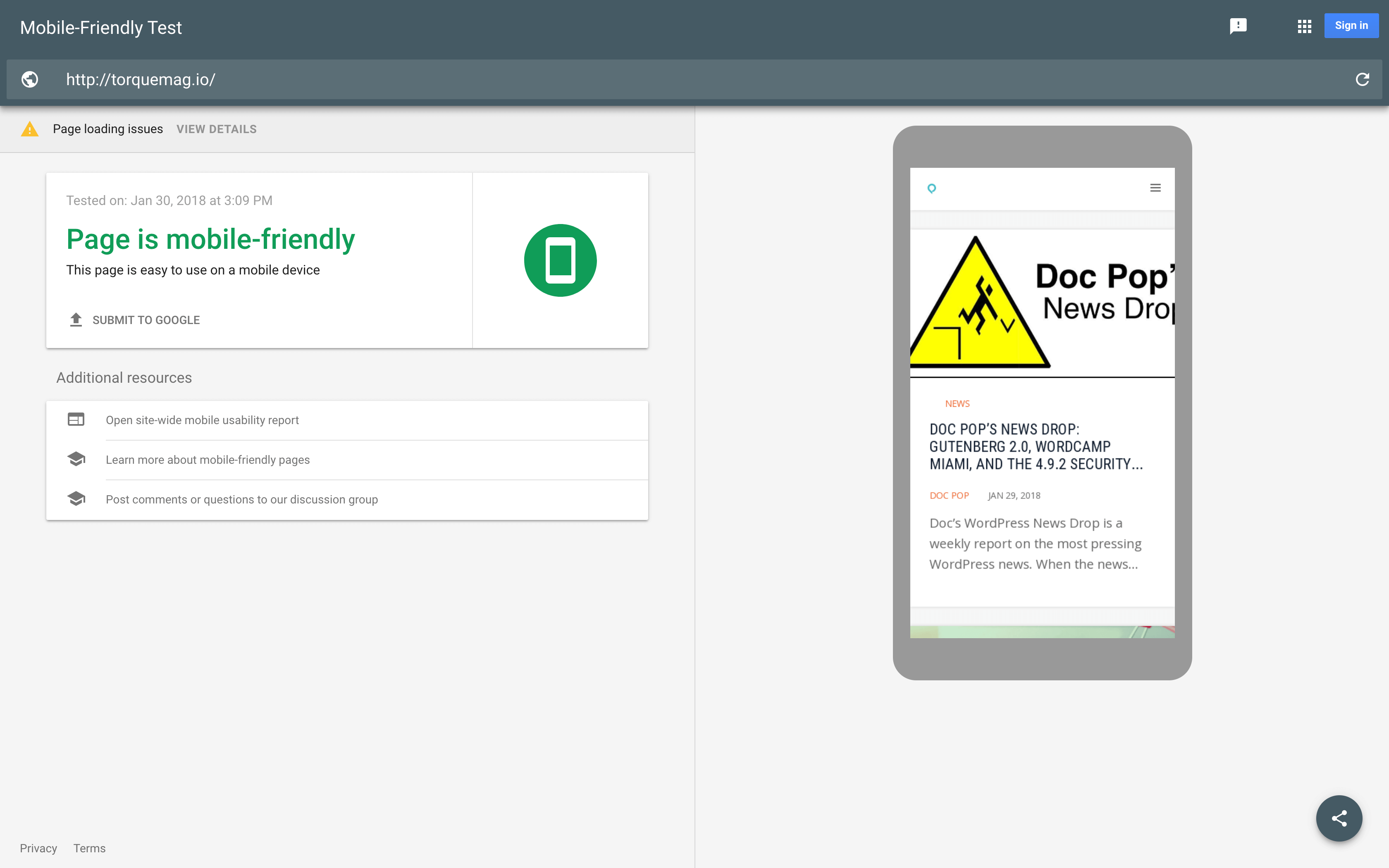
Once you’ve ascertained your site’s level of mobile-friendliness (and if it’s been found wanting), you’ll then need to settle on how to implement a more optimized design. There are three ways to do this in WordPress: through a theme, a plugin, or code. When it comes to plugins, there are plenty that can get the job done, although they’re likely going to be the least flexible solution.
For a more versatile solution, you might want to consider a dedicated theme. Most modern themes are responsive, and well-suited to smaller screens in general, so you’ll have a lot of options. However, it’s still worth checking out the demo of any theme you’re interested in, looking for quirks or anomalies. After all, not all themes are coded equally.
That brings us to our final method: coding. Many clients are going to want a custom solution, and not all off-the-shelf themes will fit their needs (or be developer-friendly). In our opinion, this is a task for a quality starter or framework theme. While there are many solutions to choose from (and you should try them all), Underscores is a standout choice, namely because it’s developed by Automattic (i.e. the developers of WordPress):
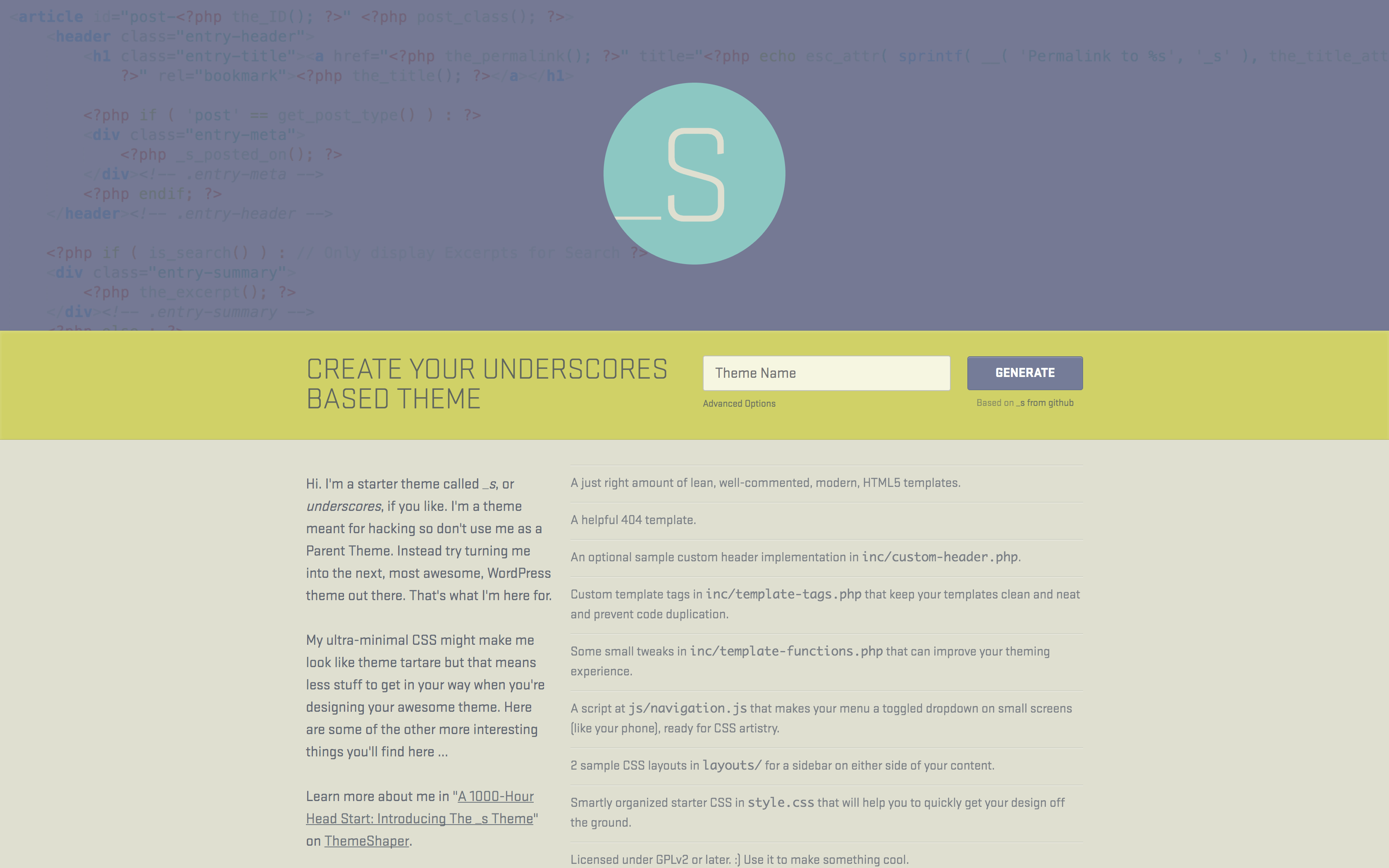
We’ve previously discussed how to create a theme with Underscores, so you may want to check out that guide. Regardless of the starter theme you choose, however, a solid grounding in what you can do to make your site responsive will come in handy.
2 Platforms to Consider When Optimizing Your Content
Once your site is optimized in a general sense, the work doesn’t stop there. You can also optimize it for specific, commonly used platforms, such as Facebook and Google. Let’s look at how to make sure your site works well on each platform’s unique mobile content format.
1. Facebook’s Instant Articles
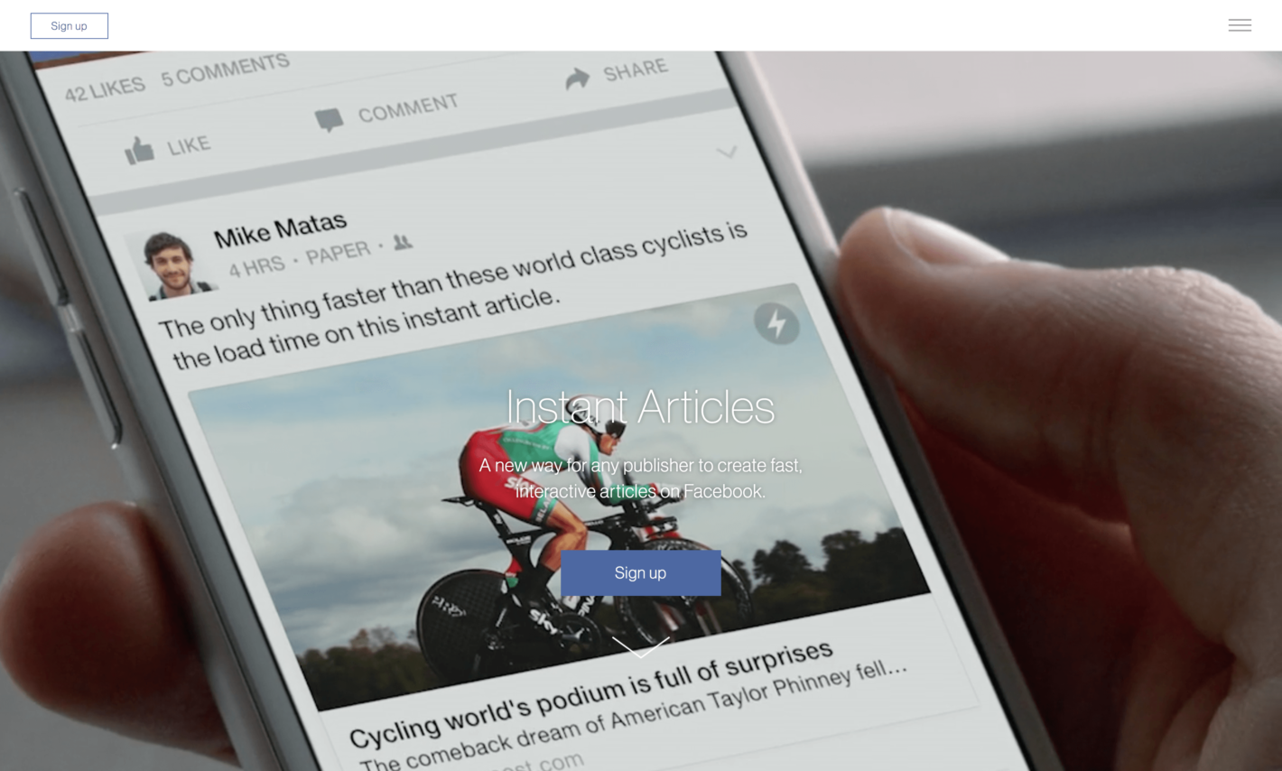
Facebook’s Instant Articles is, unsurprisingly, a ‘walled garden’. You won’t experience it unless you’re reading content from within Facebook’s dedicated mobile app. Once you do, however, you’ll find that the experience is slick and very well integrated. Opening an article creates a sandboxed environment that loads your page from the web. The environment then displays it as part of the Facebook ecosystem.
Facebook Instant Articles includes a number of engagement features (such as interactive maps and embedded audio), although you’re hamstrung when it comes to custom design. Facebook only offers templates, rather than a platform to create custom solutions. We’ve covered how this all works in more detail previously.
To begin adapting your site’s content to Instant Articles, you’ll want to check out the dedicated ‘quickstart’ guide. A separate WordPress guide explains how to connect the platform to Facebook, using the Instant Articles for WP plugin:
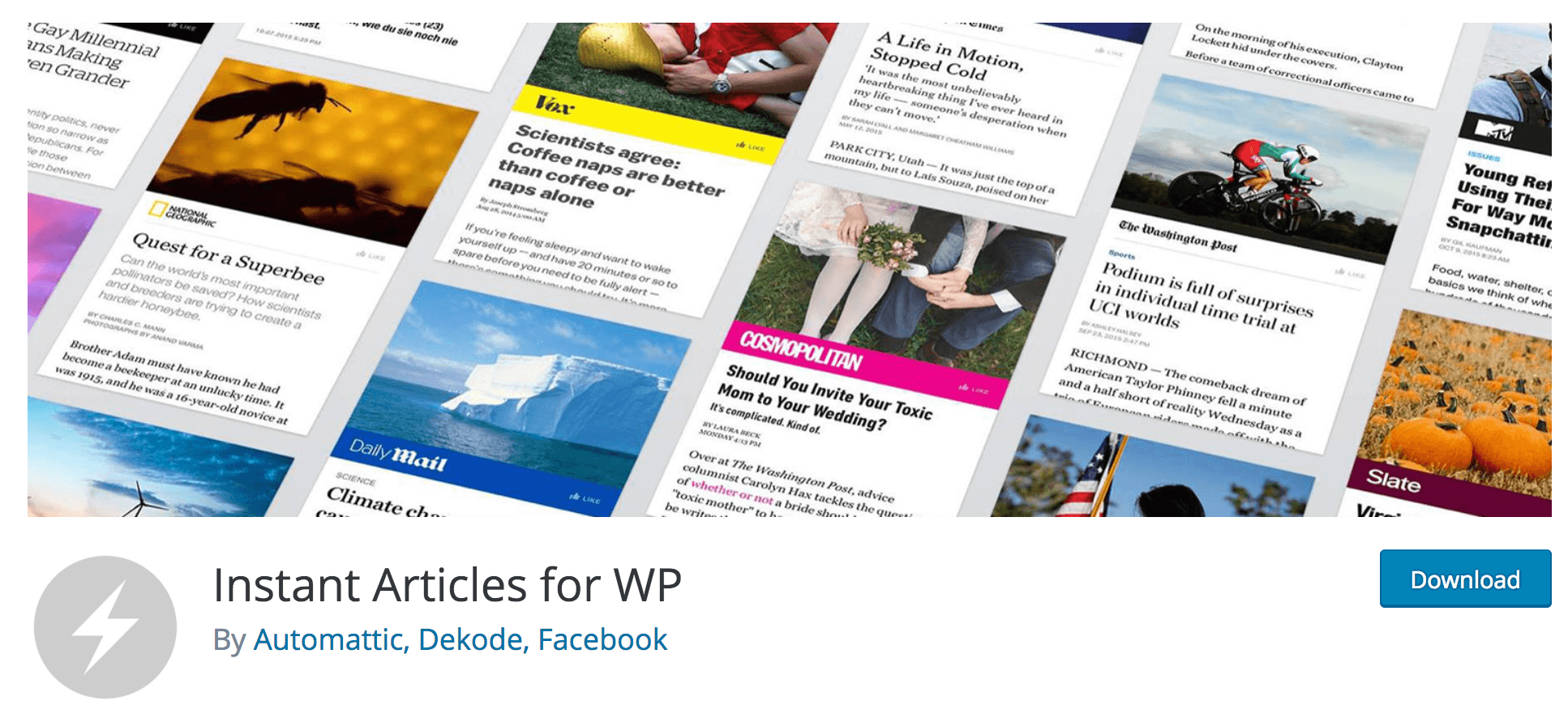
This solution is a joint venture between Facebook, Automattic, and Dekode. While it is arguably the best way to start using Instant Articles, it’s worth noting that reviews are poor in general. However, given that it’s the official version, and is mentioned as the only method for optimizing your site on Facebook’s developer pages, it will still be your go-to plugin when developing for Instant Articles.
2. Google’s Accelerated Mobile Pages
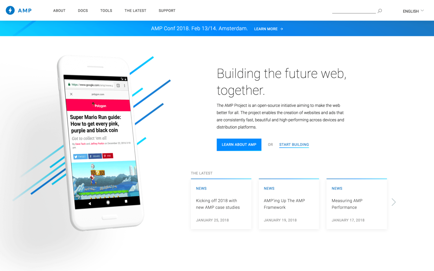
In contrast to Instant Articles, Accelerated Mobile Pages (AMP) is an open-source initiative you can be implemented on just about any website (although not on Facebook). It’s a joint initiative between Google, Twitter, and other prominent developers, with a primary focus on making web browsing on mobile devices blazingly fast. What’s more, you’re likely to see a Search Engine Optimization (SEO) benefit from implementing it, as a mobile-first index feature is set to be added to AMP in the near future.
In a complete 180-degree turn from Instant Articles, AMP has no templates at all. You’ll essentially be building your AMP-compatible pages from scratch. This isn’t the mammoth task it may seem, though. Because AMP uses an adapted form of HTML, it should be relatively easy to get up to speed. Running through Google’s tutorials and guidance will make the process clearer. Once you’re comfortable with the basics, there are a number of other elements you can include as well.
Finally, there’s also a WordPress plugin to help you implement AMP on your website. It is aptly-named the AMP for WP plugin:
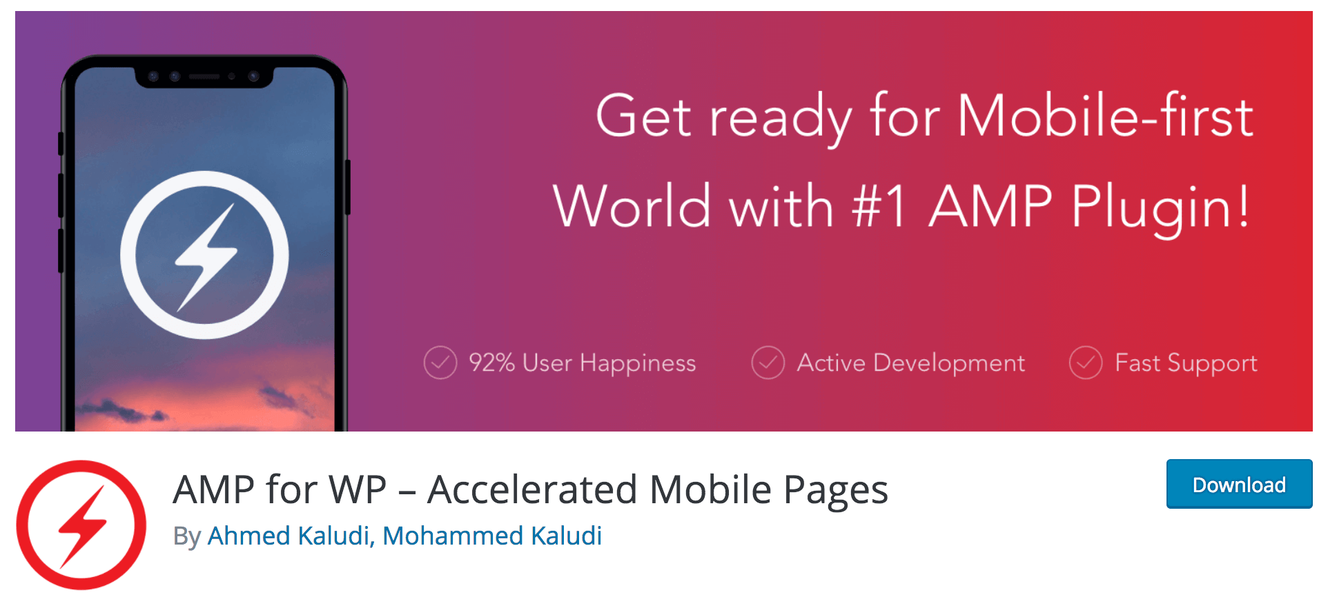
This tool provides a handy way to build AMP pages within your WordPress dashboard. It uses a drag-and-drop interface, and there are a number of extensions to enhance the experience further. If you want to fully optimize the mobile-friendliness of your site, AMP for WP is a great solution.
Conclusion
With mobile web browsing fast overtaking its desktop counterpart, it’s now crucial to develop with smaller screens in mind. Mobile users are a demographic you can’t afford to dismiss when creating a fully accessible website.
In this post, we’ve looked at how to optimize your site for mobile devices. While we’ve explored specific platforms such as Google’s AMP and Facebook’s Instant Articles, we’ve also discussed how to tackle mobile-friendliness on your site in general. Testing your theme is going to be a key step, and for clients with the budget, creating a site from scratch that works on smaller screens will be your most flexible option.
Do you have any thoughts on mobile browsing trends and how they relate to WordPress? Let us know in the comments section below!
Featured image: coffeebeanworks.
The post How to Optimize Your Content For Smaller Screens appeared first on Torque.
